


yetialerts is a lightweight JavaScript library to display customizable toast- and growl-style alert notifications on your web app where you need to communicate with users through status messages, alerts, and notifications.
This library provides smooth fade/slide animations, stackable alerts, pre-built themes and supports multiple notification types for different scenarios – success, warnings, error, and information.
How to use it:
1. Download and load the yetialerts’ JavaScript and CSS files in the document.
<link rel="stylesheet" href="/yeti-alerts.css" />
<script src="/yeti-alerts.js"></script>
2. Initialize YetiAlerts and display your first alert notification:
const yeti = new Yeti();
yeti.show({
  message: 'This is a default alert!'
});
3. Set different notification types using the severity option: ‘ok’, ‘nok’, ‘warn’, and ‘info’
yeti.show({
  message: 'This is a warning alert!',
  severity: 'warn'
});
4. By default, the alerts fade when the next alert appears. You can disable that by adding the fadeOnNext: false option.
yeti.show({
  message: 'This is a warning alert!',
  fadeOnNext: false
});
5. By default, alerts persist until you close them or another alert appears (unless fadeOnNext: false is set). You can set a duration for the alert to automatically disappear using the time option (in milliseconds). Setting a time value makes the alert non-closable.
yeti.show({
  message: 'This is a warning alert!',
  time: 5000
});
6. You can further customize alerts with these options:
yeti.show({
  title: '',
  width: 50,
  shadow: true,
  border: 0,
});
7. You can modify the look of the alerts using CSS variables. Override these variables in your stylesheet’s :root or a specific CSS rule:
:root {
  --yeti-bg-ok: #ebffec;
  --yeti-ok: #31a335;
  --yeti-bg-nok: #fdf2f1;
  --yeti-nok: #f44336;
  --yeti-bg-warn: #fff8ec;
  --yeti-warn: #ed7a00;
  --yeti-bg-info: #e6f4ff;
  --yeti-info: #0083ee;
  --yeti-close: #777;
  --yeti-shadow: #00000025;
  --yeti-radius: 5px;
  --yeti-gap: 10px;
  --yeti-font: 1em;
}
See Also:
 Lightweight Toast & Growl Notifications Inspired by macOS – Toastify
 Customizable Growl/Toast Alerts with LocalNotification.js
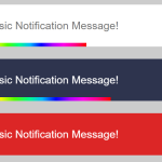 Auto-dismissable Notification Popup With Progress Bar – Notification.js
 Simple Interactive Snackbar & Toast Notification In Vanilla JavaScript – notifyjs
 Sleek Toast & Growl Alert Notification Library – Nostfly.js
 Lightweight Notification Popup JavaScript Library – X-Notify
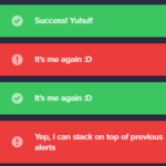 Growl And Toast Style Alert Notification Library – Notyf
 Feature-rich Web Notification Library – AST-Notif