


mono-color is a tiny, responsive, modular, clean, CSS-only front-end framework designed for content-centric websites & web applications.
More Features:
- Focused on readability.
- Optimized for both web and mobile.
- Dark and Light themes.
- 12-column based grid system.
- Useful CSS utility classes.
- Most commonly used components: cards, badges, alerts, buttons, etc.
How to use it:
1. Download & unzip the package.
2. Insert the following stylesheets into your document.
- light.min.css: Light Theme
- dark.min.css: Dark Theme
- mono.min.css: With no components, grid system, utilities, etc
- mono-color.min.css: With components, grid system, utilities, etc
<link rel="stylesheet" href="/path/to/light.min.css" media="" />
<link rel="stylesheet" href="/path/to/dark.min.css" media="(prefers-color-scheme: dark)" />
<link rel="stylesheet" href="/path/to/mono.min.css" />
<link rel="stylesheet" href="/path/to/mono-color.min.css" />
More Previews:

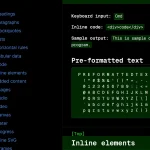
Typography

Code Block

Blockquote

Table

Form

Grid System

Rounded Buttons

Cards

Alerts
See Also:
 Classless Themeable CSS Framework For Modern Web Design – Dev.css
 CSS Framework With Almost No Classes – no.css
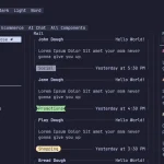 Terminal-Inspired CSS Library for Retro Web UI – WebTUI
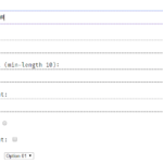 Terminal Style CSS Framework – terminal.css
 Classless CSS Framework with Georgia & Verdana Typography System – MCSS
 Windows 7 CSS Framework – 7.css
 Minimalist CSS Framework For Creating Modern Web Pages – Mgplus
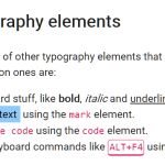 Minimal Classless CSS Framework – Simple.css