


A toggle menu built with JavaScript and CSS3 that morphs the toggle button into a popup menu when clicked. Based on CSS3 transforms and transitions.
How to use it:
Create the html for the popup menu.
<div class="menu">

  <div class="menu__button">+</div>
  <div class="menu__content">
    <h4 class="menu__title">Social Share</h4>
    <ul class="menu__content__list">
      <li>
        <i class="fa fa-facebook-square"></i> Facebook
      </li>
      <li>
        <i class="fa fa-twitter-square"></i> Twitter
      </li>
      <li>
        <i class="fa fa-google-plus-square"></i> Google+
      </li>
      <li>
        <i class="fa fa-instagram"></i> Instagram
      </li>
    </ul>
    ...
  </div>
</div>
Add the following CSS/CSS3 snippets to your page.
.menu {
  position: absolute;
  top: 20px;
  right: 20px;
  padding: 17px 15px;
  width: 50px;
  height: 50px;
  font-size: 13px;
  font-family: 'Open Sans', sans-serif;
  font-weight: 700;
  white-space: nowrap;
  color: #464448;
  overflow: hidden;
  background: #366CC8;
  border-radius: 50%;
  box-shadow: 0 3px 10px -2px rgba(0, 0, 0, 0.25);
  transition: 0.2s;
}
.menu.open {
  background: white;
  border: 1px solid #ccc;
  width: 165px;
  height: 138px;
  border-radius: 2px;
}
.menu.open .menu__button {
  color: #999;
  transform: rotate(45deg);
}
.menu.open .menu__content {
  opacity: 1;
  visibility: visible;
}
.menu__button {
  font-weight: 400;
  border: 0;
  background: none;
  color: white;
  position: absolute;
  top: 18px;
  right: 15px;
  font-size: 34px;
  padding: 0;
  width: 20px;
  height: 20px;
  line-height: 12px;
  transition: 0.2s;
  user-select: none;
}
.menu__title {
  font-size: 12px;
  margin: 0 0 13px 0;
}
.menu__content {
  opacity: 0;
  visibility: hidden;
  transition: 0.2s;
}
.menu__content__list { list-style: none; }
.menu__content__list li {
  margin: 0 0 3px 0;
  transform: translateX(20px);
  transition: 0.2s;
}
.menu__content__list li:nth-child(1) { transition-delay: 0.08s; }
.menu__content__list li:nth-child(1) svg { fill: #42A5F5; }
.menu__content__list li:nth-child(2) { transition-delay: 0.12s; }
.menu__content__list li:nth-child(2) svg { fill: #66BB6A; }
.menu__content__list li:nth-child(3) { transition-delay: 0.16s; }
.menu__content__list li:nth-child(3) svg { fill: #FF8F00; }
.menu.open .menu__content__list li { transform: translateX(0); }
.menu__content__list svg {
  vertical-align: middle;
  position: relative;
  top: -1px;
}
The main JavaScript to enable the morphing popup menu.
let menu = document.querySelector(".menu");
let button = document.querySelector(".menu__button");
toggleMenu = () => {
  menu.classList.toggle("open");
}
button.addEventListener("click", function() {
  clearInterval(interactionPreview);
  toggleMenu();
});
let interactionPreview = setInterval(() => {
  toggleMenu();
}, 2000)
See Also:
 Customizable Context Menus and Dropdowns With Vanilla JS – Tiny Popup Menu
 Animated Social Sharing Popup Menu
 Easy Accessible Popout Menu In JavaScript – JSPanel
 Sliding Hamburger Navigation With GSAP
 Google Inspired Popover Menu In Pure CSS
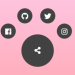 Radial Popup Menu In Pure CSS – Circle Menu
 Material Design Style Radial FAB Menu With Pure CSS
 Lightweight Accessible Datepicker Calendar Component – DateDreamer
I like this. I will give it a try