


slider.js is a minimal JavaScript library to enhance and beautify the default range slider control with custom styles and extra functionality.
How to use it:
Create a regular range input on the page.
<input id="slide" type="range" min="10" max="100" value="62" oninput="displayValue(event)" />
Create an inline element to display the current value.
<span id="val"></span>
That’s it. You can also create controls to change the max/min values allowed to pick.
<div class="form">
  <div>
    <label for="min">Lower bound</label>
    <input type="number" id="min" onkeydown="checkPostiveInteger(event)" oninput="checkValidLimits()" placeholder="  < and != upper bound">
  </div>
  <div>
    <label for="max">Upper bound</label>
    <input type="number" id="max" onkeydown="checkPostiveInteger(event)" oninput="checkValidLimits()" placeholder="  > and != lower bound">
  </div>
  <button onclick="changeLimits()" id="limitButton" disabled>Apply limits</button>
</div>
Apply your own CSS styles to the slider control.
input[type=range] {
  width: 100%;
  -webkit-appearance: none;
  margin: 0;
}
input[type=range]:focus { outline: none; }
input[type=range]::-webkit-slider-runnable-track {
 width: 100%;
 height: 19px;
 cursor: pointer;
 box-shadow: 0 4px 4px rgba(0,0,0,0.3) inset;
 background: linear-gradient(to right, #005fc2, #35A834 40%, #ffd400 65%, #FF6400);
 border-radius: 20px;
 border: 0.2px solid #010101;
}
input[type=range]::-webkit-slider-thumb {
 box-shadow: 1px 1px 1px #000000, 0px 0px 1px #0d0d0d;
 border: 1px solid #000000;
 height: 20px;
 width: 20px;
 border-radius: 20px;
 background: white;
 cursor: pointer;
 -webkit-appearance: none;
 margin-top: -1px;
}
#slide:before {
  content: attr(min);
  position: absolute;
  bottom: 0;
  left: 0;
  color: black;
  font-size: 1rem;
}
#slide:after {
  content: attr(max);
  position: absolute;
  bottom: 0;
  right: 0;
  color: black;
  font-size: 1rem;
}
#val {
  font-size: 1.6rem;
  position: absolute;
  left: 0;
  bottom: 40px;
  width: 100px;
}
See Also:
 Responsive & Touch-enabled Range Slider In Vanilla JavaScript – rangeSlider
 Accesible Range Slider Custom Element
 Build Custom Circular Range Sliders with CircularRange Web Component
 Accessible Dual-Handle Range Slider Library – range-slider.js
 Accessible Dual-Thumb Range Slider for Web & Mobile – DoubleRange
 Modern Range Sliders Based On Native Range Inputs – dual-range-input
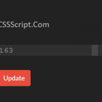 Highly Customizable Range Slider In JavaScript – Slider89.js
 Interactive Range Slider with Tooltip Using Pure CSS