


A Material Design inspired FAB (Floating Action Button ) menu that pops up a group of menu items around the trigger button. Without the need of JavaScript and any 3rd frameworks.
How to use it:
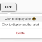
Create the floating action buttons with a trigger button on the web page.
<input id="triggerButton" class="triggerButton" type="checkbox">
<label for="triggerButton"></label>
<div class="one">Menu 1</div>
<div class="two">Menu 2</div>
<div class="three">Menu 3</div>
The main CSS for the trigger button.
.triggerButton { display: none; }
.triggerButton + label {
  cursor: pointer;
  position: absolute;
  right: 1em;
  bottom: 1em;
  background-color: tomato;
  height: var(--l);
  width: var(--l);
  border-radius: 50%;
  z-index: 2;
}
.triggerButton + label:before, .triggerButton + label:after {
  position: absolute;
  content: '';
  height: calc(var(--l) / 2 );
  width: .25em;
  background-color: #fff;
  top: 0;
  bottom: 0;
  left: 0;
  right: 0;
  margin: auto;
  border-radius: .5em;
  transition: all .25s;
}
.triggerButton + label:before {
  height: calc(var(--l) / 2 );
  width: .25em;
}
.triggerButton + label:after {
  width: calc(var(--l) / 2 );
  height: .25em;
}
.triggerButton:checked + label:before { transform: rotatez(-45deg); }
.triggerButton:checked + label:after { transform: rotatez(-45deg); }
The CSS for the menu items.
.one, .two, .three {
  cursor: pointer;
  position: absolute;
  right: 1em;
  bottom: 1em;
  padding: 1em;
  width: 1em;
  height: 1em;
  border-radius: 50%;
  opacity: 0;
  z-index: 1;
  transform: rotateZ(90deg);
  font-size: 1em;
  color: #fff;
  transition-property: all;
  transition-duration: .35s;
  transition-timing-function: cubic-bezier(0.175, 0.885, 0.32, 1.275);
}
.triggerButton:checked ~ .one, .triggerButton:checked ~ .two, .triggerButton:checked ~ .three { opacity: 1; }
.triggerButton:checked ~ .one {
  background-color: purple;
  transform: translateX(-5em);
  transition-delay: .2s;
}
.triggerButton:checked ~ .two {
  background-color: slateblue;
  transform: translateX(-3.5em) translateY(-3.5em);
  transition-delay: .1s;
}
.triggerButton:checked ~ .three {
  background-color: mediumorchid;
  transform: translateY(-5em);
}
.triggerButton:checked ~.one:hover, .triggerButton:checked ~ .two:hover, .triggerButton:checked ~ .three:hover { opacity: .9; }
See Also:
 Customizable Context Menus and Dropdowns With Vanilla JS – Tiny Popup Menu
 Animated Social Sharing Popup Menu
 Easy Accessible Popout Menu In JavaScript – JSPanel
 Sliding Hamburger Navigation With GSAP
 Google Inspired Popover Menu In Pure CSS
 Radial Popup Menu In Pure CSS – Circle Menu
 Morphing Popup Menu With JavaScript And CSS3
 Material Floating Action Button In JavaScript – Bubbler