


mosaicLayout is a JavaScript library for rendering a responsive, mobile-friendly, mosaic tiling layout (also called Masonry Layout) on the page.
How to use it:
1. Import the stylesheet mosaic-styles.css and JavaScript lazy-load-mosaic-tile-script.js into the document.
<link rel="stylesheet" href="mosaic-styles.css" />
<script src="lazy-load-mosaic-tile-script.js"></script>
2. Create a container element named masonryContainer.
<div id="masonryContainer">
</div>
3. Define an array of images to be showcased in the mosaic layout.
myImages = [
  "1.png",
  "2.jpg",
  "3.webp",
  // ...
]
4. Create a new instance of the mosaic layout.
var mosaic = new mosaicLayout({
    imagesArray: myImages
});
5. Initialize the mosaic layout and done.
mosaic.initiate();
6. Override the default CSS classnames.
var mosaic = new mosaicLayout({
    imagesArray: myImages,
    // container CSS
    container: "masonryContainer",
    // column CSS
    masonryColumn: "masonryColumn",
    // CSS class of image container
    masonryImgDiv: "masonryImgDiv",
    // CSS class of each image
    masonryImg: "masonryImg",
});
7. Determine how many columns to show on desktop & mobile.
var mosaic = new mosaicLayout({
    imagesArray: myImages,
    columns: "6",
    mobileColumns: "3",
    smallCutoff: 800 // breakpoint
});
8. Enable image lazy loading. Default: false.
var mosaic = new mosaicLayout({
    imagesArray: myImages,
    lazyLoading: false,
    lazyLoadingClass: 'lazy',
});
See Also:
 Responsive Masonry Layouts with CSS Grid and Mason-it.js
 Responsive CSS Masonry Grid Layout – Grid Overflow
 Minimal Masonry Web Layout In Pure JavaScript – MiniMasonry.js
 Easy Responsive Masonry Grid Library – Stackgrid
 Minimalist Masonry Gallery Layout With CSS Grid – mm-masonry.css
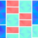 Tiny Responsive Masonry Grid Library – stack-up.js
 Simple Masonry Grid Layout With Flexbox – simple-masonry.js
 Filterable Masonry Grid In JavaScript – Isolde