


A lightweight Vanilla JS library to help you generate a responsive, mobile-friendly Masonry grid layout using CSS flexbox.
How to use it:
1. Load the simple-masonry.css and simple-masonry.js in the document.
<link rel="stylesheet" href="simple-masonry.css" />
<script src="simple-masonry.js"></script>
<!-- IE 11 Support -->
<script src="simple-masonry-ie11.js"></script>
2. Create an HTML unordered list for the Masonry grid layout.
<ul class="js-masonry-list">
  <li class="js-masonry-elm">
    <img src="1.jpg" alt="" width="400" height="300" />
  </li>
  <li class="js-masonry-elm">
    <img src="2.jpg" alt="" width="400" height="300" />
  </li>
  <li class="js-masonry-elm">
    <img src="3.jpg" alt="" width="400" height="300" />
  </li>
  ....
</ul>
3. Initialize the Masonry grid layout. That’s it.
masonry({
  // options here
});
4. Set the number of columns. Default: 1.
masonry({
  column: 5
});
5. You can also specify the number of columns for each screen solution.
masonry({
  responsive: [{
    breakpoint: 1024,
    column: 3
  }, {
    breakpoint: 600,
    column: 2
  }, {
    breakpoint: 450,
    column: 1
  }]
});
6. Default CSS selectors.
masonry({
  target: '.js-masonry-list',
  activeClass: 'is-active',
  listClass: '.js-masonry-list',
  listElmsClass: '.js-masonry-elm',
});
Changelog:
03/11/2022
- Bugfix
See Also:
 Responsive Masonry Layouts with CSS Grid and Mason-it.js
 Responsive CSS Masonry Grid Layout – Grid Overflow
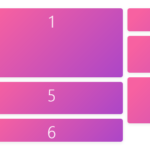 Minimal Masonry Web Layout In Pure JavaScript – MiniMasonry.js
 Easy Responsive Masonry Grid Library – Stackgrid
 Minimalist Masonry Gallery Layout With CSS Grid – mm-masonry.css
 Tiny Responsive Masonry Grid Library – stack-up.js
 Mosaic Tiling With Image Lazy Loading – mosaicLayout
 Filterable Masonry Grid In JavaScript – Isolde