


| Author: | dudyn5ky1 |
|---|---|
| Views Total: | 72,835 views |
| Official Page: | Go to website |
| Last Update: | July 2, 2021 |
| License: | MIT |
Preview:

Description:
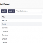
SelectPure is a pure JavaScript (es6) library to create elegant single or multiple select controls with support for autocomplete and dynamic data rendering.
Also can be used as a tag & token management tool for your web app.
How to use it:
Install the SelectPure.
# Yarn
$ yarn add select-pure
# NPM
$ npm install select-pure --save
Import the SelectPure library.
import SelectPure from "select-pure";
Or directly include the bundled JavaScript on the webpage.
<script src="bundle.min.js"></script>
Create a container in which you want to render the select control.
<span class="example"></span>
Define an array of options for the select.
const myOptions = [
  {
    label: "New York",
    value: "NY",
  },
  {
    label: "Washington",
    value: "WA",
  },
  {
    label: "California",
    value: "CA",
  },
  {
    label: "New Jersey",
    value: "NJ",
  },
  {
    label: "North Carolina",
    value: "NC",
  },
],
Create a new select control inside the container element you just created.
var instance = new SelectPure(".example", {
    options: myOptions
});
Enable the Multi-Select functionality.
var instance = new SelectPure(".example", {
    options: myOptions,
    multiple: true // default: false
});
Enable the Autocomplete functionality.
var instance = new SelectPure(".example", {
    options: myOptions,
    autocomplete: true // default: false
});
Set the pre-selected value(s).
var instance = new SelectPure(".example", {
    options: myOptions,
    value: ["NY", "CA"]
});
Customize the icon displayed in the selected options.
var instance = new SelectPure(".example", {
    options: myOptions,
    icon: "fa fa-times" // uses Font Awesome
    inlineIcon: false // custom cross icon for multiple select.
});
Execute a callback function on change.
var instance = new SelectPure(".example", {
    options: myOptions,
    onChange: value => { console.log(value); }
});
Customize the placeholder when no value is selected .
var instance = new SelectPure(".example", {
    placeholder: false
});
Get the currently selected value.
instance.value();
Reset the select.
instance.reset();
Default CSS classes.
var instance = new SelectPure(".example", {
    options: myOptions,
    classNames: {
      select: "select-pure__select",
      dropdownShown: "select-pure__select--opened",
      multiselect: "select-pure__select--multiple",
      label: "select-pure__label",
      placeholder: "select-pure__placeholder",
      dropdown: "select-pure__options",
      option: "select-pure__option",
      autocompleteInput: "select-pure__autocomplete",
      selectedLabel: "select-pure__selected-label",
      selectedOption: "select-pure__option--selected",
      placeholderHidden: "select-pure__placeholder--hidden",
      optionHidden: "select-pure__option--hidden",
    }
});
The default CSS styles.
.select-wrapper {
  margin: auto;
  max-width: 600px;
  width: calc(100% - 40px);
}
.select-pure__select {
  align-items: center;
  background: #f9f9f8;
  border-radius: 4px;
  border: 1px solid rgba(0, 0, 0, 0.15);
  box-shadow: 0 2px 4px rgba(0, 0, 0, 0.04);
  box-sizing: border-box;
  color: #363b3e;
  cursor: pointer;
  display: flex;
  font-size: 16px;
  font-weight: 500;
  justify-content: left;
  min-height: 44px;
  padding: 5px 10px;
  position: relative;
  transition: 0.2s;
  width: 100%;
}
.select-pure__options {
  border-radius: 4px;
  border: 1px solid rgba(0, 0, 0, 0.15);
  box-shadow: 0 2px 4px rgba(0, 0, 0, 0.04);
  box-sizing: border-box;
  color: #363b3e;
  display: none;
  left: 0;
  max-height: 221px;
  overflow-y: scroll;
  position: absolute;
  top: 50px;
  width: 100%;
  z-index: 5;
}
.select-pure__select--opened .select-pure__options {
  display: block;
}
.select-pure__option {
  background: #fff;
  border-bottom: 1px solid #e4e4e4;
  box-sizing: border-box;
  height: 44px;
  line-height: 25px;
  padding: 10px;
}
.select-pure__option--selected {
  color: #e4e4e4;
  cursor: initial;
  pointer-events: none;
}
.select-pure__option--hidden {
  display: none;
}
.select-pure__selected-label {
  background: #5e6264;
  border-radius: 4px;
  color: #fff;
  cursor: initial;
  display: inline-block;
  margin: 5px 10px 5px 0;
  padding: 3px 7px;
}
.select-pure__selected-label:last-of-type {
  margin-right: 0;
}
.select-pure__selected-label i {
  cursor: pointer;
  display: inline-block;
  margin-left: 7px;
}
.select-pure__selected-label i:hover {
  color: #e4e4e4;
}
.select-pure__autocomplete {
  background: #f9f9f8;
  border-bottom: 1px solid #e4e4e4;
  border-left: none;
  border-right: none;
  border-top: none;
  box-sizing: border-box;
  font-size: 16px;
  outline: none;
  padding: 10px;
  width: 100%;
}
Changelog:
07/02/2021
- fix(select-pure): fix multiple renderred hidden inputs
v0.6.3 (05/03/2021)
- refactor(select): refactor select component
v0.6.3 (05/03/2021)
- package updated
v0.6.0 (03/29/2020)
- fix bug with disabled options
v0.6.0 (03/26/2020)
- update dependencies
v0.5.0 (03/01/2020)
- add reset method
v0.4.0 (01/29/2020)
- add custom classNames
v0.3.0 (12/20/2019)
- Add placeholder, add method for getting select value
v0.2.3 (12/16/2019)
- Ability to add custom cross icon for multiselect
v0.2.1 (10/07/2019)
- fix(select): Don’t throw error when options are empty
See Also:
 Advanced Select Box Enhancement Library – pureScriptSelect
 High Performance Select Box JavaScript Library – Virtual Select
 Customizable Select Box & Input Field Enhancement Library – Choices.js
 Enhanced Dropdown Select In Pure JavaScript – LC-select
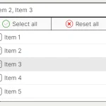 Feature-rich Custom Select JavaScript Library – SimpSelect
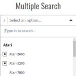 Powerful Single & Multiple Select Library – tail.select
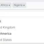 Enhance HTML Selects with Advanced Features – SnapSelect
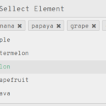 Multi-select Dropdown Component With Vanilla JavaScript – sellect.js
selectpure.min.js:1 Uncaught TypeError: Cannot read property ‘map’ of undefined
at Object._setValue (selectpure.min.js:1)
at new (selectpure.min.js:1)
at HTMLDocument. (grid.js:53)
_setValue @ selectpure.min.js:1
(anonymous) @ selectpure.min.js:1
(anonymous) @ grid.js:53
For anyone wondering; add value: [] when you create a new SelectPure instance.
looks great, but can’t find the long version of bundle.
Found a bug on mozilla:
After deleting the last entry in multi select, text is highlited.
fix adding:
.select-pure__option::-moz-selection{
color: inherit;
}
to your css
Do you have an idea why i cannot delete selected entries?
probably was why you delete the key “value:” when instantiating
You need to set the icon parameter in the initialization. If you’re using bootstrap, something like this works:
let instance = new SelectPure(“.projectMulti”, {
options: myOptions,
autocomplete: true,
multiple: true,
icon: “glyphicon glyphicon-remove”
How can i limit number of selection??
How to get and set values from and to this select using jquery
Hi, great plugin, one question though. Can I set the value dynamically? I use id (integer) and tried to add the value e.g. [‘9′, ’12’] as string, as array but the onlyt time i
t works is if I add the values manually.
Great selection box, i am new to JavaScript. How can i get the final selections that let me to pass to other page?
I have the same question!!!
How can I use autocomplete for any match? Currently only does it with the first letter.Thanks!
You can edit the bundle, look for the ‘startsWith’ method and change it for ‘include’ method.
Sorry for my bad english.
Cheap Content Writing Services in UAE
Today, we live in an internet age. If a business is not on Google, it’s not there at all! Due to the large number of people turning to the internet as a source of information, and for purchasing a large volume of products, maintaining a healthy website that ranks high in search engines like Google is essential. WRITING4U offers a comprehensive range of SEO content writing services in the UAE
anyone knows why i got TypeError: t is undefined on selecting the element? for multi-select
Don’t know if you’re still interested in the answer, but, if you’re filling your list, asynchronously, you should parse the “value” to String.
So sorry for my bad english :c
Fantastic script ! Thanks
Would be nice to be able to use value 99 for label ALL in multiple select. If ALL(value=99) is selected, then other selected labels are automatically closed. If label other than ALL is selected, then label ALL is closed.
example:
var notify_lang_4 = new SelectPure(“#notify_lang_4”, {
options: [
{
label: “ALL”,
value: “99”,
},
{
label: “English”,
value: “0”,
},
{
label: “Français”,
value: “1”,
},
{
label: “Español”,
value: “2”,
},
{
label: “italiano”,
value: “3”,
},
{
label: “Deutsche”,
value: “4”,
},
{
{
label: “日本人”,
value: “5”,
},
],
value: [“”],
multiple: true,
icon: “fa fa-times”,
})
Michel Trottier
Montreal, Canada;
Great code – exactly what I’m looking for – with one exception. I would like to enter values into a text box, click ‘Add’, and have the value added to the select box – as a visible selection. Can you provide guidance on how to do that?
como eu recupero os dados via post? obrigado.
I can’t get it to display the selector
My code:
import React from ‘react’;
import byer from ‘../../components/byer’;
import SelectPure from “select-pure”;
var instance = new SelectPure(“.fisk”, {
options: byer,
multiple: true, // default: false
autocomplete: true,
placeholder: “select city”,
onChange: value => { console.log(value); }
});
class Cars extends React.Component{
render(){
return(
);
}
}
export default Cars;
What am I doing wrong?
How can I set a value from a jquery function?
hi, this is the most simples multi select plugin I have came accros.
I need help in inserting data from database.
I have a jquery function that gets the value from db via php file.
this is the format
$droplist[]=array(‘value’ => $statusID,’label’ => $status);
retun json_encode($droplist);
when I outpout to console.log (from javascript) I am getting the full list of $droplist values.
but you function does not accept the value and the dropdown list remains empty
console.log output:
0: {value: “8”, label: “Granted”}
1: {value: “40”, label: “New Filing”}
2: {value: “41”, label: “Pending”}
3: {value: “42”, label: “Registered”}
4: {value: “43”, label: “Inactive”}
length: 5
//————- part of jquery function
success: function (data){
console.log(“getStatus dbData: “,data); // this data is correctly displayed in console
//but the data below does not accept the values.
var multi = new SelectPure(“.multi-select”, {
value: [],
options: [data],
multiple: true,
icon: “fa fa-times”,
placeholder: “-Please select-“,
onChange: value => { console.log(value); },
classNames: {
select: “select-pure__select”,
dropdownShown: “select-pure__select–opened”,
multiselect: “select-pure__select–multiple”,
label: “select-pure__label”,
placeholder: “select-pure__placeholder”,
dropdown: “select-pure__options”,
option: “select-pure__option”,
autocompleteInput: “select-pure__autocomplete”,
selectedLabel: “select-pure__selected-label”,
selectedOption: “select-pure__option–selected”,
placeholderHidden: “select-pure__placeholder–hidden”,
optionHidden: “select-pure__option–hidden”,
}
});
I’ve got it working. but I cant remove the selected option. the (X) button is missing on the selected tag
I got it working. thanks to google chromes’ inspect feature.. I manage to get your X icon file name from your demo file, and added into the span class which was not included in the css.
How do I get the selected values into form post method ?
Hey @Ryan i also wanted know about the same. Did u get to know how that need to be done for post method.
Hello, I found out that if you try to set pre-selected value with value 0, than the combobox doesn’t render it. The option is available to select, but without the ‘data-value’ attribute. Not sure if it’s only mine issue but worth checking.
is there a way to limit selections, ie i am selecting from a list of 20 items but only max of 6 allowed to be selected ?
Hi. Thanks for the nice script!
I found a bug: the placeholder does not disapear, when you select a tag.
Is there a possibility to enter the myOptions-values as plain list instead a list of objects?
add this to your style sheet
.select-pure__placeholder–hidden{
display: none !important;
}
This above css had a long dash before the ‘hidden’. It should be two short dashes:
.select-pure__placeholder–hidden {
display: none !important;
}
selectPure is not a constructor.
After selecting the tags, how to access there values in html?
How do I add ajax function to options?
How do i get the values from the selected options in PHP?
Thank you for this nice plugin. Everything seems to be working corretly, except for the “onchange” function. I tested this on your demo site, but nothing gets logged to the console when adding or removing values.
could you please add posibility to place icon for items?
options: [
{
label: “Barbina”,
value: “ba”,
icon: “/img/barbina.jpg”
},
…
to be rendered as:
Barbina
is there a config value to not close the options after selecting one?