


A pure CSS solution to create Neumorphic style radio buttons following the 2020 Neumorphism UI design trends.
How to use it:
1. Load the Font Awesome for the check/uncheck icons (OPTIONAL).
<link rel="stylesheet" href="https://stackpath.bootstrapcdn.com/font-awesome/4.7.0/css/font-awesome.min.css" />
2. Create standard radio buttons on the page.
<div>
  <label>
    <input type="radio" name="age" />
    <i class="fa fa-check" aria-hidden="true"></i>
  </label>
  <label>
    <input type="radio" name="age" />
    <i class="fa fa-times" aria-hidden="true"></i>
  </label>
</div>
3. The core CSS to apply Neumorphism styles to the radio buttons.
label {
  position: relative;
}
label input {
  appearance: none;
  -webkit-appearance: none;
  cursor: pointer;
}
label .fa {
  position: relative;
  width: 40px;
  height: 40px;
  background: #091921;
  line-height: 40px;
  text-align: center;
  margin: 0 4px;
  color: #6f6f6f;
  font-size: 16px;
  border-radius: 50%;
  box-shadow: -1px -1px 3px rgba(255, 255, 255, 0.1),
    2px 2px 6px rgba(0, 0, 0, 0.8);
}
label .fa:hover {
  box-shadow: -1px -1px 3px rgba(255, 255, 255, 0.1),
    2px 2px 6px rgba(0, 0, 0, 0.8),
    inset -2px -2px 10px rgba(255, 255, 255, 0.05),
    inset 2px 2px 10px rgba(0, 0, 0, 0.5);
}
label input:checked ~ .fa {
  color: #00fff1;
  box-shadow: inset -2px -2px 10px rgba(255, 255, 255, 0.05),
    inset 2px 2px 10px rgba(0, 0, 0, 1);
  text-shadow: 0 0 5px #00fff1, 0 0 20px #00fff1;
}
See Also:
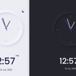 Modern Mobile-first Clock UI In JavaScript
 Neumorphic Style Login Form In Pure CSS
 Neomorphism Design Framework – neomo
 Neumorphic Style CSS Shapes
 CSS Only Neumorphic UI Framework Based On Bootstrap – NenmorphismCSS
 Tiny Neumorphism UI Framework – Skeuos CSS
 Neumorphic Bootstrap Theme For Neumorphism Design Trend – neumorph.scss
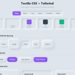 Minimal Neumorphic UI Kit in Pure CSS – Tactile CSS