


A modern login form template built following the Neumorphism Design concept.
How to use it:
1. Markup the HTML for the login form.
<div class="box">
  <form action="#" method="post">
    <label for="username">Username</label></br>
    <input type="text" name="uname" id="uname" placeholder="Enter Username" class="input-box">
    </br></br>
    <label for="username">Password</label></br>
    <input type="password" name="uname" id="uname" placeholder="Enter Password" class="input-box"></br>
    <div class="forget">
      <label class="checkbox-label">
      <input type="checkbox">
      <span class="checkbox-custom "></span>
      <span class="label-text">Remember me</span>
      </label>
      <span class="fg">
      <a href="#"> Forget password?</a>
      </span>
    </div>
    <button type="submit" class="btn">Sign In</button>
  </form>
  <span class="option">or sign in with</span>
  <div class="social">
    <div class="box-radius">
      <img src="images/fb.png" alt="">
    </div>
    <div class="box-radius">
      <img src="images/google.png" alt="">
    </div>
    <div class="box-radius">
      <img src="images/linkedin.png" alt="">
    </div>
    <div class="box-radius">
      <img src="images/twitter.png" alt="">
    </div>
  </div>
</div>
2. The CSS.
.box {
  margin: auto;
  box-sizing: border-box;
  margin-top: 100px;
  height: 500px;
  padding: 80px 40px;
  width: 340px;
  border-radius: 35px;
  background-color: #ecf0f3;
  box-shadow: -8px -8px 8px #feffff, 8px 8px 8px #161b1d2f;
}
.box label {
  font-size: 16px;
  font-weight: 500;
  color: #858686;
}
.box .input-box {
  width: 100%;
  height: 35px;
  padding-left: 20px;
  border: none;
  color: #858686;
  margin-top: 10px;
  background-color: #ecf0f3;
  outline: none;
  border-radius: 20px;
  box-shadow: inset 5px 5px 5px #cbced1, inset -5px -5px 5px #ffffff;
}
.box .input-box::placeholder {
  color: #9ea0a0;
}
.forget {
  margin-top: 15px;
}
.forget .fg a {
  text-decoration: none;
  font-size: 13px;
  color: #8f8c8c;
  line-height: 24px;
}
.forget .fg {
  display: inline-block;
  margin-left: 58%;
  font-size: 12px;
}
.forget .fg:hover {
  text-decoration: underline;
  text-decoration-color: #b4b8b8;
}
.forget .checkbox-label {
  display: block;
  position: relative;
  cursor: pointer;
  font-size: 22px;
  line-height: 22px;
}
.label-text {
  color: #8f8c8c;
  display: inline-block;
  position: absolute;
  font-weight: 500;
  left: 12%;
  font-size: 13px;
}
.forget .checkbox-label input {
  position: absolute;
  opacity: 0;
  cursor: pointer;
}
.checkbox-label .checkbox-custom {
  position: absolute;
  top: 0;
  left: 0px;
  height: 20px;
  width: 20px;
  background-color: #ecf0f3;
  border-radius: 5px;
  border: none;
  box-shadow: inset 3px 3px 3px #cbced1, inset -3px -3px 3px #ffff;
}
.checkbox-label input:checked~.checkbox-custom {
  background-color: #ecf0f3;
  border-radius: 5px;
  -webkit-transform: rotate(0deg) scale(1);
  -ms-transform: rotate(0deg) scale(1);
  transform: rotate(0deg) scale(1);
  opacity: 1;
  border: none;
  box-shadow: -4px -4px 4px #feffff, 4px 4px 4px #161b1d2f;
}
.checkbox-label .checkbox-custom::after {
  position: absolute;
  content: "";
  left: 10px;
  top: 10px;
  height: 0px;
  width: 0px;
  border-radius: 5px;
  border: solid #635f5f;
  border-width: 0 3px 3px 0;
  -webkit-transform: rotate(0deg) scale(0);
  -ms-transform: rotate(0deg) scale(0);
  transform: rotate(0deg) scale(0);
  opacity: 1;
  transition: all 0.3s ease-out;
}
.checkbox-label input:checked~.checkbox-custom::after {
  -webkit-transform: rotate(45deg) scale(1);
  -ms-transform: rotate(45deg) scale(1);
  transform: rotate(45deg) scale(1);
  opacity: 1;
  left: 7px;
  top: 3px;
  width: 4px;
  height: 8px;
  border: solid #635f5f;
  border-width: 0 2px 2px 0;
  background-color: transparent;
  border-radius: 0;
}
.btn {
  width: 100%;
  margin-top: 20px;
  height: 38px;
  border: none;
  outline: none;
  border-radius: 20px;
  background-color: #727171;
  font-size: 16px;
  font-weight: 500;
  color: #ffffff;
  cursor: pointer;
  box-shadow: -5px -5px 8px #d8e2e6, 5px 5px 10px #2c313378;
  transition: 0.8s;
}
.btn:hover {
  background-color: #535658;
  box-shadow: inset 5px 5px 10px #05050578, inset -5px -5px 10px #9e9c9c;
}
.social {
  display: flex;
  justify-content: center;
  margin-top: 14px;
}
.box-radius {
  border-radius: 50%;
  width: 40px;
  display: block;
  height: 40px;
  margin: 6px;
  background-color: #ecf0f3;
  box-shadow: 5px 5px 6px #0d275023, -5px -5px 6px #ffffff;
  padding: 11px;
  cursor: pointer;
}
.box-radius:hover {
  box-shadow: inset 5px 5px 5px #cbced1, inset -5px -5px 5px #ffffff;
}
.box-radius img {
  width: 18px;
  margin: auto;
  height: 18px;
}
.option {
  display: block;
  margin-top: 35px;
  color: #6c6d6d;
  text-align: center;
}
See Also:
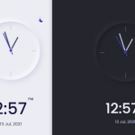 Modern Mobile-first Clock UI In JavaScript
 Neomorphism Design Framework – neomo
 Neumorphic Style CSS Shapes
 CSS Only Neumorphic UI Framework Based On Bootstrap – NenmorphismCSS
 Neumorphic Style Radio Buttons In Pure CSS
 Tiny Neumorphism UI Framework – Skeuos CSS
 Neumorphic Bootstrap Theme For Neumorphism Design Trend – neumorph.scss
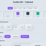 Minimal Neumorphic UI Kit in Pure CSS – Tactile CSS
Neomorphism is very interesting thing