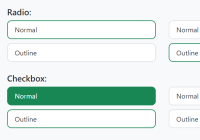
Custom Checkboxes And Radio Buttons For Bulma Framework

This package contains two CSS libraries that enable you to create beautiful custom checkbox and radio button inputs in the Bulma framework.


This package contains two CSS libraries that enable you to create beautiful custom checkbox and radio button inputs in the Bulma framework.

A CSS/CSS3 library for creating pretty nice toggles/switches to replace the bland and boring checkboxes and radio buttons.

A pure CSS solution to beautify the default checkboxes & radio buttons with Bootstrap styles.
A CSS library that converts normal checkboxes and radio buttons into checkable (toggleable) elements (like buttons and cards) for better UX.
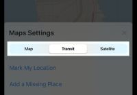
Converts a group of radio buttons into iOS style segmented controls introduced in Human Interface Guidelines.
toggle-checkbox-radio is a CSS library to create customizable, scalable checkboxes, radio buttons, and toggle switches using pure CSS.
A collection of CSS styles to customize the checkboxes and radio buttons with your own styles, images, and CSS sprites.
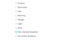
Pretty is a pure CSS/SASS library used to replace the default checkbox & radio inputs with custom icons.
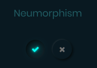
A pure CSS solution to create Neumorphic style radio buttons following the 2020 Neumorphism UI design trends.

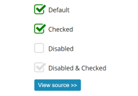
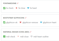
A JavaScript/CSS library that creates animated checkboxes and radio buttons with custom check markers based on Font Awesome.