


Just another pure JavaScript library that creates a responsive, fluid, Pinterest inspired grid to showcase your products, services, designs, etc. Also known as Masonry Layout.
Dead simple to use and just weights in 1kb (minified).
How to use it:
1. Install and import the waterfall.js library.
# Yarn
$ yarn add waterfall.js
# NPM
$ npm install waterfall.js --save
import waterfall from './src/waterfall'
2. Or include the minified version of the waterfall.js library on the web page.
<script src="waterfall.min.js"></script>
3. Add as many items to the grid.
<div class="waterfall">
  <div class="item">1</div>
  <div class="item">2</div>
  <div class="item">3</div>
  <div class="item">4</div>
  <div class="item">5</div>
  <div class="item">6</div>
  <div class="item">7</div>
  <div class="item">8</div>
  <div class="item">9</div>
  <div class="item">10</div>
</div>
4. Initialize the grid and done.
waterfall('.waterfall');
// OR
var grid = document.querySelector('waterfall');
waterfall(grid);
See Also:
 Tiny Pinterest Inspired Responsive Grid Layout In Vanilla JS – Gridify
 Pinterest Style Responsive Dynamic Grid System with Pure JavaScript – colm.js
 Responsive Masonry Layouts with CSS Grid and Mason-it.js
 Responsive CSS Masonry Grid Layout – Grid Overflow
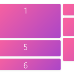 Minimal Masonry Web Layout In Pure JavaScript – MiniMasonry.js
 Easy Responsive Masonry Grid Library – Stackgrid
 Minimalist Masonry Gallery Layout With CSS Grid – mm-masonry.css
 Tiny Responsive Masonry Grid Library – stack-up.js