


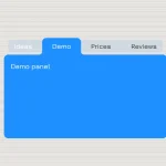
A pure CSS/CSS3 tabs component that will be automatically converted into a more readable accordion interface on small screens like Mobile devices.
How to use it:
Create a normal tabs interface from an html list.
<ul class="tabs">
  <li id="option1">
      <a href="#option1">Option 1</a>
      <div>
          <h2>Heading 1</h2>
          <p>Lorem Ipsum is simply dummy text of the printing and typesetting industry. Lorem Ipsum has</p>
          <p>Lorem Ipsum is simply dummy text of the printing and typesetting industry. Lorem Ipsum</p>
      </div>
  </li>
  <li id="option2">
      <a href="#option2">Option 2</a>
      <div>
          <h2>Heading 2</h2>
          <p>Contrary to popular belief, Lorem Ipsum is not simply random text. It has roots in piece</p>
      </div>
  </li>
  <li id="option3">
      <a href="#option3">Option 3</a>
      <div>
          <h2>Heading 3</h2>
          <p>There are many variations of passages of Lorem Ipsum available</p>
      </div>
  </li>
</ul>
The basic CSS styles to style the tabs component.
.tabs {
  position: relative;
  margin: 0;
  padding: 15px;
  font-size: 0;
}
.tabs li {
  display: inline-block;
  margin-right: 1px;
  list-style-type: none;
  font-size: 14px;
}
.tabs li:last-child { margin-right: 0; }
.tabs li a {
  display: block;
  padding: 10px 15px;
  background: rgba(219,219,219,1);
  text-decoration: none;
  color: #4B5056;
  transition: background 0.5s ease;
}
.tabs a + div {
  position: absolute;
  left: 0;
  height: 0;
  padding: 0 15px;
  overflow: hidden;
}
.tabs :target a { background: rgba(219,219,219,0); }
.tabs :target a + div {
  height: 100%;
  overflow: visible;
}
Use CSS media queries to detect the screen size and convert the tabs interface into an accordion when the screen size is smaller than 768px.
@media (max-width: 768px) {
.tabs a { width: 100%; }
.tabs a + div {
  position: static;
  float: left;
}
.tabs li {
  display: block;
  overflow: hidden;
  margin: 0 0 1px 0;
}
}
See Also:
 CSS-Only Inverted Corner Tabs With Anchor Positioning
 Animated Tabs Component In Pure CSS – Tabsy CSS
 Convert Sectioned Contents Into Tabs – tinytabs
 Lightweight Pure JavaScript Tabs With URL Persistence – Tabzy.js
 Dynamic External Content Tabs with Quicktabs.js
 Create Accessible Tabs with Pure CSS and Semantic HTML
 Accessible Tabs Component – tab-container
 Simple Fast Vanilla JavaScript Tabs