


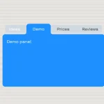
A set of 5 responsive, nice-looking tab effects built using plain HTML, CSS / CSS3 and radio input trick.
Basic usage:
Create a tab navigation and tabbed content as follow.
<div class="tabs effect-1">
  <!-- tab-title -->
  <input type="radio" id="tab-1" name="tab" checked="checked">
  <span href="#tab-item-1">Home</span>
  <input type="radio" id="tab-2" name="tab">
  <span href="#tab-item-2">Calendar</span>
  <input type="radio" id="tab-3" name="tab">
  <span href="#tab-item-3">Book Mark</span>
  <input type="radio" id="tab-4" name="tab">
  <span href="#tab-item-4">Upload</span>

  <input type="radio" id="tab-5" name="tab">
  <span href="#tab-item-5">Settings</span>
  <!-- tab-content -->
  <div class="tab-content">
    <section id="tab-item-1">
      <h1>One</h1>
    </section>
    <section id="tab-item-2">
      <h1>Two</h1>
    </section>
    <section id="tab-item-3">
      <h1>Three</h1>
    </section>
    <section id="tab-item-4">
      <h1>Four</h1>
    </section>
    <section id="tab-item-5">
      <h1>Five</h1>
    </section>
  </div>
</div>
The core CSS / CSS3 style rules for the tabs component.
* {
  padding: 0;
  margin: 0;
  list-style: none;
  box-sizing: border-box;
  outline: none;
  font-weight: normal;
}
.tabs {
  background: #fff;
  position: relative;
}
.tabs > input,
.tabs > span {
  width: 20%;
  height: 60px;
  line-height: 60px;
  position: absolute;
  top: 0;
}
.tabs > input {
  cursor: pointer;
  filter: alpha(opacity=0);
  opacity: 0;
  position: absolute;
  z-index: 99;
}
.tabs > span {
  background: #f0f0f0;
  text-align: center;
  overflow: hidden;
}
.tabs > span i,
.tabs > span {
  -webkit-transition: all .5s;
     -moz-transition: all .5s;
     -o-transition: all .5s;
      transition: all .5s;
}
.tabs > input:hover + span {
  background: rgba(255,255,255,.1);
}
.tabs > input:checked + span {
  background: #fff;
}
.tabs > input:checked + span,
.tabs > input:hover + span {
  color: #3498DB;
}
#tab-1, #tab-1 + span {
  left: 0;
}
#tab-2, #tab-2 + span {
  left: 20%;
}
#tab-3, #tab-3 + span {
  left: 40%;
}
#tab-4, #tab-4 + span {
  left: 60%;
}
#tab-5, #tab-5 + span {
  left: 80%;
}
.tab-content {
  padding: 80px 20px 20px;
  width: 100%;
  min-height: 340px;
}
.tab-content section {
  width: 100%;
  display: none;
}
.tab-content section h1 {
  margin-top: 15px;
  font-size: 100px;
  font-weight: 100;
  text-align: center;
}
#tab-1:checked ~ .tab-content #tab-item-1  {
  display: block;
}
#tab-2:checked ~ .tab-content #tab-item-2  {
  display: block;
}
#tab-3:checked ~ .tab-content #tab-item-3  {
  display: block;
}
#tab-4:checked ~ .tab-content #tab-item-4  {
  display: block;
}
#tab-5:checked ~ .tab-content #tab-item-5  {
  display: block;
}
See Also:
 CSS-Only Inverted Corner Tabs With Anchor Positioning
 Animated Tabs Component In Pure CSS – Tabsy CSS
 Convert Sectioned Contents Into Tabs – tinytabs
 Lightweight Pure JavaScript Tabs With URL Persistence – Tabzy.js
 Dynamic External Content Tabs with Quicktabs.js
 Create Accessible Tabs with Pure CSS and Semantic HTML
 Accessible Tabs Component – tab-container
 Simple Fast Vanilla JavaScript Tabs