


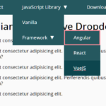
A Vanilla JavaScript responsive dropdown menu that will be converted into a hamburger toggle menu when the screen size is less than a breakpoint you specify in the CSS media queries. Smooth animation is based on CSS3 transforms and transitions.
How to use it:
Include the JavaScript file ‘menu.js’ on the html page.
<script src="js/menu.js"></script>
Create a nested HTML list for the dropdown menu.
<nav id="nav">
  <ul>
    <li><a href="menu.html">Home</a></li>
    <li><span class="submenu">Dropdown</span>
      <ul class="submenu">
        <li><a href="#">Dropdown Item</a></li>
        <li><a href="#">Dropdown Item That is a Bit Too Long</a></li>
        <li><a href="#">Dropdown Item</a></li>
      </ul>
    </li>
    <li><span class="submenu">Dropdown</span>
      <ul class="submenu">
        <li><a href="#">Dropdown Item</a></li>
        <li><a href="#">Dropdown Item</a></li>
        <li><a href="#">Dropdown Item</a></li>
        <li><a href="#">Dropdown Item</a></li>
        <li><a href="#">Dropdown Item</a></li>
        <li><a href="#">Dropdown Item</a></li>
        <li><a href="#">Dropdown Item</a></li>
        <li><a href="#">Dropdown Item</a></li>
        <li><a href="#">Dropdown Item</a></li>
        <li><a href="#">Dropdown Item</a></li>
        <li><a href="#">Dropdown Item</a></li>
        <li><a href="#">Dropdown Item</a></li>
      </ul>
    </li>
    <li><a href="#">About Us</a></li>
    <li class="last"><a href="#">Last Item</a></li>
    <li class="right"><a href="#">Right Aligned</a></li>
    <li class="onmobile"><a href="#">Only On Mobile</a></li>
  </ul>
</nav>
The basic CSS styles for the dropdown menu.
#menutoggle {
  display: block;
  margin: 0;
  padding: 0 22px;
  width: auto;
  color: #fff;
  background: #37474f;
  height: 45px;
  font: 18px/46px 'Open Sans', 'Trebuchet MS', Verdana, Arial, Helvetica, sans-serif;
  text-shadow: 0 1px 0 rgba(0, 0, 0, 0.35);
  text-align: left;
  text-transform: uppercase;
  cursor: pointer;
  position: absolute;
  right: 0;
  bottom: 0;
  border-radius: 4px 4px 0 0;
  transition: background 0.2s linear 0s;
  -webkit-tap-highlight-color: rgba(0,0,0,0);
}
#menutoggle span { display: none; }
#menutoggle:before {
  display: inline-block;
  margin-left: 0;
  width: 18px;
  height: 45px;
  line-height: 48px;
  content: "\e826";
  color: inherit;
  font-family: 'icons';
  text-align: center;
  font-size: 21px;
  vertical-align: top;
}
#menutoggle.is-active:before { content: "\e844"; }
#menutoggle:hover, #menutoggle:active, #menutoggle.is-active {
  background-color: #455a64;
  border-radius: 4px 4px 0 0;
}
#menutoggle { display: block; }
#nav {
  clear: both;
  margin: 0;
  width: 100%;
  height: 0;
  overflow: visible;
  position: relative;
  z-index: 1000;
  border-top: 1px solid #37474f;
}
#nav ul {
  float: none;
  display: block;
  margin: 0;
  width: auto;
  opacity: 0;
  max-height: 0;
  background: #37474f;
  overflow: hidden;
  transition: max-height 0.25s cubic-bezier(0, 0.7, 0, 1), opacity 0.2s ease-in-out;
  border-radius: 0 0 4px 4px;
  top: 1px;
  border: 0;
  position: relative;
}
#nav #menutoggle.is-active + ul {
  max-height: 1000px;
  opacity: 1;
  transition: max-height 0.3s ease-in-out, opacity 0.25s ease-in-out;
}
#nav li {
  display: block;
  margin: 0;
  padding: 0;
  height: auto;
  overflow: hidden;
  border: 0;
  border-top: 1px dotted #455a64;
}
#nav li:first-child { border-top: 0; }
#nav li.onmobile { display: block; }
#nav a, #nav span.submenu {
  float: none;
  display: block;
  margin: 0;
  padding: 9px 20px;
  height: auto;
  color: #fff;
  line-height: 1.6em;
  text-shadow: 0 1px 0 rgba(0, 0, 0, 0.4);
  text-align: left;
  font-size: 16px;
  font-weight: normal;
  font-family: 'Open Sans', 'Helvetica Neue', Tahoma, Arial, sans-serif;
  border: 0;
  cursor: pointer;
  -webkit-tap-highlight-color: rgba(0,0,0,0);
  transition: background 0.17s linear 0s;
}
#nav span.submenu { border-bottom: 1px dotted #455a64; }
#nav span.submenu:after {
  float: right;
  margin-left: 10px;
  width: 15px;
  height: inherit;
  content: "\e817";
  color: inherit;
  font-family: 'icons';
  text-align: center;
  font-size: 105%;
  vertical-align: top;
}
#nav span.submenu.is-active:after { content: "\e816"; }
#nav ul.submenu {
  margin: 0;
  padding: 0;
  width: 100%;
  max-height: 0;
  background: none;
  opacity: 1;
  position: relative;
  top: 0;
  transition: max-height 0.15s linear 0s;
}
#nav span.submenu.is-active + ul.submenu {
  max-height: 360px;
  overflow-y: auto;
}
#nav ul.submenu a {
  padding-left: 40px;
  background: none;
}
#nav ul.submenu a:before {
  display: inline-block;
  margin-right: 5px;
  margin-left: -15px;
  width: 10px;
  height: inherit;
  content: "\00BB";
  color: inherit;
  font-family: 'icons';
  text-align: center;
  font-size: inherit;
  vertical-align: top;
}
#nav a:hover, #nav a.is-active, #nav li:hover span.submenu, #nav ul.submenu a:hover, #nav ul.submenu a.is-active { background: #455a64; }
The primary CSS styles for the hamburger toggle menu.
@media (min-width: 36em) { /* Small devices (landscape phones, 576px and up) */
/*@media (min-width: 48em) { /* Medium devices (tablets, 768px and up) */
#menutoggle { padding: 0 15px 0 15px; }
#menutoggle span { display: inline-block; }
#menutoggle:before { margin-right: 10px; }
}
@media (min-width: 62em) { /* Large devices (desktops, 992px and up) */
#menutoggle { display: none; }
#nav {
  height: 45px;
  background: #37474f;
  position: relative;
  z-index: 99;
  border: 0;
  border-radius: 4px;
}
#nav ul {
  display: block !important;
  float: left;
  width: 100%;
  height: auto;
  opacity: 1;
  margin: 4px 0;
  position: relative;
  z-index: 10;
  top: 0;
  overflow: visible;
}
#nav li {
  float: left;
  margin: 0 5px;
  padding: 0;
  height: 37px;
  width: auto;
  min-width: auto;
  position: relative;
  border: 0;
  overflow: visible;
}
#nav li:first-child {
  margin-left: 4px;
  border-left: 0;
}
#nav li.last { border-right: 0; }
#nav li.right {
  float: right;
  margin-right: 4px;
  border-right: 0;
}
#nav li.onmobile { display: none; }
#nav a, #nav span.submenu {
  float: left;
  margin: 0;
  padding: 0 14px;
  height: 37px;
  border: 0;
  color: #fff;
  font-weight: normal;
  line-height: 39px;
  text-align: center;
  text-transform: uppercase;
  border-radius: 3px;
  transition: background 0.2s linear 0s;
  cursor: pointer;
}
#nav span.submenu:after { display: none; }
#nav a:hover, #nav a.is-active, #nav li:hover span.submenu, #nav ul.submenu a:hover, #nav span.submenu.is-active { background: #455a64; }
#nav li:hover a.submenu, #nav li:hover span.submenu, #nav span.submenu.is-active.hover {
  border-radius: 3px 3px 0 0;
  -webkit-tap-highlight-color: rgba(0,0,0,0);
}
#nav li:hover { z-index: 11; }
#nav ul.submenu {
  float: left;
  margin: 0;
  padding: 0;
  width: 250px;
  max-height: 0;
  position: absolute;
  opacity: 0;
  background: #455a64;
  top: 95%;
  z-index: 10;
  border-radius: 0 3px 3px 3px;
  box-shadow: 1px 1px 1px rgba(0, 0, 0, 0.2);
  transition: max-height 0.2s linear 0s, padding 0.2s linear 0s, opacity 0.2s linear 0s;
  overflow: hidden;
  overflow-y: auto;
}
#nav li:hover ul.submenu, #nav ul.submenu.is-active {
  padding: 3px 0;
  left: 0;
  max-height: 360px;
  opacity: 1;
}
#nav ul.submenu li {
  float: none;
  display: block;
  margin: 0;
  padding: 0;
  border: 0;
  height: auto;
}
#nav ul.submenu a {
  float: none;
  display: block;
  margin: 0;
  padding: 7px 15px 7px 28px;
  height: auto;
  text-transform: none;
  text-align: left;
  line-height: 1.5em;
  border-radius: 0;
  border: 0;
  border-top: 1px dotted #37474f;
}
#nav ul.submenu li:first-child a { border: 0; }
#nav ul.submenu li a:hover, #nav ul.submenu li a.is-active { background: #37474f; }
}
See Also:
 WCAG Compliant Responsive Dropdown Navigation – accessible-menu
 Accessible Dropdown Nav With Vanilla JavaScript – Clicky Menus
 Responsive Accessible Dropdown Menu Template with Vanilla JavaScript
 Modern One Page Scroll Web Template with Responsive Nav
 Responsive Dropdown/Off-canvas Navigation In Vanilla JavaScript – Menue
 Responsive Sliding Hamburge Menu System
 Responsive Sticky Mega Menu – SnazzyMenu.js
 Responsive Dropdown Mega Menu In JavaScript
Sir Please Add SubTopicMenu Under SubMenu In Menu