


A mobile-friendly responsive navigation system that uses CSS3 media queries to detect the screen size and transforms the regular horizontal navigation into a show / hide menu with a toggle button on small screens.
How to use it:
Create a navigation menu from a nav list.
<nav id="nav" role="navigation">
  <div class="show_menu_btn"
       data-target="#nav ul"
       data-shown-text="Hide menu"
       data-hidden-text="Show menu">
       Show menu
  </div>
  <ul>
    <li><a href="#">Home</a></li>
    <li><a href="#">Works</a></li>
    <li><a href="#">Products</a></li>
    <li><a href="#">About</a></li>
    <li><a href="#">Contact</a></li>
  </ul>
</nav>
Style the navigation menu.
#nav ul { margin: 1em 0; }
#nav ul li { padding: 0.5em; }
#nav ul li:hover { background: #88b47f; }
#nav ul a {
  display: block;
  font-size: 1em;
  color: #eee;
  border-bottom: none;
}
Style the menu toggle button.
.show_menu_btn {
  width: 35%;
  margin: 0 auto;
  padding: 0.3em;
  cursor: pointer;
  text-align: center;
  background: #88b47f;
}
The CSS3 tricks for the mobile toggle menu.
@media screen and (max-width: 599px) {
.no-js .show_menu_btn { display: none; }
.no-js #nav ul { display: block; }
.js .show_menu_btn { display: block; }
.js #nav ul { display: none; }
}
@media screen and (min-width: 600px) {
.show_menu_btn { display: none; }
#nav ul { display: block; }
}
@media screen and (max-width: 599px) {
#nav ul { display: block; }
#nav ul li {
  display: block;
  text-align: center;
  border-bottom: 1px solid #6f6f7a;
}
}
@media screen and (min-width: 600px) {
#nav { overflow: hidden; }
#nav ul li {
  width: 7em;
  float: left;
  margin-right: 1em;
}
}
The JavaScript.
var show_menu = document.querySelector('.show_menu_btn');
show_menu.addEventListener('click', function(event) {
    var target = document.querySelector(show_menu.getAttribute('data-target'));
    if (target.style.display == "none") {
        target.style.display = "block";
        show_menu.innerHTML = show_menu.getAttribute('data-shown-text');
    } else {
        target.style.display = "none";
        show_menu.innerHTML = show_menu.getAttribute('data-hidden-text');
    }
});
See Also:
 Minimal Responsive Dropdown Navigation In Pure CSS
 Responsive Drawer Navigation In Pure CSS
 Multi-level Toggle Responsive Navigation Menu using Pure CSS
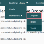 WCAG Compliant Responsive Dropdown Navigation – accessible-menu
 Accessible Dropdown Nav With Vanilla JavaScript – Clicky Menus
 Responsive Accessible Dropdown Menu Template with Vanilla JavaScript
 Modern One Page Scroll Web Template with Responsive Nav
 Responsive Dropdown/Off-canvas Navigation In Vanilla JavaScript – Menue