


A CSS/SCSS-only responsive table extension of the Bulma framework that makes your HTML tables more readable across devices.
How to use it:
1. Download and load the compiled stylesheet after Bulma’s framework.
<link rel="stylesheet" href="/path/to/cdn//bulma.min.css" />
<link rel="stylesheet" href="/path/to/css/main.min.css" />
2. Wrap your HTML table into DIV elements as follows:
<div class="b-table">
  <div class="table-wrapper has-mobile-cards">
    <table class="table is-fullwidth is-striped is-hoverable is-fullwidth">
      ...
    </table>
  </div>
</div>
3. Customize the responsive table by overriding the default variables in the _variables.scss.
$size-base: 1rem !default;
$table-sticky-header-height: 300px !default;
$table-background-color: $scheme-main !default;
$table-row-active-background-color: $primary !default;
$table-row-active-color: $primary-invert !default;
$speed-slow: 150ms !default;
$speed-slower: 250ms !default;
$table-image-cell-image-width: $size-base * 1.5 !default;
$table-image-cell-image-height: $table-image-cell-image-width !default;
$table-image-cell-collapsed-image-width: $table-image-cell-image-width * 4 !default;
$table-image-cell-collapsed-image-height: $table-image-cell-collapsed-image-width !default;
$table-row-toggle-cell-width: 40px;
See Also:
 Make Bootstrap 5 Tables More Readable On Mobile Devices – AvalynxTable.js
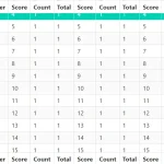 Implement Sticky Table Headers/Footers/Columns In Bulma Framework
 Versatile Datetime Picker For Bulma – bulma-calendar
 Customizable Toast Notification Plugin For Bulma Framework
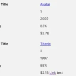 Tiny Responsive Table Web Component – table-saw
 Pure CSS Timeline For Bulma Framework
 Pure CSS Responsive Solution – fluid-table.css
 Custom Checkboxes And Radio Buttons For Bulma Framework