


A CSS/SCSS extension for the Bulma framework that converts the regular checkboxes into switch controls with variable sizes and colors.
How to use it:
1. Download and import the stylesheet main.min.css into your Bulma framework.
<link rel="stylesheet" href="/path/to/cdn/bulma.min.css" />
<link rel="stylesheet" href="/path/to/css/main.min.css">
2. Add the required switch class to checkbox’s label and customize the switch using the following CSS classes:
- is-disabled: Set the state to OFF
- is-rounded: Rounded theme
- is-outlined: Outlined theme
- is-small: Small size
- is-medium: Medium size
- is-large: Large size
<label disabled class="switch is-disabled is-rounded is-large">
  <input type="checkbox" value="false" disabled>
  <span class="check"></span>
  <span class="control-label">Disabled</span>
</label>
3. Change the color of the switch control.
<span class="check is-info"></span>
<span class="check is-success"></span>
<span class="check is-danger"></span>
<span class="check is-warning"></span>
See Also:
 CSS Only Interactive Toggle Switches – toggle-switch.css
 Custom Checkboxes And Radio Buttons For Bulma Framework
 Create Stunning Checkboxes And Radio Buttons With Magic-Input CSS Library
 CSS Only Switch Style Checkboxes
 Create Custom Switches With Checkboxes – Toggle Switchy
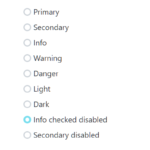 Custom Checkboxes, Radio Buttons, Switches In Pure CSS
 Pretty Checkbox CSS Library – checkboxes.css
 CSS/CSS3 Only Custom Checkboxes, Radios And Switches – el-checkbox