


The fluid-table.css responsive table library enables you to adapt your HTML table designs to cater to the growing number of mobile users.
By reorganizing multi-column tables into a clean, two-column layout, the fluid-table library ensures that your content remains legible, accessible, and visually appealing, regardless of screen size.
How to use it:
1. Download and import the fluid-table.min.css stylesheet.
<link href="../fluid-table.min.css" media="all" rel="stylesheet">
2. Add the data-label attribute to td elements as follows:
<table class="fluid-table">
  <thead>
    <tr>
      <th>col1</th>
      <th>col2</th>
      <th>col3</th>
      <th>col4</th>
    </tr>
  </thead>
  <tbody>
    <tr>
      <td data-label="col1">row1 col1</td>
      <td data-label="col2">row1 col2</td>
      <td data-label="col3">row1 col3</td>
      <td data-label="col4">row1 col4</td>
    </tr>
    <tr>
      <td data-label="col1">row2 col1</td>
      <td data-label="col2">row2 col2</td>
      <td data-label="col3">row2 col3</td>
      <td data-label="col4">row2 col4</td>
    </tr>
    <tr>
      <td data-label="col1">row3 col1</td>
      <td data-label="col2">row3 col2</td>
      <td data-label="col3">row3 col3</td>
      <td data-label="col4">row3 col4</td>
    </tr>
  </tbody>
</table>
See Also:
 Make Bootstrap 5 Tables More Readable On Mobile Devices – AvalynxTable.js
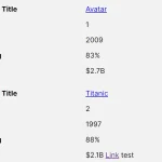 Tiny Responsive Table Web Component – table-saw
 Responsive Table Extension For Bulma Framework
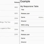 Responsive Accessible Table In Pure CSS
 Collapse Overflowing Table Columns Into A Dropdown – Podtablejs
 Responsive Table For Bootstrap 5 Framework
 Add Scroll Shadows To Wide HTML Tables – TableScrollShadow
 Convert HTML Table To Card View On Mobile Using JavaScript