


An expanding radial navigation system that enables a toggle button to reveal a circle menu with a spiral animation.
How to use it:
1. Create the HTML for the expanding menu. You can customize the background of the menu item in the --clr variable.
<ul class="menu">
  <!-- Toggle Button -->
  <div class="toggle"><img src="toggle.png" alt="Click Me"></div>
  <!-- Menu Items -->
  <li style="--i:0;--clr:#ff2972;">
    <a href="#"> <img src="assets/icon/alarm.png" alt=""></a>
  </li>
  <li style="--i:1;--clr:#fee800;">
    <a href="#"> <img src="assets/icon/calendar.png" alt=""></a>
  </li>
  <li style="--i:2;--clr:#04fc43;">
    <a href="#"> <img src="assets/icon/earth.png" alt=""></a>
  </li>
  <li style="--i:3;--clr:#fe00f1;">
    <a href="#"> <img src="assets/icon/follower.png" alt=""></a>
  </li>
  <li style="--i:4;--clr:#00b0fe;">
    <a href="#"> <img src="assets/icon/gps.png" alt=""></a>
  </li>
  <li style="--i:5;--clr:#fea600;">
    <a href="#"> <img src="assets/icon/me.png" alt=""></a>
  </li>
  <li style="--i:6;--clr:#a529ff;">
    <a href="#"> <img src="assets/icon/travel.png" alt=""></a>
  </li>
  <li style="--i:7;--clr:#01bdab;">
    <a href="#"> <img src="assets/icon/music.png" alt=""></a>
  </li>
</ul>
2. The necessary CSS styles.
/* Size and Background  */
.toggle img {
  width: 70px;
  cursor: pointer;
}
.menu li img {
  width: 30px;
}
/* Menu Items */
.menu {
  position: relative;
  width: 240px;
  height: 235px;
  display: flex;
  justify-content: center;
  align-items: center;
}
.menu li {
  position: absolute;
  left: 0;
  list-style: none;
  transition: 0.5s;
  transition-delay: calc(0.1s * var(--i));
  transform-origin: 140px;
  transform: rotate(0deg) translateX(110px);
}
/* Animations */
.menu.active li {
  transform: rotate(calc(360deg / 8 * var(--i)) ) translateX(0px);
}
.menu li a {
  display: flex;
  justify-content: center;
  align-items: center;
  width: 60px ;
  height: 60px;
  color: var(--clr);
  border: 2px solid var(--clr);
  border-radius: 50%;
  font-size: 1.5em;
  transform: rotate(calc(360deg / -8 * var(--i)));
  transition: 1s;
}
.menu li a:hover {
  transition: 0;
  background: var(--clr);
  color: #333;
  box-shadow: 0 0 10px var(--clr),
  0 0 30px var(--clr),
  0 0 50px var(--clr);
}
.toggle:hover {
  filter: grayscale(100%);
  box-shadow: 0 0 10px #fff;
}
.menu .toggle {
  position: relative;
  width: 60px;
  height: 60px;
  background: #2f363e;
  border: 2px solid #fff;
  border-radius: 50%;
  color:white;
  display: flex;
  justify-content: center;
  text-align: center;
  z-index: 10000;
  font-size: 2rem;
  transition: trasform 2.25s;
}
3. Activate the expanding menu.
let toggle = document.querySelector('.toggle');
let menu = document.querySelector('.menu');
toggle.onclick = function(){
  menu.classList.toggle('active')
}
See Also:
 Pure CSS Radial Menu with Native Select Element
 Rotating Circle Menu With JavaScript And CSS – Pentagon Menu
 Beautiful Radial Popup Menu With JavaScript And CSS
 Radial Toggle Menu With JavaScript And CSS3
 Path-style Animated Radial Menu – BloomingMenu.js
 Lightweight JavaScript Round Menu Library – radial.js
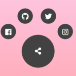 Radial Popup Menu In Pure CSS – Circle Menu
 Ring/Circle Toggle Navigation Concept