


A Pentagon Popup Menu that arranges 5 menu items around a circle and displays them with a rotation effect when toggled.
How to use it:
1. Create the circle menu from a nav element.
<nav class="menu open_menu">≡ <a class="nav-item" title='Home' href="#">Home Icon</a> <a class="nav-item" title='Search' href="#">Search Icon</a> <a class="nav-item" title='Notifications' href="#">Notification Icon</a> <a class="nav-item" title='Favorites' href="#">Favorites Icon</a> <a class="nav-item" title='Profile' href="#">Profile Icon</a> </nav>
2. The main CSS styles for the toggle button.
:root {
  --btn-size: 150px;
  --accent-color: red;
}
.menu {
  position: relative;
  width: var(--btn-size);
  aspect-ratio: 1 / 1;
  border-radius: 50%;
  display: grid;
  place-items: center;
  text-align: center;
  color: white;
  cursor: pointer;
  user-select: none;
  transition: 0.75s;
  line-height: 100%;
}
.menu:after {
  content: '\2630';
  width: var(--btn-size);
  aspect-ratio: 1 / 1;
  position: absolute;
  left: 0;
  top: 0;
  display: grid;
  place-items: center;
  background: var(--accent-color);
  border-radius: inherit;
  font-size: calc(var(--btn-size) * .48);
  transition: .75s;
  box-shadow:
    0 10px 15px rgba(0,0,0,.5);
}
.open_menu:after {
  content: '\00D7';
  background: gray;
}
3. Style & animate the menu items.
.nav-item {
  width: var(--btn-size);
  aspect-ratio: 1 / 1;
  border-radius: 50%;
  background: var(--accent-color);
  position: absolute;
  transition: 0.75s;
  user-select: none;
  left: 0;
  top: 0;
  transform: scale(0.1);
  box-shadow: 0 5px 5px rgba(0,0,0,.25);
  text-decoration: none;
  font-family: sans-serif;
  color: white;
  box-sizing: border-box;
  display: grid;
  place-items: center;
}
.open_menu .nav-item {
  transform: scale(1) rotate(360deg);
}
.open_menu .nav-item:hover {
  transform: scale(1.25) rotate(360deg);
}
.open_menu .nav-item:nth-child(1) {
  top: calc(var(--btn-size) * -.4);
  left: calc(var(--btn-size) * -1.2);
}
.open_menu .nav-item:nth-child(2) {
  top: calc(var(--btn-size) * -1.2);
  left: 0px;
}
.open_menu .nav-item:nth-child(3) {
  top: calc(var(--btn-size) * -.4);
  left: calc(var(--btn-size) * 1.2);
}
.open_menu .nav-item:nth-child(4) {
  top: calc(var(--btn-size) * 1);
  left: calc(var(--btn-size) * -.8);
}
.open_menu .nav-item:nth-child(5) {
  top: var(--btn-size);
  left: calc(var(--btn-size) * .8);
}
4. Enable the toggle button to reveal the menu items.
document.querySelector(".menu").addEventListener("click", function () {
	this.classList.toggle("open_menu");
});
See Also:
 Pure CSS Radial Menu with Native Select Element
 Expanding Spiral Menu With JavaScript And CSS3
 Beautiful Radial Popup Menu With JavaScript And CSS
 Radial Toggle Menu With JavaScript And CSS3
 Path-style Animated Radial Menu – BloomingMenu.js
 Lightweight JavaScript Round Menu Library – radial.js
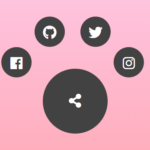 Radial Popup Menu In Pure CSS – Circle Menu
 Ring/Circle Toggle Navigation Concept