


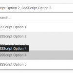
SimpleSearchableSelect is a standalone JavaScript library that transforms native select elements into filterable dropdowns. Key features include easy search and selection, autocompletion, multiple selections, swipe gestures for removing choices, asynchronous data fetching, and debounced input events for better performance.
With this library, users can search and filter long lists to quickly find options. As they type, suggestions auto-populate based on available matches. Multiple selections are also supported with the ability to remove values via swipe gestures. This enhanced UX removes traditional frustrations of scrolling through long lists to find the right options.
How to use it:
1. Download and import the SimpleSearchableSelect.js library.
import {SSS} from '../SimpleSearchableSelect.min.js';2. Attach the function SSS to your existing select element and the library will take care of the rest:
<select id="demo">
...
</select>
new SSS(document.getElementById('demo'));3. Available options to customize the dropdown.
const sssInstance = new SSS(document.getElementById('demo'),{
    // Timeout in milliseconds for debouncing input events.
    inputIntervalTimeout: 200,
    // Prefix for generating unique element IDs.
    idPrefix: 'SSS_',
    // DOM insertion position for the input element.
    insertPosition: 'beforebegin',
    // Threshold for swipe gestures.
    swipeOffset: 50,
    // Speed of swipe animation in milliseconds.
    swipeAnimationSpeed: 200,
    // Asynchronous data fetching function or false if not used.
    promiseData: false,
    // Allows customization of the style or behavior of a selected option in datalist.
    // If selectedStyle is set to a function, this function will be invoked when styling a selected option.
    // The function should accept the reference value of the selected option as an argument and return a string representing the customized style or behavior.
    selectedStyle: false,
    // Indicates whether multiple selections are allowed. Defaults to the value of the select element.
    multiple: undefined,
    // Indicates whether the input is required.  Defaults to the value of the select element.
    required: undefined,
    // Custom placeholder
    placeholder: undefined,

});
4. API methods.
// Set a single value
sssInstance.setValue('option-value');
// Set multiple values
sssInstance.setValue(['value1', 'value2']);
// Set value without triggering 'change' event
sssInstance.setValue('new-value', false);
// Retrieve selected values
const selectedValues = sssInstance.getValues();
// Clear all selected values
sssInstance.clearValue();
// Clear a specific value
sssInstance.clearValue('value-to-clear');
// Clear multiple values
sssInstance.clearValue(['value1', 'value2']);
// Reset the value to the original state
sssInstance.resetValue();
// Destroy the instance
sssInstance.destroy();
Changelog:
v1.2.0 (12/10/2023)
- feat: add selectedStyle option
v1.1.0 (12/05/2023)
- Add an ability to specify a custom placeholder
- Bugfix
See Also:
 High Performance Select Box with Virtual Scroll (Vanilla JS) – Virtual Select
 Tagging & Searchable Dropdown with Multi-Select – Searchdown.js
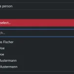 Bootstrap 5 Select Dropdown Enhancer – AvalynxSelect
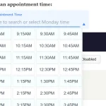 Fast Touch-Friendly Picker Library for JavaScript & React – Quickpick UI
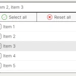 Feature-rich Custom Select JavaScript Library – SimpSelect
 Advanced Draggable & Selectable Library – DragSelect
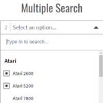 Powerful Single & Multiple Select Library – tail.select
 Enhanced Dropdown Select In Pure JavaScript – LC-select