


shepherd is a JavaScript library that creates an interactive, accessible, dynamic visual guide to let your users learn about new features and functions on your web app.
Full responsive, user-friendly and mobile compatible.
See also:
How to use it:
Install the package.
# Yarn
$ yarn add shepherd.js
# NPM
$ npm install shepherd.js --save
Import the shepherd module.
import Shepherd from 'shepherd.js';
Or import the shepherd.js into the document.
<script src="https://cdn.jsdelivr.net/npm/shepherd.js@latest/dist/js/shepherd.min.js"></script>
Create a new tour.
let myTour = new Shepherd.Tour({
    // options here
});
Add steps to the tour.
myTour.addStep({
  id: 'target-element 1',
  title: 'Step 1',
  text: 'This is Step 1',
  attachTo: {
    element: '.example-css-selector',
    on: 'bottom'
  },
  buttons: [
    {
      text: 'Next',
      action: tour.next
    }
  ]
});
Start the tour.
myTour.start();
All default tour options.
let myTour = new Shepherd.Tour({
    // Default options for Steps, created through 'addStep'
    defaultStepOptions: {},
    // An array of steps
    steps: [],
    // An optional "name" for the tour. This will be appended to the the tour's dynamically generated `id` property -- which is also set on the `body` element as the `data-shepherd-active-tour` attribute whenever the tour becomes active.
    tourName: '',
    // Whether or not steps should be placed above a darkened modal overlay.
    // If true, the overlay will create an opening around the target element so that it can remain interactive
    useModalOverlay: true,
    // Specify container element for the modal
    modalContainer: '',
    // An optional container element for the steps.
    stepsContainer: document.body,
    // Exiting the tour with the escape key will be enabled unless this is explicitly set to false.
    exitOnEsc: true or false,
    // Navigating the tour via left and right arrow keys will be enabled unless this is explicitly set to false.
    keyboardNavigation: true of false,
    // If true, will issue a window.confirm before cancelling
    confirmCancel: false,
    // The message to display in the confirm dialog
    confirmCancelMessage: ''

})
All default step options.
myTour.addStep({
  // element ID for the step
  id: '',
  // The text in the body of the step. It can be one of four types:
  // HTML string
  // Array of HTML strings
  // HTMLElement object
  // Function to be executed when the step is built. It must return one the three options above.
  text: '',

  // Step title
  title: '',
  // where to attach the step to
  attachTo: {
    element: '.example-css-selector',
    on: 'bottom'
  },
  // returns a promise. When the promise resolves, the rest of the show code for the step will execute.
  beforeShowPromise: function (){},
  // allows to click target
  canClickTarget: true,
  // extra classes
  classes: '',
  // an array of buttons to add to the step.
  buttons: [{
    text: '',
    classes: '',
    secondary: false, // adds secondary button
    action: function (){},
    events: {'mouseover': function(){}},
  }],
  // An action on the page which should advance shepherd to the next step.
  // It can be of the form "selector event", or an object with those properties.
  // For example: ".some-element click", or {selector: '.some-element', event: 'click'}.
  // It doesn't have to be an event inside the tour, it can be any event fired on any element on the page.
  // You can also always manually advance the Tour by calling myTour.next().
  advanceOn: '',
  // extra class to apply to the attachTo element when it is highlighted
  highlightClass: '',
  // shows cancel link
  cancelIcon: true or false
  // scrolls the page to the current step
  scrollTo: true or false
  // a function that lets you override the default scrollTo behavior and define a custom action to do the scrolling, and possibly other logic
  scrollToHandler: function(){},
  // you can define show, hide, etc events inside when
  when: {},
  // a function that, when it returns true, will show the step. If it returns false, the step will be skipped
  showOn: function(){}

});
Tour’s API.
// Methods
myTour.addStep(id, options)
myTour.addSteps(steps)
myTour.getById(id)
myTour.next()
myTour.back()
myTour.cancel()
myTour.hide()
myTour.show([id])
myTour.start()
myTour.getCurrentStep()
myTour.on(eventName, handler, [context])
myTour.off(eventName, [handler])
myTour.once(eventName, handler, [context])
// Events
myTour.on('start', function(){
  // ...
})
myTour.on('show', function(){
  // ...
})
myTour.on('hide', function(){
  // ...
})
myTour.on('cancel', function(){
  // ...
})
myTour.on('complete', function(){
  // ...
})
Step’s API.
// Methods
myStep.show()
myStep.hide()
myStep.cancel()
myStep.complete()
myStep.scrollTo()
myStep.isOpen()
myStep.destroy()
myStep.on(eventName, handler, [context])
myStep.off(eventName, [handler])
myStep.once(eventName, handler, [context])
// Events
myStep.on('destroy', function(){
  // ...
})
myStep.on('show', function(){
  // ...
})
myStep.on('hide', function(){
  // ...
})
myTour.on('cancel', function(){
  // ...
})
myTour.on('complete', function(){
  // ...
})
myTour.on('before-hide', function(){
  // ...
})
myTour.on('before-show', function(){
  // ...
})
Changelog:
v13.0.1 (07/24/2024)
- Update
v12.0.0 (03/08/2024)
- Move files from src/js to src, convert to TS
- Drop support for node < 18
- Add Pro events sharing
- Bug Fix
v11.2.0 (09/03/2023)
- Prevent ESC, KEY_RIGHT, KEY_LEFT propagation when keyboardNav is enabled
v11.1.1 (04/04/2023)
- Bugfix
v11.1.0 (04/03/2023)
- add funtion support for confirmCancel
- prevent to show spurious warnings in dev panel consol
v11.0.1 (12/13/2022)
- Bugfix
v11.0.0 (11/22/2022)
- Replace popperJS with Floating UI
- Exporting StepOptionsButton type to be able to add tour steps buttons dynamically with type checking
- feat: add ability to specify corner radius
- Bug Fix
v10.0.1 (08/01/2022)
- Bug Fix
v10.0.0 (06/06/2022)
- Implement lazy evaluation of attachTo.element
- Fix chrome opacity bug
v9.1.1 (05/25/2022)
- Fixed showOn incorrectly skipping an index
v9.1.0 (04/09/2022)
- Add dynamic text and label properties for buttons
v9.0.0 (01/11/2022)
- Drop node 10 support
- Fix type signature for Evented.off()
- Bug Fix
v8.3.1 (05/07/2021)
- Add preventOverflow option for tether to false
v8.3.0 (04/06/2021)
- Updated package
v8.2.3 (03/26/2021)
- Updated package
v8.2.1 (03/24/2021)
- Update
v8.2.0 (03/03/2021)
- Remove shepherd-target-click-disabled class on step hide
- Bug Fix: properly handle centered modal
v8.1.0 (10/05/2020)
- Add stepsContainer option, allowing users to specify rendering target for step elements
- Add missing types for Step.options and Tour.steps
- Added default fallback for target when step is hidden/destroyed
- shift + tab handled
v8.0.2 (07/10/2020)
- Updated
v8.0.0 (05/26/2020)
- Officially drop IE 11 and remove from browserslist
- Require attachTo.on to show arrow
v7.2.1 (05/14/2020)
- Update
v7.1.6 (05/12/2020)
- Add deepmerge for deep clone functionality
v7.1.5 (04/28/2020)
- Refactor popper options
v7.1.4 (04/24/2020)
- Fixed Layout error when has popperOptions
v7.1.3 (04/23/2020)
- Fix defaultStepOptions.popperOptions issues
v7.1.2 (04/19/2020)
- Update
v7.1.1 (04/14/2020)
- Add new function for creating modals when needed and cleanup
v7.1.0 (03/28/2020)
- Bugfix
v7.0.4 (03/08/2020)
- Single argument on classList.add for IE11 compatibility
v7.0.2 (03/06/2020)
- Fix bug when modifiers was not defined
v7.0.1 (02/25/2020)
- Bugfixes and update.
v6.0.2 (11/09/2019)
- Fix dynamic shepherd classes interfering with tether classes
v6.0.2 (11/09/2019)
- Fix dynamic shepherd classes interfering with tether classes
v6.0.1 (11/07/2019)
- Update
v6.0.0 stable (10/30/2019)
- Dynamically update text while in tour
- Add fade-in animation to tether
- Fixed Step arrow not attaching correctly.
- Remove pinned arrows
- Update transitions on shepherd element
- Removed unnecessary parenthetical commas
v6.0.2beta (10/22/2019)
- Updated
v6.0.0 (10/04/2019)
- Fixed Can’t get shepherdElementZIndex to work
v5.0.1 (08/29/2019)
- Fixed Can’t get shepherdElementZIndex to work
- Fixed Pass shepherdElementZIndex to tippy as zIndex
v5.0.0 (08/26/2019)
- fixed: ionic element – bubbles not pointing to right place due to clientHeight = 0
- added: Vue.js wrapper
v5.0.0beta2 (08/23/2019)
- showCancelLink -> cancelIcon
- Remove link styles
- Remove Shepherd.Evented
- Types don’t support activeTour or Evented properties.
- Remove object-assign-deep, refactor setting popper options
- Use requestAnimationFrame to position modal opening
- Add overlayOpacity to styleVariables options
- Add keyboardNav and exitOnEsc options
- Move activeTour to namespace
- Fixed advanceOn click doesn’t work on nested elements
- Fixed Use currentTarget for advanceOn
- adding alt and role to img element
- fixing a11y issue by adding lang attribute to html element
v4.6.0 (08/10/2019)
- Wrong type definition for scrollTo
- Fade in modal overlay
- Fix for the wrong type definition of StepOptions.scrollTo
v4.5.0 (08/09/2019)
- Support passing elements for text
v4.4.1 (08/08/2019)
- Use objectAssignDeep to deeply merge tippyOptions
v4.4.0 (08/07/2019)
- Fixed Shepherd.Tour constructor definition of steps errors with showOn being undefined
v4.3.4 (08/05/2019)
- Add addSteps method and allow passing steps to tour constructor
v4.3.3 (08/03/2019)
- Bugfix
v4.3.0 (08/02/2019)
- Add option to specify container element for the modal
- Fix cancel link color for when the header has dark background
- Fix content border radius
- Fix applying tippyOptions
v4.2.0 (08/01/2019)
- Remove shepherdElementWidth option
v4.1.0 (07/31/2019)
- Make cancel link more accessible
v4.0.0 stable (07/30/2019)
- major update
v4.0.0beta15 (07/27/2019)
- Switch modals from ids to classes and prefix them
v4.0.0beta14 (07/27/2019)
- Simplify addStep API
v4.0.0beta13 (07/27/2019)
- Remove predefined themes
- Fixed: ommiting ‘on’ doesn’t work
- Fixed: Modal mask opening shows back up on scroll
v4.0.0beta12 (07/27/2019)
- Add first class support for secondary button
- Fixed for IE 11
v4.0.0beta10 (07/21/2019)
- Use autoBind, pass context rather than manually binding
- Polyfill all usage with core-js
- Remove drop util
- Start fixing IE11 support
v4.0.0beta2 (07/14/2019)
- Remove array support for step.options.text
- Cleanup public/private API
v4.0.0beta (07/03/2019)
- .shepherd-popper -> .shepherd, move .shepherd-has-title
- Tippy v5
- Remove remaining lodash, IE 11+
- Remove the string option for advanceOn in favor of object
- Remove string option for attachTo in favor of object
- Fixed bugs: useModalOverlay does not play well with multiple instances on the page
v3.1.0 (06/25/2019)
- Fix jumpy disableScroll
- Reuse existing modal overlay
v3.0.0 (06/24/2019)
- Remove ul, li button wrapper
- Support to keyboard navigation
- Add disableScroll option
- Add aria-describedby and aria-labeledby
- Arrow nav
- Add focus trap, to disallow tabbing outside the modal
- Support close with ESC, focus tooltip on show
v2.10.0 (06/14/2019)
- Add scrollIntoView options and polyfill
- Add TypeScript definitions
- Bugs fixed
06/10/2019
- v2.9.1
05/28/2019
- v2.9.0
05/04/2019
- v2.8.0
See Also:
 Lightweight Vanilla JS Library for Interactive Guided Tours – Boarding.js
 Lightweight User Tour/Onboarding Library for Web Apps – CodingIntroJS
 Build Interactive Product tours & User Onboarding with Cue.js
 Interactive Guided UI Tours with Target-Highlight.js
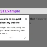 Create Interactive Web App Tours in Under 10KB – GTourJS
 Create Interactive Guided Tours In App – TourGuide.js
 Slider-style Guided Tour In Vanilla JavaScript – tourguide.js
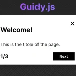 Creating Interactive Step-by-step User Guides with Guidy.js