


A smart, customizable, step-by-step tour plugin used to guide your visitors across new features of your web applications.
More features:
- Auto moves focus to the current step with a background overlay.
- Displays information in a tooltip style popup.
- Supports HTML content.
How to use it:
1. Install & download the package via NPM.
# NPM
$ npm install smartour --save
2. Import the Smartour.js as a module.
import Smartour from './dist/index.esm.js'
3. Or load the compiled version fo the Smartour.js from the dist folder.
<script src="dist/index.js"></script>
4. Initialize the Smartour.
let tour = new Smartour();
5. Create steps for your guided tour as follows:
tour
  .queue([{
    el: '.step-1',
    options: {
      layerEvent: tour.next.bind(tour), // event to trigger when clicking on the layer
      slotPosition: 'right' // top, right, left, bottom
    },
    slot: 'Text or HTML Content Here'
  }, {
    el: '.step-2',
    options: {
      layerEvent: tour.next.bind(tour)
    },
    slot: 'Text or HTML Content Here'
  }, {
    el: '.step-3',
    options: {
      layerEvent: tour.next.bind(tour)
    },
    slot: `
      <button class="action-1">
        Action Button 1
      </button>
      <button class="demo-btn action-2">
        Action Button 2
      </button>
    `,
    keyNodes: [{
      el: '.action-1',
      event: () => { alert('Event!!') }
    }, {
      el: '.action-2',
      event: () => { alert('Another event!!') }
    }]
}])
6. Start the tour and done.
tour.run();
7. Create a single-step tour using the .focus method.
tour.focus({
  el: '#single-step',
  slot: `Text or HTML Content Here`
})
8. Goto the next/prev step.
tour.next();
tour.prev();
9. All possible options.
{
  prefix: 'smartour',
  padding: 5, // in px
  maskColor: 'rgba(0, 0, 0, .5)',
  animate: true,
  slotPosition: 'top'
  layerEvent: smartour.over
}
10. The necessary CSS styles for the slot (tooltip).
.smartour-slot {
  position: relative;
  background: #fff;
  padding: 5px;
  border-radius: 4px;
  font-size: 1rem
}
.smartour-slot_top {
  -webkit-transform: translateY(-10px);
  transform: translateY(-10px)
}
.smartour-slot_top:after {
  content: "";
  position: absolute;
  bottom: -5px;
  left: 50%;
  -webkit-transform: translateX(-50%);
  transform: translateX(-50%);
  border-left: 5px solid transparent;
  border-right: 5px solid transparent;
  border-top: 5px solid #fff
}
.smartour-slot_bottom {
  -webkit-transform: translateY(10px);
  transform: translateY(10px)
}
.smartour-slot_bottom:after {
  content: "";
  position: absolute;
  top: -5px;
  left: 50%;
  -webkit-transform: translateX(-50%);
  transform: translateX(-50%);
  border-left: 5px solid transparent;
  border-right: 5px solid transparent;
  border-bottom: 5px solid #fff
}
.smartour-slot_right {
  -webkit-transform: translateX(10px);
  transform: translateX(10px)
}
.smartour-slot_right:after {
  content: "";
  position: absolute;
  left: -5px;
  top: 50%;
  -webkit-transform: translateY(-50%);
  transform: translateY(-50%);
  border-bottom: 5px solid transparent;
  border-right: 5px solid #fff;
  border-top: 5px solid transparent
}
.smartour-slot_left {
  -webkit-transform: translateX(-10px);
  transform: translateX(-10px)
}
.smartour-slot_left:after {
  content: "";
  position: absolute;
  right: -5px;
  top: 50%;
  -webkit-transform: translateY(-50%);
  transform: translateY(-50%);
  border-bottom: 5px solid transparent;
  border-left: 5px solid #fff;
  border-top: 5px solid transparent
}
See Also:
 Lightweight Vanilla JS Library for Interactive Guided Tours – Boarding.js
 Lightweight User Tour/Onboarding Library for Web Apps – CodingIntroJS
 Build Interactive Product tours & User Onboarding with Cue.js
 Interactive Guided UI Tours with Target-Highlight.js
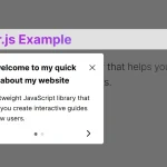 Create Interactive Web App Tours in Under 10KB – GTourJS
 Create Interactive Guided Tours In App – TourGuide.js
 Slider-style Guided Tour In Vanilla JavaScript – tourguide.js
 Creating Interactive Step-by-step User Guides with Guidy.js