


A stylish side navigation made by FictionTeam that creates a transparent off-canvas menu with CSS/CSS3 and a little bit of JavaScript.
How to use it:
Create a navigation button inside the main container with the CSS class of ‘container’.
<span class="nav__button"><i class="licon-reorder"></i></span>
Create an off-canvas menu next to the navigation button.
<nav class="navigation">
  <h3>My Navigation:</h3>
  <a href="#">Facebook</a>
  <a href="#">Google Plus</a>
  <a href="#">Twitter</a>
  <a href="#">Github</a>
  <a href="#">Instagram</a>
</nav>
The CSS/CSS3 to style the navigation button and to make it act like a hamburger button when toggled.
.container span.nav__button {
  position: fixed;
  bottom: 0;
  right: 0;
  margin: 1.75rem;
  width: 50px;
  height: 50px;
  text-align: center;
  line-height: 45px;
  border-radius: 100%;
  background: rgba(255, 255, 255, 0.9);
  box-shadow: 0 2px 4px 0 rgba(0, 0, 0, 0.25);
  cursor: pointer;
  z-index: 9;
  -webkit-user-select: none;
  -moz-user-select: none;
  -ms-user-select: none;
  user-select: none;
  -webkit-touch-callout: none;
}
.container span.nav__button.open { background-color: rgba(255, 255, 255, 0.3); }
[class^="licon-"]:before,
[class^="licon-"]:after {
  content: '';
  pointer-events: none;
}
.licon-reorder {
  width: 24px;
  height: 2px;
  background-color: #616161;
  -webkit-transition: background-color 0.25s;
  transition: background-color 0.25s;
  -webkit-transition-timing-function: cubic-bezier(0.7, 0, 0.3, 1);
  transition-timing-function: cubic-bezier(0.7, 0, 0.3, 1);
}
.licon-reorder:before,
.licon-reorder:after {
  position: absolute;
  background-color: #616161;
  width: 24px;
  height: 2px;
  left: 0;
  -webkit-transform: translate3d(0, 0, 0);
  transform: translate3d(0, 0, 0);
  -webkit-transition: -webkit-transform .25s, color .2s;
  transition: transform .25s, color .2s;
  -webkit-transition-timing-function: cubic-bezier(1, 0, 0.23, 1);
  transition-timing-function: cubic-bezier(1, 0, 0.23, 1);
}
.licon-reorder:before { top: -8px; }
.licon-reorder:after { bottom: -8px; }
.open .licon-reorder { background-color: transparent; }
.open .licon-reorder:before,
.open .licon-reorder:after { background: #eee; }
.open .licon-reorder:before {
  -webkit-transform: translateY(5px);
  -ms-transform: translateY(5px);
  transform: translateY(5px);
}
.open .licon-reorder:after {
  -webkit-transform: translateY(-3px);
  -ms-transform: translateY(-3px);
  transform: translateY(-3px);
}
The required
.navigation {
  position: fixed;
  width: 14rem;
  height: 100vh;
  top: 0;
  right: 0;
  background: rgba(10, 10, 13, 0.75);
  padding: 1.75rem;
  z-index: 1;
  -webkit-transform: translateX(100vh) scale(0.5, 0.25);
  -ms-transform: translateX(100vh) scale(0.5, 0.25);
  transform: translateX(100vh) scale(0.5, 0.25);
  -webkit-transition: -webkit-transform 0.3s;
  transition: transform 0.3s;
  -webkit-transition-timing-function: cubic-bezier(0.7, 0, 0.3, 1);
  transition-timing-function: cubic-bezier(0.7, 0, 0.3, 1);
}
.navigation a {
  color: #e9e9e9;
  display: block;
  margin-bottom: 1em;
  border-bottom: 1px solid rgba(255, 255, 255, 0.1);
}
.navigation a:hover { color: #aaaaaa; }
 [class^="licon-"] {
 display: inline-block;
 vertical-align: middle;
 position: relative;
 font-style: normal;
}
.active .navigation {
  -webkit-transform: translateX(0) scale(1, 1);
  -ms-transform: translateX(0) scale(1, 1);
  transform: translateX(0) scale(1, 1);
}
@media (max-width: 40rem) {
 .active .navigation {
 position: fixed;
 width: 100%;
 background-color: rgba(0, 0, 0, 0.8);
}
}
Enable the off-canvas menu with a little JavaScript.
var btn = document.querySelector('.nav__button'),
    container = document.querySelector('.container');
btn.addEventListener('click', function () {
    this.classList.toggle('open');
    container.classList.toggle('active');
});
CSS/CSS3 for the off-canvas menu.
See Also:
 Vanilla JS Offcanvas Side Menu – Mobile Swipe Menu
 Create Mobile-First Side Menus with SlideReveal.js Library
 Simple Sidebar Hamburger Menu In CSS
 Responsive Multi-level Dropdown Menu With JavaScript And CSS – ozmenu.js
 Responsive Sidebar Navigation With Hamburger Toggle Button
 Off-canvas Accordion Menu With Bootstrap 5
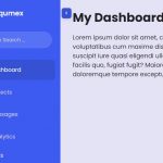 Beautiful Dashboard Sidebar Menu Template
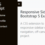 Responsive Sidebar Navigation For Bootstrap 5