


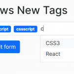
use-bootstrap-tag is a JavaScript plugin that converts standard text fields into customizable tag style inputs for Bootstrap 5 forms.
Users can easily add custom tags into the tags input or select predefined values directly from a dropdown. The plugin then showcases the chosen selections as stylish tokens, chips, or tags in the inputs.
How to use it:
1. Download and import the use-bootstrap-tag plugin’s files into your Bootstrap 5 project.
<!-- Bootstrap 5 Is Required -->
<link rel="stylesheet" href="/path/to/cdn/bootstrap.min.css" />
<script src="/path/to/cdn/bootstrap.min.js"></script>
<!-- use-bootstrap-tag -->
<link rel="stylesheet" href="use-bootstrap-tag.min.css" />
<script src="use-bootstrap-tag.min.js"></script>
2. Call the function UseBootstrapTag on the existing input field and the plugin will do the rest.
<input type="text" class="form-control" value="CSS, Script, Com" id="example">
const example = UseBootstrapTag(document.getElementById('example'))3. Customize the tag separators. Defaults to comma.
<input
  type="text"
  class="form-control"
  placeholder="Type Something And Press SPACE"
  data-ub-tag-separator=" "
  id="example">
4. Determine whether to allow duplicate tags.
<input
  type="text"
  class="form-control"
  data-ub-tag-duplicate
  id="example">
5. Enable your users to add tags by pressing ENTER.
<input
  type="text"
  class="form-control"
  data-ub-tag-enter
  id="example">
6. Custom transformation. Sometimes, you may need the input tags to follow certain patterns or formats. With this feature, apply your own modifications to the entered tags effortlessly.
<input
  type="text"
  class="form-control"
  data-ub-tag-transform="input => input.toUpperCase()
  id="example">
7. Style the tags using the native Bootstrap’s styling utilities.
- primary
- secondary (default)
- success
- danger
- warning
- info
- darklight
<input
  type="text"
  class="form-control"
  data-ub-tag-variant="danger"
  id="example">
8. Specify the position of the remove icon.
<input
  type="text"
  class="form-control"
  data-ub-tag-x-position="left"
  id="example">
9. Set the maximum number of tags.
<input
  type="text"
  class="form-control"
  data-ub-tag-max="5"
  id="example">
10. Determine whether to clear content when the input field loses focus.
<input
  type="text"
  class="form-control"
  data-ub-tag-no-input-onblur
  id="example">
11. API methods.
// add value(s)
example.addValue('jquery')
example.addValue(['jquery', 'script'])
// remove value(s)
example.removeValue('jquery')
example.removeValue(['jquery', 'script'])
// get value(s)
example.getValue()
example.getValues()
Changelog:
v2.2.2 (07/04/2024)
- Fixed placeholder color
v2.2.1 (06/26/2024)
- Fixed types
v2.2.0 (10/13/2023)
- Added no-input-onblur option.
v2.1.1 (09/30/2023)
- Updated to bootstrap v5.3.2.
- Small improvements.
v2.1.0 (09/06/2023)
- Added max option.
v2.0.1 (09/05/2023)
- Some rendering improvements.
v2.0.0 (09/05/2023)
- Rewrite project back to vanilla-js to improve performance and reduce size.
- Pressing Enter is now the default action for adding a tag. Previously, users had to include an attribute option.
- Now pressing Backspace on a focused tag deletes it and shifts focus to the previous tag, while pressing Delete deletes the tag and moves focus to the next one.
- Fixed the tag with long text not breaking words.
- Fixed server-side validation styles.
- Fixed where adding existing values programmatically did not trigger a warning for duplicate tags.
v1.0.3 (08/29/2023)
- Remove placeholder when input value is not empty
v1.0.2 (08/27/2023)
- Fixed lost focus after deleting the focused tag with the backspace or delete key (Firefox only).
v1.0.1 (08/25/2023)
- Named export to default export.
- Added transition.
- Added variant option.
- Added x-position option.
- Added focusable tag, when it focused you can press backspace or delete key to remove it.
- Fixed clicking label not focusing input.
v0.0.3 (08/22/2023)
- ignore hidden class if target reinitialized
v0.0.2 (08/20/2023)
- Hide the ‘close’ icon when disabled
See Also:
 Easy Tags Input Component For Bootstrap 5/4 – Tags.js
 Searchable Tags Input Component For Bootstrap 5
 Add Web Audio Feedback to Bootstrap 5 Components – Bootstrap UI Sounds
 iOS-style Bottom Sheet Component for Bootstrap 5 – BootstrapSheet
 Inspect CSS Styles With Bootstrap Popover CSS Inspector
 Navbar-Synced Context Menu for Bootstrap 5 – BRC JS
 Make Bootstrap 5 Tables More Readable On Mobile Devices – AvalynxTable.js
 Shadstrap: Bootstrap 5 Theme with shadcn/ui Aesthetics