


In this tutorial, we’re going to create fancy gradient text fade in/out animations as you’ve seen on the Apple iPhone 14 Pro page.
How to use it:
1. Add your text to the webpage.
<div class="hero-text">
  <p>A magical new way to interact with iPhone. A vital new safety feature designed to save lives. An innovative 48MP camera for mind-blowing detail. All powered by the ultimate smartphone chip.</p>
</div>
2. Apply the fancy animation to the text using CSS3 animations.
.hero-text p {
  position: relative;
  width: 55vw;
  font-size: 40px;
  color: transparent;
  margin: auto;
  line-height: 1.5;
  padding: 20px;
  background: linear-gradient(transparent, transparent 25%, #ffb6ff, #b344ff, transparent 75%, transparent);
  -webkit-background-clip: text;
          background-clip: text;
  background-size: 100% 400%;
  background-position: center 0;
  -webkit-animation: textScroll 6s infinite linear alternate;
          animation: textScroll 6s infinite linear alternate;
}
@-webkit-keyframes textScroll {
  100% {
    background-position: center 100%;
  }
}
@keyframes textScroll {
  100% {
    background-position: center 100%;
  }
}
See Also:
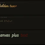 Font-Based Handwriting Text Animation for the Web – Tegaki
 Advanced Typewriter Animation Library – TypeFX.js
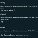 Natural Typing Animations In JavaScript – Typecadence
 Animate Text Using SVG Font – svg-text-animate.js
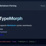 Text Typing Animations with Real-time Markdown/HTML Rendering – TypeMorph
 Text Shuffle Animation In Pure JavaScript – shuffle-text.js
 Create Scroll-Triggered Letter Animations – AniLet.js
 Pure CSS Morphing Text Effect with Gooey Transitions