


A pure JavaScript library to create animated modal dialogs that use Animate.css for amazing CSS3 based open/close animations. Works perfectly with Bootstrap framework.
How to use it:
Load the animate.css for modal animations.
<link rel="stylesheet" href="https://unpkg.com/animate.css/animate.css">
Load the required rmodal.css for basic modal styles.
<link rel="stylesheet" href="src/rmodal.css">
Include Bootstrap’s CSS to style the modal window (Optional). You can also add your own styles in the CSS.
<link rel="stylesheet" href="//netdna.bootstrapcdn.com/bootstrap/3.3.2/css/bootstrap.min.css">
Create the content for the modal dialog.
<div id="modal" class="modal">
  <div class="modal-dialog animated">
    <div class="modal-content">
      <form class="form-horizontal" method="get">
        <div class="modal-header"> Modal Headling </div>
        <div class="modal-body">
          Modal Body
        </div>
        <div class="modal-footer">
          <button class="btn btn-default" type="button" onclick="modal.close();">Close</button>
          <button class="btn btn-primary" type="submit" onclick="modal.close();">Cancel</button>
        </div>
      </form>
    </div>
  </div>
</div>
Include the rmodal.js library in your document
<script src="src/rmodal.js"></script>
Create a link to trigger the modal dialog.
<a href="#" id="showModal">Show modal</a>
Enable the trigger link to toggle a modal dialog.
window.onload = function() {
  var modal = new RModal(document.getElementById('modal'), {
      //content: 'Abracadabra'
      beforeOpen: function(next) {
          console.log('beforeOpen');
          next();
      }
      , afterOpen: function() {
          console.log('opened');
      }
      , beforeClose: function(next) {
          console.log('beforeClose');
          next();
      }
      , afterClose: function() {
          console.log('closed');
      }
      // , bodyClass: 'modal-open'
      // , dialogClass: 'modal-dialog modal-dialog-lg'
      // , dialogOpenClass: 'animated fadeIn'
      // , dialogCloseClass: 'animated fadeOut'
      // , focus: ['input.form-control', 'textarea', 'button.btn-primary']
  });
  window.addEventListener('resize', function() {
      modal.resize();
  }, false);
  document.addEventListener('keydown', function(ev) {
      if (ev.which == 27) {
          modal.close();
      }
  }, false);
  document.getElementById('showModal').addEventListener("click", function(ev) {
      ev.preventDefault();
      modal.open();
  }, false);
  window.modal = modal;
}
Changelog:
v1.1.0 (10/16/2022)
- Migrate to TypeScript
See Also:
 Inspect CSS Styles With Bootstrap Popover CSS Inspector
 Navbar-Synced Context Menu for Bootstrap 5 – BRC JS
 Make Bootstrap 5 Tables More Readable On Mobile Devices – AvalynxTable.js
 Bootstrap 5 Theme with shadcn/ui Aesthetics – Shadstrap
 Lightweight Loading Overlay Plugin For Bootstrap 5 – AvalynxLoader
 Bootstrap 5 Select Dropdown Enhancer – AvalynxSelect
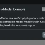 Build Customizable Modals With AvalynxModal And Bootstrap
 Advanced Alert Notification System For Bootstrap 5 – AvalynxAlert.js
I’m using this modal for a project, but I can’t seem to control how wide it is even when I take out the input field. Where is this styling set up so I can change it?