


A lightweight JavaScript library for creating customizable, animated HTML5 tooltips on any elements.
How to use it:
1. To get started, include the following files on the page.
<link rel="stylesheet" href="dist/tooltip.min.css" />
<script src="dist/tooltip.min.js"></script>
2. Define the tooltip content in the data-tooltip attribute:
<button data-tooltip="Tooltip Content">
  Hover Me
</button>
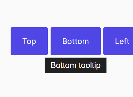
3. Determine at which point the tooltip should appear. Possible values:
- top
- bottom
- left
- right
- null (auto)
<button data-tooltip="Tooltip Content"
        data-tooltip-position="bottom">
  Hover Me
</button>
4. Determine the space between the tooltip and its trigger element. Default: 4.
<button data-tooltip="Tooltip Content"
        data-tooltip-margin="10">
  Hover Me
</button>
5. Config the tooltip animation.
<button data-tooltip="Tooltip Content"
        data-tooltip-enter-delay="0"
        data-tooltip-exit-delay="0"
        data-tooltip-show-duration="300"
        data-tooltip-hide-duration="200"
        data-tooltip-transition-distance="200">
  Hover Me
</button>
6. Set the z-index of the tooltip. Default: 1.
<button data-tooltip="Tooltip Content"
        data-tooltip-z-index="999">
  Hover Me
</button>
7. Determine whether to show the tooltip only if element text is partially hidden with an ellipsis. Default: false.
<button data-tooltip="Tooltip Content"
        data-tooltip-ellipsis-only="true">
  Hover Me
</button>
8. Set the font size. Default: 14px.
<button data-tooltip="Tooltip Content"
        data-tooltip-font-size="12px">
  Hover Me
</button>
9. Set the maximum width of the tooltip. Default: 300px.
<button data-tooltip="Tooltip Content"
        data-tooltip-max-width="320px">
  Hover Me
</button>
10. Set the alignment of the tooltip. Default: ‘left’.
<button data-tooltip="Tooltip Content"
        data-tooltip-alignment="top right">
  Hover Me
</button>
11. Determine whether to allow html elements in the tooltip text. Default: false.
<button data-tooltip="Tooltip Content"
        data-hide-on-click="false">
  Hover Me
</button>
12. Determine whether to hide the tooltip on click. Default: true.
<button data-tooltip="Tooltip Content"
        data-tooltip-allow-html="true">
  Hover Me
</button>
13. Determine whether to hide the arrow icon. Default: false.
<button data-tooltip="Tooltip Content"
        data-tooltip-hide-arrow-icon="true">
  Hover Me
</button>
14. Apply additional CSS classes to the tooltip.
<button data-tooltip="Tooltip Content"
        data-tooltip-additional-classes="customClass">
  Hover Me
</button>
15. Set the space between tooltip and window edge in px. Default: 5.
<button data-tooltip="Tooltip Content"
        data-tooltip-offset="6">
  Hover Me
</button>
Changelog:
v1.0.16 (08/15/2021)
- Bugfix
v1.0.15 (08/07/2021)
- Bugfix
v1.0.14 (07/28/2021)
- Publishing in NPM
v1.0.10 (07/11/2021)
- Bug fixes
- New property: offset
v1.0.9 (05/09/2021)
- Bugfixes
v1.0.8 (03/13/2021)
- Allowing secondary position: e.g. data-tooltip-position=”top right”
v1.0.7 (03/06/2021)
- New attributes
v1.0.6 (02/27/2021)
- Bug fixes
v1.0.5 (02/20/2021)
- Added
data-hide-on-clickattribute
v1.0.4 (02/15/2021)
- Added
data-tooltip-max-widthattribute
v1.0.2 (02/01/2021)
- Breaking the long word
- New attribute to set font size
See Also:
 32 Smooth Image Hover Effects – ImageHover
 Touch-enabled 360 Image Preview In JavaScript – Threesixty
 Responsive Design Assistant For TailwindCSS – TailwindCSS Breakpoint Tool
 Minimalist Desktop Notification Library – Toaster
 Real-Time Number/Currency Formatting With liveNumberFormat.js Library
 Pure CSS Material Morphing Menu
 Zero-Class Web Development with launch.css Framework
 Dither Images for E-Paper Displays in JavaScript – EPD Optimize