


Crispy-Notify is a lightweight yet full-featured notification library for creating beautiful and customizable toast messages to inform users of important messages, alerts, and updates in your web app.
Inspired by fkhadra’s react-toastify notification component.
Features:
- Auto close after a timeout.
- Dark mode.
- Custom positions.
- Plays a sound when a toast is activated.
- With or without progress bars.
- 5 notification types: info, warning, success, error.
- And more.
How to use it:
1. Download and import the Crispy-Notify as a module.
<!-- Required Stylesheet -->
<link rel="stylesheet" href="styles/toast.css" />
<script type="module">
  import Toast from "./Toast.js";
</script>
2. Display a default toast message on the screen.
new Toast({
    toastContent: {
      message: "Toast Message",
      title: "Toast Title",
    },
});
3. Change the notification type:
- info
- warning
- success
- error
new Toast({
    toastContent: {
      message: "Toast Message",
      title: "Toast Title",
      type: "warning",
    },
});
4. Position the toast messages:
- top-center
- top-left
- top-right (default)
- bottom-center
- bottom-left
- bottom-right
new Toast({
    toastContent: {
      message: "Toast Message",
      title: "Toast Title",
      type: "warning",
    },
    position: "top-left",
});
5. More configurations to customize the toast messages.
new Toast({
    // auto dismiss the toast message after this timeout
    autoClose: 5000, // in ms.
    // close the toast message on click
    canCloseOnClick: true,
    // enable dark mode
    darkMode: false,
    // callback function
    onClose: () => {},

    // pause the countdown timer based on...
    pauseOnHover: true,
    pauseOnFocusLoss: true,
    // play a sound effect
    playNotificationSound: false,
    // show progress bar
    showProgressBar: true,

});
Changelog:
10/05/2024
- Updating the font-family to Virgil
04/04/2023
- Added animated toast icons
See Also:
 Material Design Toast & Snackbar Library with Action Buttons – MiniSnackbar
 Developer-Friendly Toast Alerts in JavaScript – Toast-JS
 Sonner-Style Stacked Toast Notifications in JavaScript – Toastry
 Framework-Agnostic Toast Notifications with TypeScript – NotifyX
 Advanced Toast/Tooltip/Popover/Confirm/Modal Notification Library – toast-anchor
 Modern Toast Popup JavaScript Library – EggyJS
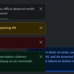 Advanced Alert Notification System For Bootstrap 5 – AvalynxAlert.js
 SVG Gooey Toast Notification Library – Physics Toast