


Sliders in Virtual Reality (VR) and Augmented Reality (AR) have always presented a challenge to developers. Sliders that are uniform and lined up on the z-axis look weird in VR, while in AR they’re too slow to use. This concept solves those problems using a 3D range slider that moves on the z-axis. The ticks spread out along with the handle to its place when active, and then everything merges into the middle when inactive.
This is a 3D range slider control that runs on the z-axis. Each tick also spreads out as the handle is dragged, then merges together when it’s released. This gives a sense of depth in a 3D or VR/AR environment, resulting in a sort of conveyor belt effect. Very easy to integrate into any project and customize to your own preference.
See It In Action:
How to use it:
1. Code the HTML for the 3D range slider.
<div id="rs" class="rs rs--pristine">
  <div class="rs__range-wrap">
    <input class="rs__range" type="range" data-range>
  </div>
  <div class="rs__rings">
    <button class="rs__handle" type="button" data-handle>
      <span class="rs__handle-value" data-value>0</span>
    </button>
    <div class="rs__ring"></div>
    <div class="rs__ring"></div>
    <div class="rs__ring"></div>
    <div class="rs__ring"></div>
    <div class="rs__ring"></div>
    <div class="rs__ring"></div>
    <div class="rs__ring"></div>
  </div>
</div>
2. The CSS/CSS3 styles.
:root {
  --hue: 223;
  --bg: hsl(var(--hue),10%,90%);
  --fg: hsl(var(--hue),10%,10%);
  --primary: hsl(var(--hue),90%,55%);
  --trans-dur: 0.3s;
  font-size: calc(16px + (24 - 16) * (100vw - 320px) / (1280 - 320));
}
.rs,
.rs__rings {
  position: relative;
}
.rs {
  --rel-value: 0;
  --range-units: 1;
  transition: transform 0.3s ease-in-out;
}
.rs__range-wrap,
.rs__rings {
  transform: rotateX(30deg) rotateY(30deg);
  transform-style: preserve-3d;
}
.rs__range:focus,
.rs__handle:focus {
  outline: transparent;
}
.rs__range-wrap {
  display: none;
  position: absolute;
  inset: 0;
  z-index: 1;
}
.rs__range {
  background-color: transparent;
  position: absolute;
  top: 50%;
  left: 50%;
  width: 24em;
  height: 12em;
  transform: translate(-50%,-50%) rotateX(90deg) rotateZ(90deg);
  -webkit-appearance: none;
  appearance: none;
}
.rs__range::-webkit-slider-thumb {
  background-color: transparent;
  border: 0;
  width: 12em;
  height: 8em;
  transform: skewY(30deg);
  -webkit-appearance: none;
  appearance: none;
}
.rs__range::-moz-range-thumb {
  background-color: transparent;
  border: 0;
  width: 12em;
  height: 8em;
  transform: skewY(30deg);
}
.rs__rings {
  z-index: 0;
}
.rs__handle,
.rs__ring {
  border-radius: 2em;
  box-shadow: 0 0 0 0.25em inset;
}
.rs__handle {
  background-color: transparent;
  color: var(--fg);
  position: relative;
  width: 8em;
  height: 8em;
  transition:
    box-shadow var(--trans-dur),
    color var(--trans-dur),
    transform var(--trans-dur) linear;
  -webkit-appearance: none;
  appearance: none;
  -webkit-tap-highlight-color: transparent;
  user-select: none;
  -webkit-user-select: none;
  -moz-user-select: none;
}
.rs__handle:before {
  animation: handleBlur var(--trans-dur) ease-in-out;
  border-radius: 50%;
  box-shadow: 0 0 0 0 inset;
  content: "";
  display: block;
  opacity: 0.1;
  position: absolute;
  top: -25%;
  left: -25%;
  width: 150%;
  height: 150%;
}
.rs__handle:focus {
  color: var(--primary);
}
.rs__handle-value {
  font-size: 3em;
  font-weight: 300;
  line-height: 1;
}
.rs__ring {
  position: absolute;
  inset: 0;
  opacity: 0.1;
  pointer-events: none;
  visibility: hidden;
  transition:
    transform var(--trans-dur) linear,
    visibility var(--trans-dur) steps(1);
}
.rs--pristine .rs__handle:before {
  animation: none;
}
.rs--active .rs__handle {
  pointer-events: none;
  transform: translateZ(calc(-6em + (var(--rel-value) / var(--range-units) * 12em)));
}
.rs--active .rs__handle:before {
  animation: handleFocus 0.6s ease-in-out;
  box-shadow: 0 0 0 6em inset;
  transform: scale(0.4);
}
.rs--active .rs__range-wrap { display: block; }
.rs--active .rs__ring {
  visibility: visible;
  transition-duration: var(--trans-dur), 0s;
}
.rs--active .rs__ring:nth-of-type(1) { transform: translateZ(6em); }
.rs--active .rs__ring:nth-of-type(2) { transform: translateZ(4em); }
.rs--active .rs__ring:nth-of-type(3) { transform: translateZ(2em); }
.rs--active .rs__ring:nth-of-type(4) { transform: translateZ(0); }
.rs--active .rs__ring:nth-of-type(5) { transform: translateZ(-2em); }
.rs--active .rs__ring:nth-of-type(6) { transform: translateZ(-4em); }
.rs--active .rs__ring:nth-of-type(7) { transform: translateZ(-6em); }
/* Dark theme */
@media (prefers-color-scheme: dark) {
  :root {
    --bg: hsl(var(--hue),10%,10%);
    --fg: hsl(var(--hue),10%,90%);
    --primary: hsl(var(--hue),90%,65%);
  }
}
/* Animations */
@keyframes handleBlur {
  from {
    box-shadow: 0 0 0 6em inset;
    transform: scale(0.4);
  }
  to {
    box-shadow: 0 0 0 0.1em inset;
    transform: scale(1);
  }
}
@keyframes handleFocus {
  from { transform: scale(0); }
  33% { transform: scale(0.5); }
  67% { transform: scale(0.35); }
  to { transform: scale(0.4); }
}
3. The main JavaScript to activate the interactions.
window.addEventListener("DOMContentLoaded",() => {
  const slider = new _3DRangeSlider("#rs");
});
class _3DRangeSlider {
  constructor(qs) {
    this.el = document.querySelector(qs);
    this.handle = this.el?.querySelector("[data-handle]");
    this.range = this.el?.querySelector("[data-range]");
    this.value = 3;
    this.min = 0;
    this.max = 6;
    this.step = 1;
    this.active = false;
    this.rangeFocusTimeout = null;
    this.init();
  }
  init() {
    if (this.el) {
      this.handle?.addEventListener("click",this.expand.bind(this));
      if (this.range) {
        this.range.value = this.value;
        this.range.min = this.min;
        this.range.max = this.max;
        this.range.step = this.step;
        this.range.addEventListener("input",this.adjust.bind(this));
        document.addEventListener("click",this.collapse.bind(this));
        document.addEventListener("keydown",this.collapse.bind(this));
      }
      this.updateDisplay();
    }
  }
  expand() {
    this.active = true;
    this.handle.blur();
    this.handle.disabled = this.active;
    this.el.classList.remove("rs--pristine");
    this.el.classList.add("rs--active");
    clearTimeout(this.rangeFocusTimeout);
    this.rangeFocusTimeout = setTimeout(() => this.range.focus(),1);
  }
  collapse(e) {
    if (e.key === "Escape" || (!e.key && e.target === document.body)) {
      this.active = false;
      this.handle.disabled = this.active;
      this.el.classList.remove("rs--active");
    }
  }
  adjust(e) {
    this.value = e.target.value;
    this.updateDisplay();
  }
  updateDisplay() {
    if (this.el) {
      // CSS variables
      this.el.style.setProperty("--rel-value",this.value - this.min);
      this.el.style.setProperty("--range-units",this.max - this.min);
      // displayed value
      const value = this.el.querySelector("[data-value]");
      if (value)
        value.textContent = this.value;
    }
  }
}
See Also:
 Responsive & Touch-enabled Range Slider In Vanilla JavaScript – rangeSlider
 Accesible Range Slider Custom Element
 Build Custom Circular Range Sliders with CircularRange Web Component
 Accessible Dual-Handle Range Slider Library – range-slider.js
 Accessible Dual-Thumb Range Slider for Web & Mobile – DoubleRange
 Modern Range Sliders Based On Native Range Inputs – dual-range-input
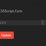 Highly Customizable Range Slider In JavaScript – Slider89.js
 Interactive Range Slider with Tooltip Using Pure CSS