


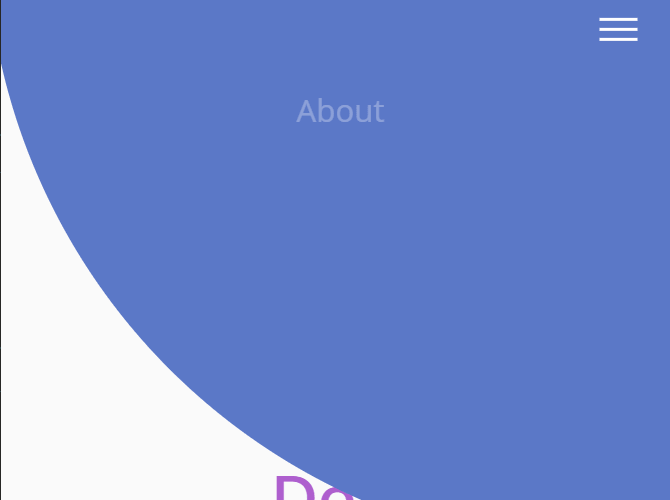
A responsive hamburger navigation system that morphs the hamburger toggle button into a fullscreen navigation using a little JavaScript and CSS transition & clip-path properties.
How to use it
1. Create a site navigation with a hamburger toggle button on the web page.
<nav>
  <div class="hamburger">
    <div class="line"></div>
    <div class="line"></div>
    <div class="line"></div>
  </div>
  <ul class="nav-links">
    <li><a href="#">CSS</a></li>
    <li><a href="#">Script</a></li>
    <li><a href="#">Com</a></li>
  </ul>
</nav>
2. The basic CSS styles for the regular horizontal menu.
nav {
  height: 10vh;
  background: #5b78c7;
}
.nav-links {
  display: flex;
  list-style: none;
  width: 50%;
  height: 100%;
  justify-content: space-around;
  align-items: center;
  margin-left: auto;
}
.nav-links li a {
  color: white;
  text-decoration: none;
  font-size: 16px;
}
3. Collapse the horizontal menu into a hamburger toggle button when the screen size is smaller than a specific viewport size.
@media screen and (max-width: 768px) {
  .line {
    width: 30px;
    height: 3px;
    background: white;
    margin: 5px;
  }
  nav {
    position: relative;
  }
  .hamburger {
    position: absolute;
    cursor: pointer;
    right: 5%;
    top: 50%;
    transform: translate(-5%, -50%);
    z-index: 2;
  }
  .nav-links {
    position: fixed;
    background: #5b78c7;
    height: 100vh;
    width: 100%;
    flex-direction: column;
    clip-path: circle(100px at 90% -10%);
    -webkit-clip-path: circle(100px at 90% -10%);
    transition: all 1s ease-out;
    pointer-events: none;
  }
  .nav-links.open {
    clip-path: circle(1000px at 90% -10%);
    -webkit-clip-path: circle(1000px at 90% -10%);
    pointer-events: all;
  }
  .landing {
    flex-direction: column;
  }
  .nav-links li {
    opacity: 0;
  }
  .nav-links li a {
    font-size: 25px;
  }
  .nav-links li:nth-child(1) {
    transition: all 0.5s ease 0.2s;
  }
  .nav-links li:nth-child(2) {
    transition: all 0.5s ease 0.4s;
  }
  .nav-links li:nth-child(3) {
    transition: all 0.5s ease 0.6s;
  }
  li.fade {
    opacity: 1;
  }
}
4. The main JavaScript to toggle CSS classes for the morphing animation.
const hamburger = document.querySelector(".hamburger");
const navLinks = document.querySelector(".nav-links");
const links = document.querySelectorAll(".nav-links li");
hamburger.addEventListener("click", () => {
  navLinks.classList.toggle("open");
  links.forEach(link => {
    link.classList.toggle("fade");
  });
});
See Also:
 Responsive Sliding Hamburge Menu System
 Simple Sidebar Hamburger Menu In CSS
 Responsive Sidebar Navigation With Hamburger Toggle Button
 Expanding Dropdown Menu In JavaScript
 Hamburger Site Navigation With Menu Rotation
 3D Perspective Hamburger Menu With JavaScript And CSS3
 Mobile-friendly Hamburger Navigation With Submenus
 Sliding Hamburger Navigation With GSAP