Responsive Mobile-friendly Nav System With JavaScript And Flexbox
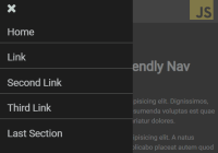
Yet another responsive, cross-platform navigation system that converts the horizontal menu into an off-screen hamburger navigation on the mobile device.


Yet another responsive, cross-platform navigation system that converts the horizontal menu into an off-screen hamburger navigation on the mobile device.

hy-drawer is a JavaScript library that makes it easy to create mobile-friendly, high-performant drawer navigation for your mobile/desktop web app.

A tilted sliding drawer navigation (off-canvas menu) with an animated hamburger button, built using JavaScript, CSS3 animations and clip path.
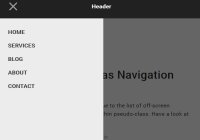
A pure CSS, mobile-friendly off-canvas navigation system built using plain HTML/CSS/CSS3 and :focus-within CSS pseudo-class.

A pure JavaScript/CSS based hamburger navigation that allows you to toggle an off-screen sidebar menu when you click on the hamburger trigger.

The Heads-Up library helps you create a smart sticky navigation that hides on scroll down and reappears on scroll up.

A multi-level drawer (off-canvas) menu inspired by the modern app navigation system. Written in pure CSS/CSS3 and Checkbox Hack.

ApocSidebar is a ES 5/6 JavaScript sidebar component that allows to reveal off-screen sidebars with some cool animations based on CSS3.

A Vanilla JavaScript plugin used to create a mobile-friendly off-canvas side menu that supports touch swipe events.

MenuSpy.js is a multi-purpose JavaScript library for your one page scrolling website that highlights the menu item relative to the currently visible section.