


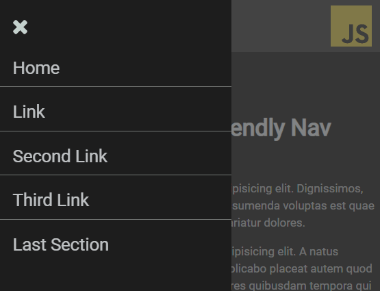
Yet another responsive, cross-platform navigation system that converts the horizontal menu into an off-screen hamburger navigation on the mobile device.
Built with vanilla JavaScript and CSS flexbox model.
How to use it:
Import the JavaScript nav.js and Stylesheet nav.css into the HTML file.
<link rel="stylesheet" href="css/nav.css">
<script src="js/nav.js"></script>
Create a normal header navigation following the HTML structure like these:
<header class="nav-wrapper">
  <nav class="nav" role="navigation">
    <span class="toggleNav">
      <svg class="svg-hamburger" viewBox="0 0 1536 1280" xmlns="http://www.w3.org/2000/svg">
        <path class="svg-hamburger-path" d="M1536 1088v128q0 26-19 45t-45 19H64q-26 0-45-19t-19-45v-128q0-26 19-45t45-19h1408q26 0 45 19t19 45zm0-512v128q0 26-19 45t-45 19H64q-26 0-45-19T0 704V576q0-26 19-45t45-19h1408q26 0 45 19t19 45zm0-512v128q0 26-19 45t-45 19H64q-26 0-45-19T0 192V64q0-26 19-45T64 0h1408q26 0 45 19t19 45z" fill="rgba(226, 241, 236, 20.85)" />
      </svg>
    </span>
    <ul class="nav__list" id="sideNav">
      <div class="nav__list-left">
        <a class="closeBtn">
          <svg class="svg-close" viewBox="0 0 1188 1188" xmlns="http://www.w3.org/2000/svg">
            <path class="svg-close-path" d="M1188 956q0 40-28 68l-136 136q-28 28-68 28t-68-28L594 866l-294 294q-28 28-68 28t-68-28L28 1024Q0 996 0 956t28-68l294-294L28 300Q0 272 0 232t28-68L164 28q28-28 68-28t68 28l294 294L888 28q28-28 68-28t68 28l136 136q28 28 28 68t-28 68L866 594l294 294q28 28 28 68z" fill="rgba(226, 241, 236, 0.85)" />
          </svg>
        </a>
        <li>
          <a class="nav__item" href="#">Home</a>
        </li>
        <li>
          <a class="nav__item" href="#">About</a>
        </li>
        <li>
          <a class="nav__item" href="#">Contact</a>
        </li>
        <li>
          <a class="nav__item" href="#">Blog</a>
        </li>
        <li>
          <a class="nav__item" href="#">Jobs</a>
        </li>
      </div>
      <div class="nav__list-right">
        <div class="page__overlay"></div>
      </div>
    </ul>
  </nav>
</header>
Customize the screen width at which breakpoint the header navigation will be collapsed into an off-screen navigation with a hamburger button.
@media all and (min-width: 800px) {
  /* ... */
}
See Also:
 Responsive Dropdown/Off-canvas Navigation In Vanilla JavaScript – Menue
 Responsive Multi-level Dropdown Menu With JavaScript And CSS – ozmenu.js
 Mobile-friendly Hamburger Navigation With Submenus
 Convert Bootstrap 5 Navbar Into Offcanvas Menu
 Responsive Offcanvas Menu For Bootstrap 5
 Responsive Single-level Dropdown Menu With JavaScript
 Responsive Mobile Menu Using CSS Flexbox – ftwnav
 Responsive Multi-level Sidebar Menu With JavaScript/CSS