


select.css is a lightweight CSS library used to consistently style the native select element consistently on most popular devices like iOS, Android, Kindle, Windows Phone, Desktop browsers and much more.
How to use it:
Load the required select.css in the head section of the document.
<link rel="stylesheet" href="src/select.css">
Wrap your regular select elements in a container with CSS class of ‘custom-select’.
<div class="button custom-select">
  <select>
    <option>Apples</option>
    <option>Bananas</option>
    <option>Grapes</option>
    <option>Oranges</option>
  </select>
</div>
Add custom styles to the select. Override the styles as you like.
.button {
  border: 1px solid #bbb;
  border-radius: .3em;
  box-shadow: 0 1px 0 1px rgba(0,0,0,.04);
  background: #f3f3f3; /* Old browsers */
  background: -moz-linear-gradient(top, #ffffff 0%, #e5e5e5 100%); /* FF3.6+ */
  background: -webkit-gradient(linear, left top, left bottom, color-stop(0%, #ffffff), color-stop(100%, #e5e5e5)); /* Chrome,Safari4+ */
  background: -webkit-linear-gradient(top, #ffffff 0%, #e5e5e5 100%); /* Chrome10+,Safari5.1+ */
  background: -o-linear-gradient(top, #ffffff 0%, #e5e5e5 100%); /* Opera 11.10+ */
  background: -ms-linear-gradient(top, #ffffff 0%, #e5e5e5 100%); /* IE10+ */
  background: linear-gradient(to bottom, #ffffff 0%, #e5e5e5 100%); /* W3C */
}
Changelog:
v2.0.3 (06/29/2017)
- Bugfix
See Also:
 Tagging & Searchable Dropdown with Multi-Select – Searchdown.js
 Bootstrap 5 Select Dropdown Enhancer – AvalynxSelect
 Fast Touch-Friendly Picker Library for JavaScript & React – Quickpick UI
 Feature-rich Custom Select JavaScript Library – SimpSelect
 Advanced Draggable & Selectable Library – DragSelect
 Powerful Single & Multiple Select Library – tail.select
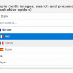 Enhanced Dropdown Select In Pure JavaScript – LC-select
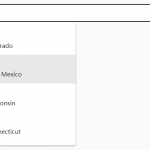 Enhanced Select Box In Vanilla JavaScript – Select.js