


Pico.css is a minimal, responsive, semantic, reader-centric design system implemented in pure CSS.
Features:
- Dark & Light mode based on prefers-color-scheme.
- Highly customizable with CSS/SCSS.
- 12-column based grid system.
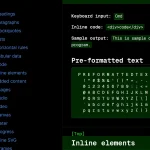
- Most commonly used components: Accordion, Card, Nav, Tooltip.
- Easy to extend using your own CSS.
More Like This:
- Minimal Classless CSS Framework – Simple.css
- Quickly Build Professional Webpages With The Tiny.css Classless Framework
- Minimal Classless CSS Framework To Build Elegant Webpages – Magick.css
- Performance-focused Classless CSS Framework – Fly.css
- Build Minimal Accessible Web Designs with Lissom.CSS
How to use it:
1. Download the package and insert the pico.min.css into the document.
<!-- All in one -->
<link rel="stylesheet" href="css/pico.min.css" />
<!-- Class-less version -->
<link rel="stylesheet" href="css/pico.classless.min.css" />
<!-- Fluid Class-less version -->
<link rel="stylesheet" href="css/pico.fluid.classless.min.css" />
<!-- Conditional styling -->
<link rel="stylesheet" href="css/pico.conditional.min.css" />
<!-- Themes -->
<link rel="stylesheet" href="css/pico.amber.min.css" />
2. Customize the Pico.css.
:root {
  --pico-font-family-emoji: "Apple Color Emoji", "Segoe UI Emoji", "Segoe UI Symbol", "Noto Color Emoji";
  --pico-font-family-sans-serif: system-ui, "Segoe UI", Roboto, Oxygen, Ubuntu, Cantarell, Helvetica, Arial, "Helvetica Neue", sans-serif, var(--pico-font-family-emoji);
  --pico-font-family-monospace: ui-monospace, SFMono-Regular, "SF Mono", Menlo, Consolas, "Liberation Mono", monospace, var(--pico-font-family-emoji);
  --pico-font-family: var(--pico-font-family-sans-serif);
  --pico-line-height: 1.5;
  --pico-font-weight: 400;
  --pico-font-size: 100%;
  --pico-text-underline-offset: 0.1rem;
  --pico-border-radius: 0.25rem;
  --pico-border-width: 0.0625rem;
  --pico-outline-width: 0.125rem;
  --pico-transition: 0.2s ease-in-out;
  --pico-spacing: 1rem;
  --pico-typography-spacing-vertical: 1rem;
  --pico-block-spacing-vertical: var(--pico-spacing);
  --pico-block-spacing-horizontal: var(--pico-spacing);
  --pico-grid-column-gap: var(--pico-spacing);
  --pico-grid-row-gap: var(--pico-spacing);
  --pico-form-element-spacing-vertical: 0.75rem;
  --pico-form-element-spacing-horizontal: 1rem;
  --pico-group-box-shadow: 0 0 0 rgba(0, 0, 0, 0);
  --pico-group-box-shadow-focus-with-button: 0 0 0 var(--pico-outline-width) var(--pico-primary-focus);
  --pico-group-box-shadow-focus-with-input: 0 0 0 0.0625rem var(--pico-form-element-border-color);
  --pico-modal-overlay-backdrop-filter: blur(0.375rem);
  --pico-nav-element-spacing-vertical: 1rem;
  --pico-nav-element-spacing-horizontal: 0.5rem;
  --pico-nav-link-spacing-vertical: 0.5rem;
  --pico-nav-link-spacing-horizontal: 0.5rem;
  --pico-nav-breadcrumb-divider: ">";
  --pico-icon-checkbox: url("data:image/svg+xml,%3Csvg xmlns='http://www.w3.org/2000/svg' width='24' height='24' viewBox='0 0 24 24' fill='none' stroke='rgb(255, 255, 255)' stroke-width='4' stroke-linecap='round' stroke-linejoin='round'%3E%3Cpolyline points='20 6 9 17 4 12'%3E%3C/polyline%3E%3C/svg%3E");
  --pico-icon-minus: url("data:image/svg+xml,%3Csvg xmlns='http://www.w3.org/2000/svg' width='24' height='24' viewBox='0 0 24 24' fill='none' stroke='rgb(255, 255, 255)' stroke-width='4' stroke-linecap='round' stroke-linejoin='round'%3E%3Cline x1='5' y1='12' x2='19' y2='12'%3E%3C/line%3E%3C/svg%3E");
  --pico-icon-chevron: url("data:image/svg+xml,%3Csvg xmlns='http://www.w3.org/2000/svg' width='24' height='24' viewBox='0 0 24 24' fill='none' stroke='rgb(136, 145, 164)' stroke-width='2' stroke-linecap='round' stroke-linejoin='round'%3E%3Cpolyline points='6 9 12 15 18 9'%3E%3C/polyline%3E%3C/svg%3E");
  --pico-icon-date: url("data:image/svg+xml,%3Csvg xmlns='http://www.w3.org/2000/svg' width='24' height='24' viewBox='0 0 24 24' fill='none' stroke='rgb(136, 145, 164)' stroke-width='2' stroke-linecap='round' stroke-linejoin='round'%3E%3Crect x='3' y='4' width='18' height='18' rx='2' ry='2'%3E%3C/rect%3E%3Cline x1='16' y1='2' x2='16' y2='6'%3E%3C/line%3E%3Cline x1='8' y1='2' x2='8' y2='6'%3E%3C/line%3E%3Cline x1='3' y1='10' x2='21' y2='10'%3E%3C/line%3E%3C/svg%3E");
  --pico-icon-time: url("data:image/svg+xml,%3Csvg xmlns='http://www.w3.org/2000/svg' width='24' height='24' viewBox='0 0 24 24' fill='none' stroke='rgb(136, 145, 164)' stroke-width='2' stroke-linecap='round' stroke-linejoin='round'%3E%3Ccircle cx='12' cy='12' r='10'%3E%3C/circle%3E%3Cpolyline points='12 6 12 12 16 14'%3E%3C/polyline%3E%3C/svg%3E");
  --pico-icon-search: url("data:image/svg+xml,%3Csvg xmlns='http://www.w3.org/2000/svg' width='24' height='24' viewBox='0 0 24 24' fill='none' stroke='rgb(136, 145, 164)' stroke-width='1.5' stroke-linecap='round' stroke-linejoin='round'%3E%3Ccircle cx='11' cy='11' r='8'%3E%3C/circle%3E%3Cline x1='21' y1='21' x2='16.65' y2='16.65'%3E%3C/line%3E%3C/svg%3E");
  --pico-icon-close: url("data:image/svg+xml,%3Csvg xmlns='http://www.w3.org/2000/svg' width='24' height='24' viewBox='0 0 24 24' fill='none' stroke='rgb(136, 145, 164)' stroke-width='3' stroke-linecap='round' stroke-linejoin='round'%3E%3Cline x1='18' y1='6' x2='6' y2='18'%3E%3C/line%3E%3Cline x1='6' y1='6' x2='18' y2='18'%3E%3C/line%3E%3C/svg%3E");
  --pico-icon-loading: url("data:image/svg+xml,%3Csvg fill='none' height='24' width='24' viewBox='0 0 24 24' xmlns='http://www.w3.org/2000/svg' %3E%3Cstyle%3E g %7B animation: rotate 2s linear infinite; transform-origin: center center; %7D circle %7B stroke-dasharray: 75,100; stroke-dashoffset: -5; animation: dash 1.5s ease-in-out infinite; stroke-linecap: round; %7D @keyframes rotate %7B 0%25 %7B transform: rotate(0deg); %7D 100%25 %7B transform: rotate(360deg); %7D %7D @keyframes dash %7B 0%25 %7B stroke-dasharray: 1,100; stroke-dashoffset: 0; %7D 50%25 %7B stroke-dasharray: 44.5,100; stroke-dashoffset: -17.5; %7D 100%25 %7B stroke-dasharray: 44.5,100; stroke-dashoffset: -62; %7D %7D %3C/style%3E%3Cg%3E%3Ccircle cx='12' cy='12' r='10' fill='none' stroke='rgb(136, 145, 164)' stroke-width='4' /%3E%3C/g%3E%3C/svg%3E");
}
@media (min-width: 576px) {
  :root {
    --pico-font-size: 106.25%;
  }
}
@media (min-width: 768px) {
  :root {
    --pico-font-size: 112.5%;
  }
}
@media (min-width: 1024px) {
  :root {
    --pico-font-size: 118.75%;
  }
}
@media (min-width: 1280px) {
  :root {
    --pico-font-size: 125%;
  }
}
@media (min-width: 1536px) {
  :root {
    --pico-font-size: 131.25%;
  }
}
Previews:

Pico.css Dark Theme

Pico.css Accordion

Pico.css Card

Pico.css Nav

Pico.css Tooltip
Changelog:
v2.1.1 (03/15/2025)
- Bugfixes
v2.0.4/5/6 (03/03/2024)
- Bugfixes
- Update dependencies
v2.0.3 (02/17/2024)
- Allow <button> as a modal closing icon
- Bugfixes
v2.0.0 (02/11/2024)
- New look and feel
- Easier customization
- Color palette
- Better breakpoints
- Group component
- Conditional Styling
v1.5.11 (12/30/2023)
- Include the close icon styles in the classless version
- Add missing chevron icon when accordion is disabled
- Upgrade dependencies
v1.5.10 (04/22/2023)
- Updated
v1.5.9 (04/09/2023)
- Updated
v1.5.8 (04/08/2023)
- Bugfixes
v1.5.7 (01/28/2023)
- Support for .grid + small in forms
- Bugfixes
v1.5.6 (10/04/2022)
- Add Dropdown component
- Add Breadcrumb component
- Improvements
- Bugfixes
v1.4.4 (01/03/2022)
- Allow role=button to any HTML element
- Bugfixes
v1.4.0 (10/25/2021)
- Update
v1.3.2 (07/18/2021)
- NEW: Loading indicator with aria-busy=”true”
- /scss code and /docs reorganization with an utilities category
- Disable prefers-reduced-motion: reduce for aria-busy=”true”
- Disable progress:indeterminate animation if prefers-reduced-motion: reduce is enabled
- Define font-size for <small>, <td>, <sub>, and <sup> with em unit
- Define sizes for type=”checkbox”, type=”radio”, and role=”switch” with em unit
- Add –form-element-disabled-opacity CSS var
- Delete ‘Variations’ category in README.md
Clean and Fixes
v1.3.1 (07/10/2021)
- Bugfixes and improvements
v1.3.0 (07/04/2021)
- CSS Vars refactoring for more customization
- Bugfixes
- Improvements
v1.2.1 (10/28/2020)
- Inputs: Set validation states with aria-invalid
- Small fixes
v1.2.0 (10/01/2020)
- Move SCSS vars for styles to CSS vars
- Add <progress>
- Add tooltip animation
v1.1.0 (09/14/2020)
- Clean and polish code and docs
- Consistent table borders in dark-mode
- Smaller list spacing
- Refactoring for Checkboxes and Radio buttons
- New form elements: type=date, type=datetime-local, type=month, type=time, type=week, type=range, type=search
- CSS icons color dynamisation
- Bigger Checkboxes and Radio buttons
- Styles reordering for a better slim version
- Better alignement for checkboxes & radios
- Optional use of !important in variables
- Add Bootstrap grid system and Form elements examples
v1.0.6 (09/12/2020)
- Sanitize.css integration
- Better color management for CSS icons (select, input.valid, input.invalid, details)
- Better heading spacings after a typography block
v1.0.5 (08/08/2020)
- Fix .contrast link inside <nav>
- Helper <small> for <select> and <textarea>
- Better rollover for a.contrast
See Also:
 Classless Themeable CSS Framework For Modern Web Design – Dev.css
 CSS Framework With Almost No Classes – no.css
 Classless CSS Framework with Georgia & Verdana Typography System – MCSS
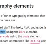 Minimal Classless CSS Framework – Simple.css
 Zero-Class Web Development with launch.css Framework
 Responsive Classes CSS Framework – Prime.css
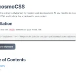 Modern Classless CSS Framework – cosmoCSS
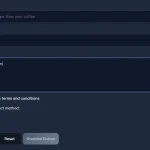 Modern Web Styling Without Class Declarations – Classless.css