


A CSS only responsive site navigation that automatically converts the normal horizontal nav into a sliding hamburger menu. Based on CSS transition, flexbox and checkbox+label tricks.
How to use it:
Add your menu list with a hamburger toggle button into your nav element:
<nav>
  <input type="checkbox" id="checkbox-demo">
  <label for="checkbox-demo">
    <ul class="menu demo">
      <li><a href="#">HOME</a></li>
      <li><a href="#">ABOUT</a></li>
      <li><a href="#">CONTACT</a></li>
      <li><a href="#">BLOG</a></li>
    </ul>
    <span class="toggle">☰</span>
  </label>
</nav>
Style the normal horizontal nav menu.
nav {
  margin: 50px auto;
  max-width: 700px;
  width: 95%;
  font-family: 'Roboto Condensed', sans-serif;
}
#checkbox1,
.toggle {
  display: none;
}
.menu {
  padding: 0;
  margin: 0;
  max-width: 700px;
  height: 50px;
  border-radius: 5px;
  display: flex;
  flex-direction: row;
  justify-content: space-around;
  align-items: center;
  list-style-type: none;
}
.menu li a {
  text-decoration: none;
  align-self: center;
  border-radius: 5px;
  font-size: 14px;
  padding: 10px 15px;
  transition: background .2s linear;
}
Style the hamburger menu on small screens.
@media screen and (max-width: 600px) {
  .menu li a {
    font-size: 13px;
  }
}
@media screen and (max-width: 550px) {
  .toggle {
    clear: both;
    display: block;
    text-align: center;
    font-size: 14px;
    line-height: 40px;
    cursor: pointer;
    width: 100%;
    height: 40px;
    font-size: 18px;
    color: #595959;
    background: #dbdbdb;
    border-bottom-left-radius: 5px;
    border-bottom-right-radius: 5px;
    transition: all .1s linear;
  }
  .toggle:hover {
    background: #cecece;
  }
  #checkbox1:checked + label .demo li {
    opacity: 1;
    visibility: visible;
    transition: all .7s linear;
  }
  #checkbox1:checked + label .demo {
    height: 200px;
  }
  .menu {
    border-radius: 0px;
    border-top-left-radius: 5px;
    border-top-right-radius: 5px;
    display: flex;
    flex-direction: column;
    justify-content: space-around;
    align-items: center;
    height: 0px;
    transition: height .3s linear;
  }
  .menu li {
    display: flex;
    /* magic */
    align-self: center;
    width: 95%;
    opacity: 0;
    visibility: hidden;
  }
  .menu li a {
    width: 95%;
    text-align: center;
    align-self: center;
    align-content: center;
  }
}
See Also:
 Responsive Sliding Hamburge Menu System
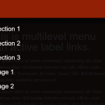 Mobile-friendly Hamburger Navigation With Submenus
 WCAG Compliant Responsive Dropdown Navigation – accessible-menu
 Accessible Dropdown Nav With Vanilla JavaScript – Clicky Menus
 Responsive Accessible Dropdown Menu Template with Vanilla JavaScript
 Modern One Page Scroll Web Template with Responsive Nav
 Responsive Dropdown/Off-canvas Navigation In Vanilla JavaScript – Menue
 Responsive Sticky Mega Menu – SnazzyMenu.js
I want to add sub-menus to this menu, how do I do it? I need the css code. thank you..