


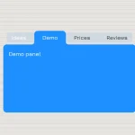
A pure CSS responsive tab view that will be automatically converted into a vertical accordion when the screen size is smaller than a breakpoint specified in the CSS3 media queries. Heavily based on CSS3 flex box model.
How to use it:
Create the html for the tab navigation and panels.
<div class="responsive-tabs">
  <input class="state" type="radio" title="tab-one" name="tabs-state" id="tab-one" checked />
  <input class="state" type="radio" title="tab-two" name="tabs-state" id="tab-two" />
  <input class="state" type="radio" title="tab-three" name="tabs-state" id="tab-three" />
  <div class="tabs flex-tabs">
    <label for="tab-one" id="tab-one-label" class="tab">Tab One</label>
    <label for="tab-two" id="tab-two-label" class="tab">Tab Two</label>
    <label for="tab-three" id="tab-three-label" class="tab">Tab Three</label>

    <div id="tab-one-panel" class="panel active">
      Panel 1
    </div>
    <div id="tab-two-panel" class="panel">
      Panel 2
    </div>
    <div id="tab-three-panel" class="panel">
       Panel 3
    </div>
  </div>
</div>
The basic CSS styles for the tab view.
.responsive-tabs {
  margin: 20px;
  width: 80%;
}
.responsive-tabs .state {
  position: absolute;
  left: -10000px;
}
.responsive-tabs .flex-tabs {
  display: -webkit-box;
  display: -webkit-flex;
  display: -ms-flexbox;
  display: flex;
  -webkit-box-pack: justify;
  -webkit-justify-content: space-between;
  -ms-flex-pack: justify;
  justify-content: space-between;
  -webkit-flex-wrap: wrap;
  -ms-flex-wrap: wrap;
  flex-wrap: wrap;
}
.responsive-tabs .flex-tabs .tab {
  -webkit-box-flex: 1;
  -webkit-flex-grow: 1;
  -ms-flex-positive: 1;
  flex-grow: 1;
  max-height: 40px;
}
.responsive-tabs .flex-tabs .panel {
  background-color: #fff;
  padding: 20px;
  min-height: 300px;
  display: none;
  width: 100%;
  -webkit-flex-basis: auto;
  -ms-flex-preferred-size: auto;
  flex-basis: auto;
}
.responsive-tabs .tab {
  display: inline-block;
  padding: 10px;
  vertical-align: top;
  background-color: #eee;
  cursor: hand;
  cursor: pointer;
  border-left: 10px solid #ccc;
}
.responsive-tabs .tab:hover { background-color: #fff; }
#tab-one:checked ~ .tabs #tab-one-label, #tab-two:checked ~ .tabs #tab-two-label, #tab-three:checked ~ .tabs #tab-three-label, #tab-four:checked ~ .tabs #tab-four-label {
  background-color: #fff;
  cursor: default;
  border-left-color: #69be28;
}
#tab-one:checked ~ .tabs #tab-one-panel, #tab-two:checked ~ .tabs #tab-two-panel, #tab-three:checked ~ .tabs #tab-three-panel, #tab-four:checked ~ .tabs #tab-four-panel { display: block; }
Make it responsive by changing the flex-direction and order in the CSS media queries.
@media (max-width: 600px) {
.flex-tabs {
  -webkit-box-orient: vertical;
  -webkit-box-direction: normal;
  -webkit-flex-direction: column;
  -ms-flex-direction: column;
  flex-direction: column;
}
.flex-tabs .tab {
  background: #fff;
  border-bottom: 1px solid #ccc;
}
.flex-tabs .tab:last-of-type { border-bottom: none; }
.flex-tabs #tab-one-label {
  -webkit-box-ordinal-group: 2;
  -webkit-order: 1;
  -ms-flex-order: 1;
  order: 1;
}
.flex-tabs #tab-two-label {
  -webkit-box-ordinal-group: 4;
  -webkit-order: 3;
  -ms-flex-order: 3;
  order: 3;
}
.flex-tabs #tab-three-label {
  -webkit-box-ordinal-group: 6;
  -webkit-order: 5;
  -ms-flex-order: 5;
  order: 5;
}
.flex-tabs #tab-four-label {
  -webkit-box-ordinal-group: 8;
  -webkit-order: 7;
  -ms-flex-order: 7;
  order: 7;
}
.flex-tabs #tab-one-panel {
  -webkit-box-ordinal-group: 3;
  -webkit-order: 2;
  -ms-flex-order: 2;
  order: 2;
}
.flex-tabs #tab-two-panel {
  -webkit-box-ordinal-group: 5;
  -webkit-order: 4;
  -ms-flex-order: 4;
  order: 4;
}
.flex-tabs #tab-three-panel {
  -webkit-box-ordinal-group: 7;
  -webkit-order: 6;
  -ms-flex-order: 6;
  order: 6;
}
.flex-tabs #tab-four-panel {
  -webkit-box-ordinal-group: 9;
  -webkit-order: 8;
  -ms-flex-order: 8;
  order: 8;
}
#tab-one:checked ~ .tabs #tab-one-label,  #tab-two:checked ~ .tabs #tab-two-label,  #tab-three:checked ~ .tabs #tab-three-label,  #tab-four:checked ~ .tabs #tab-four-label { border-bottom: none; }
#tab-one:checked ~ .tabs #tab-one-panel,  #tab-two:checked ~ .tabs #tab-two-panel,  #tab-three:checked ~ .tabs #tab-three-panel,  #tab-four:checked ~ .tabs #tab-four-panel { border-bottom: 1px solid #ccc; }
}
See Also:
 CSS-Only Inverted Corner Tabs With Anchor Positioning
 Animated Tabs Component In Pure CSS – Tabsy CSS
 Convert Sectioned Contents Into Tabs – tinytabs
 Lightweight Pure JavaScript Tabs With URL Persistence – Tabzy.js
 Dynamic External Content Tabs with Quicktabs.js
 Create Accessible Tabs with Pure CSS and Semantic HTML
 Accessible Tabs Component – tab-container
 Simple Fast Vanilla JavaScript Tabs
Really nice item – as well as the resource for designers & like. Glad to have found it!