


A pure HTML5 / CSS3 solution to make your html table more readable on small screens, without any JavaScript.
How to use it:
Use the data-label attribute to specify the corresponding thead element for each table cell.
<thead>
    <tr>
      <th scope="col">Column 1</th>
      <th scope="col">Column 2</th>
      <th scope="col">Column 3</th>
      <th scope="col">Column 4</th>
    </tr>
  </thead>
<tbody>
  <tr>
    <td scope="row" data-label="Column 1">1</td>
    <td data-label="Column 2">2</td>
    <td data-label="Column 3">3</td>
    <td data-label="Column 4">4</td>
  </tr>
  ...
</tbody>
Style the regular html table.
table {
  border: 1px solid #ccc;
  border-collapse: collapse;
  margin: 0;
  padding: 0;
  width: 100%;
}
table tr {
  background: #f8f8f8;
  border: 1px solid #ddd;
  padding: .35em;
}
table th, table td {
  padding: .625em;
  text-align: center;
}
table th {
  font-size: .85em;
  letter-spacing: .1em;
  text-transform: uppercase;
}
Make the html table responsive using CSS3 media queries.
@media screen and (max-width: 639px) {
table { border: 0; }
table thead { display: none; }
table tr {
  border-bottom: 3px solid #ddd;
  display: block;
  margin-bottom: .625em;
}
table td {
  border-bottom: 1px solid #ddd;
  display: block;
  font-size: .8em;
  text-align: right;
}
table td:before {
  content: attr(data-label);
  float: left;
  font-weight: bold;
  text-transform: uppercase;
}
table td:last-child { border-bottom: 0; }
}
See Also:
 Make Bootstrap 5 Tables More Readable On Mobile Devices – AvalynxTable.js
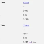 Tiny Responsive Table Web Component – table-saw
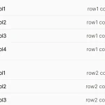 Pure CSS Responsive Solution – fluid-table.css
 Responsive Table Extension For Bulma Framework
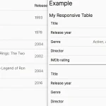 Responsive Accessible Table In Pure CSS
 Collapse Overflowing Table Columns Into A Dropdown – Podtablejs
 Responsive Table For Bootstrap 5 Framework
 Add Scroll Shadows To Wide HTML Tables – TableScrollShadow