


easyBar is a small, easy, yet highly customizable progress bar component written in vanilla JavaScript.
See also:
Features:
- Smooth animation.
- Custom progress indicator image.
- Custom trigger events.
- Custom background color/image.
- Allow to set the min/max values.
Basic usage:
Insert the minified version of the easyBar into the document.
<link rel="stylesheet" href="dist/css/easybar.min.css">
<script src="dist/js/easybar.min.js"></script>
Create a DIV container to hold the progress bar.
<div class="easybar" id="example"></div>
Create a new progress bar and set the current/max percentage values.
var instance = {
    selector: '#example',
    value: 3,
    maxValue: 10
}
Customize the appearance of the progress bar.
var instance = {
    selector: '#example',
    value: 3,
    maxValue: 10,
    height: '20px',
    backgroundColour: '#f1f1f1',
    backgroundImage: '',
    barColour: '#3B5998',
    barImage: '',
    wrapperWidth: '50%',
    wrapperPadding: '20px',
    image: '',
    imageHeight: '50',
    imageWidth: '50',
    borderRadius: '0',
    imagePercentageOffsetX: 0
}
Customize the progress animation.
var instance = {
    selector: '#example',
    value: 3,
    maxValue: 10,
    transitionDuration: 1500,
    transitionDelay: '400ms',
    transitionProperty: 'width',
    transitionTiming: 'linear'
}
Customize the trigger event/selector.
var instance = {
    selector: '#example',
    value: 3,
    maxValue: 10,
    trigger: 'onPageLoad',
    triggerSelector: ''
}
See Also:
 Pure CSS Progress Bar Library with Custom Themes – progress-bar.css
 Modern TypeScript Progress Bar Library – BProgress
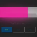 3D Liquid Progress Bar in Pure CSS/CSS3
 Easy Scroll Position Tracking – ScrollProgress.js
 Visualize Progress Data With Animated, Circular Progress Bars – ProgressJS
 Radial Progress Indicator For Click-and-hold Actions – HoldCircleJS
 Simple Scroll Progress Indicator For Long Pages – PageBar.js
 Generate Linear & Radial Progressbars Using CSS – Progress.css