


Aeon is a lightweight, accessible, themeable, multilingual, progressively enhanced, framework-agnostic date & time picker web component for the web.
It automatically adapts to the browser’s locale language and date format, making it perfect for international users.
How to use it:
1. Download and import the Aeon.
<script src="./dist/aeon.js" type="module"></script>
2. Add date & time input fields to the aeon-datepicker component. That’s it.
<aeon-datepicker>
  <input
    type="date"
    value="2023-04-17"
  />
  <input type="time" value="12:00" />
</aeon-datepicker>
3. Available props to customize the date picker.
- id: unique ID
- locale: custom local. The format can be further configured using
dateStyle - default-date: initial date
- default-time: initial time
- start-day: 0 – Sunday, 1 – Monday
- start-year: start year
- end-year: end year
- confirm-on-date: auto close the picker interface when a date is selected
- use-native: use the browser’s native inputs for date and time
- date-style: config date styles
<aeon-datepicker
  id="datepicker"
  locale="en-us"
  default-date="2023-04-18"
  default-time="09:30"
  start-day="1"
  start-year="1900"
  end-year="2050"
  confirm-on-date="true"
  use-native="false"
  date-style='{"month":"long"}'
>
  ...
</aeon-datepicker>
4. Get the current value.
document.querySelector('aeon-datepicker').value5. Customize the styles of the date picker.
:root {
  --aeon-rgb: 255, 255, 255;
  --aeon-bgRgb: 0, 0, 0;
}
<!-- OR --> <aeon-datepicker style="--aeon-rgb: 255, 255, 255; --aeon-bgRgb: 0, 0, 0;"> ... </aeon-datepicker>
See Also:
 Persian Jalali & Gregorian Date Picker in Vanilla JS – Azar Datepicker
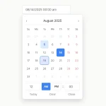 Accessible Customizable Date/Time/Date Picker for Modern Web App – FDatepicker
 Vanilla DateTime Picker: Zero-Dependency JS Date-Time Input
 Vanilla JS Date & Time Picker for Moderb Web Apps – Tuncxys DatePicker
 Versatile Datetime Picker For Bulma – bulma-calendar
 Powerful, Customizable JavaScript Date Picker – Datelite
 Easy Datetime & Date Range Pickers in Vanilla JavaScript
 Minimal Multilingual Datetime Picker Component – input-dt