


Tuncxys DatePicker is a dependency-free JavaScript library that creates customizable, themeable, and interactive date & time pickers.
Features:
- Multilingual Support: 20 built-in languages, including English, German, French, Spanish, and more. You can also add custom languages through the locales configuration.
- Theme System: 2 built-in themes (default, dark) or create your own themes with 30+ color properties.
- Smart Validation & Masking: Input validation prevents invalid date entries with visual feedback. The masking system guides users through date/time entry slot-by-slot.
- Smart Positioning: Automatic popup positioning adjusts based on viewport space.
- Flexible Mode Options: Works as date-only picker, time-only picker, or combined datetime picker.
- Date Restrictions: Disable specific days of the week, block specific dates, or set dynamic ranges relative to the current date.
How To Use It:
1. Install Tuncxys DatePicker and import it into your project.
# NPM
$ npm install tuncxys-datepicker
import 'tuncxys-datepicker/css';
import TuncxysDatePicker from 'tuncxys-datepicker';
2. Or download the package and load the following files into your HTML document.
<link rel="stylesheet" href="/dist/tuncxys-datepicker.css">
<script src="/dist/tuncxys-datepicker.umd.js"></script>
3. Create an empty DIV container to hold your date & time picker.
<div id="my-datepicker"></div>
4. Create a new ‘TuncxysDatePicker’ instance to build a default date & time picker.
new TuncxysDatePicker('#my-datepicker', {
  // options here
});
5. Available configuration options with default values:
new TuncxysDatePicker('#my-datepicker', {
  // Used to change the language.
  // Options: 'en', 'tr', 'de', 'fr', 'es', 'az', 'ru', 'ja', 'zh', 'ar', 'hi', 'pt', 'ko', 'it', 'id', 'vi', 'nl', 'pl', 'th', 'sv'
  lang: 'en',
  // Used to set the width of the datepicker (e.g., '100%', '300px').
  width: '300px',
  // Sets the name attribute for form submission (useful for PHP/Backend).
  submitName: 'date_output',
  // Enables/disables the time picker section.
  enableTime: true,
  // Enables/disables the date picker section.
  enableDate: true,
  // Sets certain days of the week as restricted (0 = Sunday, 1 = Monday, ... 6 = Saturday).
  disableWeekDays: [],
  // Disables specific dates on the calendar. Must use 'YYYY-MM-DD' format.
  disableDates: [],
  // Limits the calendar to 1 year. Must be set to false to use detailed restrictions below.
  enableLimit: false,
  // Enables detailed day-based offset restrictions.
  enableDayLimit: false,
  // Sets how many days backward from today are allowed.
  // Works on a day basis if enableDayLimit: true, otherwise on a year basis.
  minOffset: 100,
  // Sets how many days forward from today are allowed.
  // Works on a day basis if enableDayLimit: true, otherwise on a year basis.
  maxOffset: 100,
  // Sets the absolute lower limit of the calendar (Format: 'YYYY-MM-DD').
  // Note: enableDayLimit: true must be enabled.
  dateLowerLimit: null,
  // Sets the absolute upper limit of the calendar (Format: 'YYYY-MM-DD').
  // Note: enableDayLimit: true must be enabled.
  dateUpperLimit: null,
  // Callback function triggered when the value changes.
  // dateObj: JS Date object | dateStr: String format | instance: The picker instance
  onChange: (dateObj, dateStr, instance) => {
    console.log('Selected:', dateStr);
  },
  // Sets the visual theme.
  // Options: 'default', 'dark', 'custom'
  theme: 'default',
  // Object to customize colors. Active only when theme is set to 'custom'.
  colors: {
    // Base Structure
    background: '#ffffff',       // Main background (Popup and Input)
    border: '#e2e8f0',           // Input and Popup border
    borderFocus: '#3b82f6',      // Border color on focus
    text: '#1e293b',             // General text color
    placeholder: '#94a3b8',      // Placeholder text color
    // Icons and Selection
    icon: '#3b82f6',             // Calendar and time icons
    iconHoverBg: '#eff6ff',      // Background when hovering icon button
    selectionBg: '#3b82f6',      // Background when selecting text in input
    selectionText: '#ffffff',    // Text color when selecting text in input
    // Calendar Grid
    weekDayText: '#64748b',      // Weekday headers (Mon, Tue...)
    passiveText: '#cbd5e1',      // Faded days from other months
    hoverBg: '#f1f5f9',          // Background when hovering days
    selectedBg: '#3b82f6',       // Background of selected day
    selectedText: '#ffffff',     // Text color of selected day
    todayBg: 'rgba(59, 130, 246, 0.1)', // Background of "Today" indicator
    todayText: '#3b82f6',        // Text color of "Today"
    // Warnings and Errors
    restricted: '#ef4444',       // Text color of restricted days
    error: '#ef4444',            // Color of shake effect on invalid input
    toastBg: '#ef4444',          // Background of error toast
    toastText: '#ffffff',        // Text color of error toast
    // Time Picker
    timeHeader: '#64748b',       // HOUR and MINUTE headers
    timeNum: '#cbd5e1',          // Inactive (faded) time numbers
    timeNumActive: '#3b82f6',    // Active (centered) time number
    timeSeparator: '#e2e8f0',    // Lines between time columns
    timeGradStart: 'rgba(255, 255, 255, 1)', // Start of gradient (match background)
    timeGradEnd: 'rgba(255, 255, 255, 0)'    // End of gradient (transparent)
  }
});
6. API methods.
| Method | Description |
|---|---|
new TuncxysDatePicker(selector, options) | Initializes a new instance of the datepicker on the specified input element. |
destroy() | Completely removes the datepicker instance, cleans up the DOM, and removes all event listeners. |
toggleCalendar() | Programmatically toggles the visibility of the calendar popup (if enabled). |
toggleClock() | Programmatically toggles the visibility of the time picker popup (if enabled). |
closePickers() | Closes any currently open popups (calendar or time). |
Advance Examples:
Booking Systems with Date Restrictions
// Hotel booking: 30 days advance booking, no weekends
new TuncxysDatePicker('#hotel-booking', {
    enableDayLimit: true,
    minOffset: 1,           // Tomorrow onwards
    maxOffset: 30,          // 30 days maximum
    disableWeekDays: [0, 6], // No weekend bookings
    onChange(dateObj, dateStr, instance) {
        // Validate against backend availability
        checkRoomAvailability(dateStr);
    }
});
Historical Date Selection
// Birth date picker: past dates only
new TuncxysDatePicker('#birthdate', {
    enableDayLimit: true,
    maxOffset: 0,            // Today is maximum
    minOffset: -36500,       // ~100 years back
    enableTime: false,       // No time needed for birth dates
    onChange(dateObj, dateStr, instance) {
        calculateAge(dateObj);
    }
});
Multi-language Form
// Detect user language and apply
const userLang = navigator.language.split('-')[0]; // 'en', 'fr', 'de', etc.
const supportedLangs = ['en', 'tr', 'de', 'fr', 'es', 'az', 'ru', 'ja', 'zh', 'ar', 'hi', 'pt', 'ko', 'it', 'id', 'vi', 'nl', 'pl', 'th', 'sv'];
new TuncxysDatePicker('#intl-picker', {
    lang: supportedLangs.includes(userLang) ? userLang : 'en',
    theme: 'default'
});
Alternatives
- Flatpickr: A popular date picker with plugin ecosystem and framework integrations.
- Vanilla JS DatePicker: A lightweight option based on Bootstrap Datepicker but without jQuery dependency.
- 10 Best Date And Timer Pickers In Pure JavaScript
FAQs:
Q: How do I disable dates dynamically based on API data?
A: Initialize the picker with an empty disableDates array, then use the instance parameter from the onChange callback to update restrictions. Store the instance reference on initialization: const picker = new TuncxysDatePicker('#my-picker', {...}). Fetch your API data and update the configuration object. You’ll need to reinitialize the picker with the new configuration including the updated disableDates array from your API response.
Q: The time picker gradient looks broken after changing the background color. What’s wrong?
A: The timeGradStart and timeGradEnd properties must match your custom background color. If you set background: '#1a1a1a', you must also set timeGradStart: 'rgba(26, 26, 26, 1)' and timeGradEnd: 'rgba(26, 26, 26, 0)'. The gradient creates the fade effect at the top and bottom of the time roller. Mismatched colors cause visible borders or incorrect fading.
Q: What’s the best way to handle form validation with this picker?
A: Use the onChange callback to update a hidden input or state variable with the selected date. The dateStr parameter provides a formatted string ready for backend submission. The dateObj parameter gives you a JavaScript Date object for client-side validation. Add your validation logic inside the onChange handler to check date ranges, compare with other dates, or validate business rules before enabling form submission.
Changelog:
v1.0.5 (12/17/2025)
- Bugfixes
See Also:
 Persian Jalali & Gregorian Date Picker in Vanilla JS – Azar Datepicker
 Accessible Customizable Date/Time/Date Picker for Modern Web App – FDatepicker
 Vanilla DateTime Picker: Zero-Dependency JS Date-Time Input
 Versatile Datetime Picker For Bulma – bulma-calendar
 Powerful, Customizable JavaScript Date Picker – Datelite
 Easy Datetime & Date Range Pickers in Vanilla JavaScript
 Minimal Multilingual Datetime Picker Component – input-dt
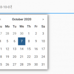 Minimal Date & Time Picker – dtsel