


A fancy responsive fullscreen expanding image gallery built using CSS3 flexbox and vanilla JavaScript.
How to use it:
Create the html for the expanding gallery.
<div class="panels">
  <div class="panel panel1">
    <p>Hey</p>
    <p>Let's</p>
    <p>Dance</p>
  </div>
  <div class="panel panel2">
    <p>Give</p>
    <p>Take</p>
    <p>Receive</p>
  </div>
  <div class="panel panel3">
    <p>Experience</p>
    <p>It</p>
    <p>Today</p>
  </div>
  <div class="panel panel4">
    <p>Give</p>
    <p>All</p>
    <p>You can</p>
  </div>
  <div class="panel panel5">
    <p>Life</p>
    <p>In</p>
    <p>Motion</p>
  </div>
</div>
The primary CSS/CSS3 styles.
.panels {
  min-height:100vh;
  overflow: hidden;
  display: flex;
}
.panel {
  background:#6B0F9C;
  box-shadow:inset 0 0 0 5px rgba(255,255,255,0.1);
  color:white;
  text-align: center;
  align-items:center;
  /* Safari transitionend event.propertyName === flex */
  /* Chrome + FF transitionend event.propertyName === flex-grow */
  transition:
    font-size 0.7s cubic-bezier(0.61,-0.19, 0.7,-0.11),
    flex 0.7s cubic-bezier(0.61,-0.19, 0.7,-0.11),
    background 0.2s;
  font-size: 20px;
  background-size:cover;
  background-position:center;
  flex: 1;
  justify-content: center;
  align-items: center;
  display: flex;
  flex-direction: column;
}
.panel > * {
  margin:0;
  width: 100%;
  transition:transform 0.5s;
  flex: 1 0 auto;
  display: flex;
  justify-content: center;
  align-items: center;
}
.panel > *:first-child { transform: translateY(-100%); }
.panel.open-active > *:first-child { transform: translateY(0%); }
.panel > *:last-child { transform: translateY(100%); }
.panel.open-active > *:last-child { transform: translateY(0%); }
.panel p {
  text-transform: uppercase;
  font-family: 'Roboto', cursive;
  text-shadow:0 0 4px rgba(0, 0, 0, 0.72), 0 0 14px rgba(0, 0, 0, 0.45);
  font-size: 2em;
}
.panel p:nth-child(2) {
  font-size: 4em;
}
.panel.open {
  flex: 5;
  font-size:40px;
}
Add your own background images to the panels.
.panel1 { background-image:url(1.jpg);}
.panel2 { background-image:url(2.jpg);}
.panel3 { background-image:url(3.jpg);}
.panel4 { background-image:url(4.jpg);}
.panel5 { background-image:url(5.jpg);}
The JavaScript to toggle the CSS styles as you click on the panels.
const panels = document.querySelectorAll('.panel');
function toggleOpen() {
  this.classList.toggle('open');
  // console.log('abro/cierro')
}
 function toggleActive(e) {
    //console.log(e)
  if(e.propertyName.includes('flex')) {
    this.classList.toggle('open-active')
    }
 }

  panels.forEach(function(panel) {
  panel.addEventListener('click', toggleOpen)
  panel.addEventListener('transitionend', toggleActive)
});
See Also:
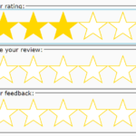 Accessible Star Rating Control Using Radio Buttons
 Responsive Sidebar Using Bootstrap 5 Offcanvas
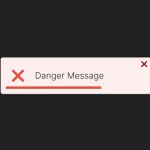 Intuitive Toast-like Popup Messages In Vanilla JavaScript
 Easy Alert & Notification Dialog Library – AsgarAlert
 Easy Customization Of HTML Select Boxes – nice-select2
 Create Guided Tours And Highlight Elements – Tooltip Sequence
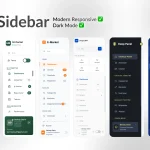 6 Modern Responsive Sidebar Navigation Components for TailwindCSS
 Side Revealing Navigation In Plain HTML/CSS