


Griddle is a CSS front-end framework that mainly provides a flexbox based grid system for modern mobile-first web design.
Features:
- xs, sm, md, lg, xl, and xxl breakpoints.
- Custom space between grid items.
- Allows you to specify the number of rows.
- Spacing, Display, Color, and Image modifiers.
- Customizable via CSS variables.
How to use it:
1. Install and download the Griddle.
# Yarn
$ yarn add @daveberning/griddle
# NPM
$ npm install @daveberning/griddle --save
2. Import the Griddle.
import '@daveberning/griddle;
// or
@import '@daveberning/griddle;
<!-- Or-->
<!-- Grid Only -->
<link rel="stylesheet" href="dist/grid.css" />
<!-- With Additional Features -->
<link rel="stylesheet" href="dist/grid-plus.css" />
<!-- All In One -->
<link rel="stylesheet" href="dist/main.css" />
3. Create a basic grid layout.
- has-col-{number}-{breakpoint}: the number of rows
- is-col-{number}-{breakpoint}: the number of columns
<div class="is-grid has-col-2 has-col-4-lg">
  <div class="is-col-1 is-col-6-md">Column One</div>
  <div class="is-col-1">Column Two</div>
  ...
</div>
4. Add gap to grid items:
<div class="is-grid">
  Gap: 1rem
</div>
<div class="is-grid has-col-gap-lg">
  Gap: 2rem
</div>
<div class="is-grid has-col-gap-md">
  Gap: 1.5rem
</div>
<div class="is-grid has-no-col-gap">
  No Gap
</div>
<div class="is-grid has-row-gap-lg">
  Row Gap: 2rem
</div>
<div class="is-grid has-row-gap-md">
  Row Gap: 1.5rem
</div>
<div class="is-grid has-no-row-gap">
  No Row Gap
</div>
5. Determine the direction of the grid layout.
<div class="is-grid is-rtl">
  ...
</div>
<div class="is-grid is-rtl-{breakpoints}">
  Breakpoints: xs, sm, md, lg, xl, and xxl
</div>
6. Determine the placement of grid items:
- is-placed-left
- is-placed-right
- is-placed-center
- is-placed-start
- is-placed-normal
<div class="is-grid is-rtl">
  <div class="is-placed-right">
  </div>
</div>
7. Available utility classes specific to typography.
<!-- Heading Elements -->
<h1 class="is-h1">H1</h1>
<h2 class="is-h2">H2</h2>
<h3 class="is-h3">H3</h3>
<h4 class="is-h4">H4</h4>
<h5 class="is-h5">H5</h5>
<h6 class="is-h6">H6</h6>
<!-- Text Colors -->
<p class="is-text-primary">Text</p>
<p class="is-text-secondary">Text</p>
<p class="is-text-tertiary">Text</p>
<p class="is-text-cta">Text</p>
<p class="is-text-white">Text</p>
<p class="is-text-black">Text</p>
<p class="is-text-grey">Text</p>
<p class="is-text-success">Text</p>
<p class="is-text-warning">Text</p>
<p class="is-text-danger">Text</p>
<p class="is-text-info">Text</p>
<!-- Text Styles -->
<p class="is-bold">Text</p>
<p class="is-strike">Text</p>
<p class="is-italic">Text</p>
<p class="is-capitalized">Text</p>
<p class="is-uppercase">Text</p>
<p class="is-aligned-left">Text</p>
<p class="is-aligned-center">Text</p>
<p class="is-aligned-right">Text</p>
<!-- Elements -->
<button class="is-button">Button</button>
<a class="is-button is-cta is-rounded is-outline">Another Button</button>
<p class="is-alert">Alert Message</p>
<p class="is-tag">Tag</p>
8. Apply margins and paddings to elements:
- has-m-{breakpoint}
- has-p-{breakpoint}
- has-m-top-{breakpoint}
- has-m-right-{breakpoint}
- has-m-bottom-{breakpoint}
- has-m-left-{breakpoint}
- has-p-top-{breakpoint}
- has-p-right-{breakpoint}
- has-p-bottom-{breakpoint}
- has-p-left-{breakpoint}
9. Align content in the layout with the following modifier classes:
- is-centered
- is-centered-horizontally
- is-centered-vertically
10. Display modifier classes:
- is-block
- is-inline-block
- is-flex
- is-inline-flex
- is-grid
- is-inline-grid
- is-device: Shows an element on a touch device
- is-screen: Shows an element on a non-touch screen device
11. Make images fully responsive.
<img src="1.jpg" class="is-responsive is-rounded" />
12. Customize the framework by overriding the default CSS variables.
/* CSS Variables
----------------------------------------- */
:root {
  /* Colors */
  --primary: #016575;
  --secondary: #03414b;
  --tertiary: #003242;
  --cta: #EB8A5E;
  --white: #ffffff;
  --black: #000000;
  --grey: #ececec;
  --success: #48C774;
  --warning: #FFDD57;
  --danger: #F14668;
  --info: #3298DC;
  /* Typography */
  --h1: 4rem;
  --h2: 3.5rem;
  --h3: 3rem;
  --h4: 2.5rem;
  --h5: 2rem;
  --h6: 1.5rem;
  --root-font-size: 16px; /* REM values are based on this */
  --root-line-height: 2rem;
  /* Misc */
  --container-width: 1400px;
  --border-radius: .25rem;
  --border-radius-md: .5rem;
  --border-radius-lg: .75rem;
  --spacing: 1rem;      /* Used for .has-m and .has-p classes */
  --spacing-md: 1.5rem; /* Used for .has-m-md and .has-p-md classes */
  --spacing-lg: 2rem;   /* Used for .has-m-lg and .has-p-lg classes */
  /* Grid Gaps */
  --col-gap: 1rem;
  --col-gap-md: 1.5rem;
  --col-gap-lg: 2rem;
  --row-gap: 1rem;
  --row-gap-md: 1.5rem;
  --row-gap-lg: 2rem;
}
See Also:
 Terminal-Inspired CSS Library for Retro Web UI – WebTUI
 Classless Themeable CSS Framework For Modern Web Design – Dev.css
 CSS Framework With Almost No Classes – no.css
 Terminal Style CSS Framework – terminal.css
 Classless CSS Framework with Georgia & Verdana Typography System – MCSS
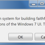 7.css: Windows 7 CSS Framework
 Minimalist CSS Framework For Creating Modern Web Pages – Mgplus
 Minimal Classless CSS Framework – Simple.css