


A hamburger mega menu with an animated fullscreen overlay built with JavaScript and CSS/CSS3.
How to use it:
Create the fullscreen mega menu with a close button.
<nav id="overlay">
  <img src="images/close-button.svg" alt="menu" class="close-button"  id="close-menu">
  <ul>
      <li>
          <a href="#">Home</a>
          <span>Watch out, This is my site</span>
      </li>
      <li>
          <a href="#">About Me</a>
          <span>Watch out, This is my site</span>
      </li>
      <li>
          <a href="#">Services</a>
          <span>Watch out, This is my site</span>
      </li>
      <li>
          <a href="#">Contact</a>
          <span>Watch out, This is my site</span>
      </li>
  </ul>
</nav>
Create a hamburger button to toggle the mega menu.
<img src="images/burger-menu.svg" alt="menu" class="menu-btn" id="open-menu">
Style the mega menu in the CSS.
nav .close-button {
  width: 18px;
  float: right;
  cursor: pointer;
  opacity: 0;
}
nav ul {
  list-style-type: none;
  margin: 10% auto 0 auto;
  padding: 0;
  display: -ms-grid;
  display: grid;
  -ms-grid-columns: (auto)[4];
      grid-template-columns: repeat(4, auto);
  width: 80%;
}
nav ul a {
  color: white;
  font-weight: bold;
  font-size: 1.4em;
}
nav ul span {
  color: gray;
  display: block;
  font-size: .75em;
  margin-top: 20px;
}
nav ul li {
  opacity: 0;
}
The necessary CSS/CSS3 rules for the animated overlay.
.show-menu {
  display: block;
  -webkit-animation: slide-menu 1s ease-in forwards;
          animation: slide-menu 1s ease-in forwards;
}
.show-menu .close-button {
  -webkit-animation: show-x 1s 1s forwards;
          animation: show-x 1s 1s forwards;
}
.show-menu li:nth-of-type(1) {
  -webkit-animation: menu-item-anim .6s forwards 1s ease-in-out;
          animation: menu-item-anim .6s forwards 1s ease-in-out;
}
.show-menu li:nth-of-type(2) {
  -webkit-animation: menu-item-anim .6s forwards 1.2s ease-in-out;
          animation: menu-item-anim .6s forwards 1.2s ease-in-out;
}
.show-menu li:nth-of-type(3) {
  -webkit-animation: menu-item-anim .6s forwards 1.6s ease-in-out;
          animation: menu-item-anim .6s forwards 1.6s ease-in-out;
}
.show-menu li:nth-of-type(4) {
  -webkit-animation: menu-item-anim .6s forwards 1.8s ease-in-out;
          animation: menu-item-anim .6s forwards 1.8s ease-in-out;
}
@-webkit-keyframes slide-menu {
  from {
    -webkit-transform: scaleX(0);
            transform: scaleX(0);
  }
  to {
    -webkit-transform: scaleX(1);
            transform: scaleX(1);
  }
}
@keyframes slide-menu {
  from {
    -webkit-transform: scaleX(0);
            transform: scaleX(0);
  }
  to {
    -webkit-transform: scaleX(1);
            transform: scaleX(1);
  }
}
@-webkit-keyframes show-x {
  from {
    opacity: 0;
  }
  to {
    opacity: 1;
  }
}
@keyframes show-x {
  from {
    opacity: 0;
  }
  to {
    opacity: 1;
  }
}
@-webkit-keyframes menu-item-anim {
  from {
    -webkit-transform: translateY(70%);
            transform: translateY(70%);
    opacity: 0;
  }
  to {
    -webkit-transform: translateY(0);
            transform: translateY(0);
    opacity: 1;
  }
}
@keyframes menu-item-anim {
  from {
    -webkit-transform: translateY(70%);
            transform: translateY(70%);
    opacity: 0;
  }
  to {
    -webkit-transform: translateY(0);
            transform: translateY(0);
    opacity: 1;
  }
}
Activate the mega menu by toggling CSS classes using JavaScript.
const overlay = document.getElementById('overlay');
const closeMenu = document.getElementById('close-menu');

document.getElementById('open-menu') .addEventListener('click', function() {
    overlay.classList.add('show-menu');
});
document.getElementById('close-menu').addEventListener('click', function(){
    overlay.classList.remove('show-menu')
})
See Also:
 Responsive Sliding Hamburge Menu System
 Responsive Sticky Mega Menu – SnazzyMenu.js
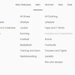 Responsive Dropdown Mega Menu In JavaScript
 Simple Sidebar Hamburger Menu In CSS
 Responsive Sidebar Navigation With Hamburger Toggle Button
 Expanding Dropdown Menu In JavaScript
 Hamburger Site Navigation With Menu Rotation
 Responsive Mega Menu In JavaScript
This is gorgeous. I’ve got no idea at the moment how to actually execute this (WP) but I am going to see if I can find out.
Thank you
Cheers
Karin