


A set of animated, Google inspired, 4-dot loading indicators built using pure CSS.
Animations Included:
- Bounce (Demo)
- Disappear (Demo)
- Growth (Demo)
- Shrink (Demo)
- Waves (Demo)
- Square Rotate (Demo)
- Square (Demo)
- Switch (Demo)
How to use it:
1. Create the HTML for the 4-dot loading indicator. Add dark/white class name to change the background.
<div class="overflow dark" id="preload">
<div class="circle-line">
<div class="circle-red"> </div>
<div class="circle-blue"> </div>
<div class="circle-green"> </div>
<div class="circle-yellow"> </div>
</div>
</div>2. Include an animation CSS of your choice on the webpage. That’s it.
<link rel="stylesheet" href="4circle-line-bounce/style.css">
<link rel="stylesheet" href="4circle-line-disappear/style.css">
<link rel="stylesheet" href="4circle-line-growth/style.css">
<link rel="stylesheet" href="4circle-line-shrink/style.css">
<link rel="stylesheet" href="4circle-line-waves/style.css">
<link rel="stylesheet" href="4circle-square-rotate/style.css">
<link rel="stylesheet" href="4circle-square/style.css">
<link rel="stylesheet" href="4circle-switch/style.css">
See Also:
 Auto-Generated Skeleton Loader Web Component for Any Framework – phantom-ui
 Material Design 3 Expressive Loading Indicator to React/Vue/Svelte/Vanilla JS
 Math Curve Loaders: Mathematical SVG Loading Animations in CSS & JS
 Lightweight Loading Overlay Plugin For Bootstrap 5 – AvalynxLoader
 12+ Lightweight CSS Loading Animations – NanoLoader
 Modern TypeScript Progress Bar Library – BProgress
 Google-Style 4-Dot Bounce Loading Indicator with Pure CSS/CSS3
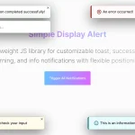 Lightweight JavaScript Notification System – Simple Display Alert