| Author: | bevacqua |
|---|---|
| Views Total: | 13,597 views |
| Official Page: | Go to website |
| Last Update: | July 14, 2021 |
| License: | MIT |
Preview:

Description:
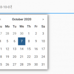
Rome.js is a simple to use JS library for appending a highly customizable date & time picker on your input field when clicked/focused on.
Requires moment.js.
See also:
Installation:
# NPM
$ npm install @bevacqua/rome --save
Basic Usage:
Load the required rome.js at the bottom of your web page.
<script src="dist/rome.js"></script>
<-- or -->
<script src="/path/to/moment.js"></script>
<script src="dist/rome.standalone.js"></script>
Load the rome.css into the head section of your page to style the date & time picker.
<link href="dist/rome.css" rel="stylesheet">
Create a regular text field that allows you to pick a date & time from a popup panel.
<input id="dt" class="input">
Initialize the date & time picker with just one line of Javascript.
rome(dt,options);
Available options:
appendTo: DOM element where the calendar will be appended to. Takes ‘parent’ as the parent elementautoClose: Closes the calendar when picking a day or a timeautoHideOnBlur: Hides the calendar when focusing something other than the input fieldautoHideOnClick: Hides the calendar when clicking awaydate: The calendar shows days and allows you to navigate between monthsdateValidator: Function to validate that a given date is considered valid. Takes a native Date parameter.dayFormat: Format string used to display days on the calendarinitialValue: Format string used to display days on the calendarinputFormat: Format string used for the input field as well as the results of romeinvalidate: Ensures the date is valid when the field is blurredstrictParse: Compares input strictly against inputFormat, and partial matches are discardedmax: Disallow dates past max. Takes string, Date, momentmin: Disallow dates before min. Takes string, Date, momentmonthFormat: Format string used by the calendar to display months and their yearmonthsInCalendar: How many months get rendered in the calendarrequired: Is the field required or do you allow empty values?styles: CSS classes applied to elements on the calendartime: The calendar shows the current time and allows you to change it using a dropdowntimeFormat: Format string used to display the time on the calendartimeInterval: Seconds between each option in the time dropdowntimeValidator: Function to validate that a given time is considered valid. Takes a native Date parameter.weekdayFormat: Format used to display weekdays. Takes min (Mo), short (Mon), long (Monday), or an array with seven strings of your choosing.weekStart: Day considered the first of the week. Range: Sunday 0 – Saturday 6
const opitons = {
  "appendTo": document.body,
  "autoClose": true,
  "autoHideOnBlur": true,
  "autoHideOnClick": true,
  "date": true,
  "dateValidator": Function.prototype,
  "dayFormat": "DD",
  "initialValue": null,
  "inputFormat": "YYYY-MM-DD HH:mm",
  "invalidate": true,
  "max": null,
  "min": null,
  "monthFormat": "MMMM YYYY",
  "monthsInCalendar": 1,
  "required": false,
  "strictParse": false,
  "styles": {
    "back": "rd-back",
    "container": "rd-container",
    "date": "rd-date",
    "dayBody": "rd-days-body",
    "dayBodyElem": "rd-day-body",
    "dayConcealed": "rd-day-concealed",
    "dayDisabled": "rd-day-disabled",
    "dayHead": "rd-days-head",
    "dayHeadElem": "rd-day-head",
    "dayRow": "rd-days-row",
    "dayTable": "rd-days",
    "month": "rd-month",
    "next": "rd-next",
    "positioned": "rd-container-attachment",
    "selectedDay": "rd-day-selected",
    "selectedTime": "rd-time-selected",
    "time": "rd-time",
    "timeList": "rd-time-list",
    "timeOption": "rd-time-option"
  },
  "time": true,
  "timeFormat": "HH:mm",
  "timeInterval": 1800,
  "timeValidator": Function.prototype,
  "weekdayFormat": "min",
  "weekStart": moment().weekday(0).day()
}
API methods.
// Shows the picker
.show()
// Hides the picker
.hide()
// Gets the current date
.getDate()
// Gets the current date string
.getDateString(format)
// Gets the moment object
.getMoment()
// Destroys the picker
.destroy()
// restores the picker
.restore(options)
// Updates options
.options(options?)
// Resets the options
.options.reset()
// Emits all values
.emitValues()
// Sets the value
.setValue(value)
// Refreshes the picker
.refresh()
// Backs to the previous month
.back()
// Goes to the next month
.next()
Changelog:
v3.0.4 (07/14/2021)
- Update
v3.0.2 (03/20/2019)
- Updated options, methods, events.
v2.1.22 (05/30/2018)
- fixed bugs


