


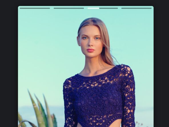
The slide-stories.js JavaScript library enables you to create an Instagram inspired automatic photo slideshow on the webpage.
It displays segmented progress bars on the top of the slideshow and automatically navigates to the next photo when the countdown is finished.
You’re also allowed to manually navigate to the next or previous image by clicking on the right side or left side of the current image.
How to use it:
1. Add images and next/prev controls to the slideshow.
<div data-slide="slide" class="slide">
  <div class="slide-items">
    <img src="1.jpg" alt="Img 1">
    <img src="2.jpg" alt="Img 2">
    <img src="3.jpg" alt="Img 3">
    <img src="4.jpg" alt="Img 4">
    ...
  </div>
  <nav class="slide-nav">
    <div class="slide-thumb"></div>
    <button class="slide-prev">Prev</button>
    <button class="slide-next">Next</button>
  </nav>
</div>
2. Load the main script slide-stories.js at the end of the document.
<script src="./slide-stories.js"></script>
3. The necessary CSS styles for the slideshow.
img {
  max-width: 100%;
  display: block;
}
.slide {
  max-width: 380px;
  margin: 20px auto;
  display: grid;
  box-shadow: 0 4px 20px 2px rgba(0, 0, 0, 0.4);
}
.slide-items {
  position: relative;
  grid-area: 1/1;
  border-radius: 5px;
  overflow: hidden;
}
.slide-nav {
  grid-area: 1/1;
  z-index: 1;
  display: grid;
  grid-template-columns: 1fr 1fr;
  grid-template-rows: auto 1fr;
}
.slide-nav button {
  -webkit-appearance: none;
  -webkit-tap-highlight-color: rgba(0, 0, 0, 0);
  opacity: 0;
}
.slide-items > * {
  position: absolute;
  top: 0px;
  opacity: 0;
  pointer-events: none;
}
.slide-items > .active {
  position: relative;
  opacity: 1;
  pointer-events: initial;
}
.slide-thumb {
  display: flex;
  grid-column: 1 / 3;
}
.slide-thumb > span {
  flex: 1;
  display: block;
  height: 3px;
  background: rgba(0, 0, 0, 0.4);
  margin: 5px;
  border-radius: 3px;
  overflow: hidden;
}
.slide-thumb > span.active::after {
  content: '';
  display: block;
  height: inherit;
  background: rgba(255, 255, 255, 0.9);
  border-radius: 3px;
  transform: translateX(-100%);
  animation: thumb 5s forwards linear;
}
@keyframes thumb {
  to {
    transform: initial;
  }
}
See Also:
 Add Instagram Photos To Your Website Using instafeed.js
 Display Instagram User Profile With insta-feed.js Library
 Add Instagram Photos To Your Website Without API – instagramFeed
 JavaScript Library To Fetch And Display Instagram Feeds On The Webpage – instafetch.js
 Integrate A Instagram Stream Into Your Webpage – Minigram.js
 Responsive Hamburger Header Navigation – side-menu-component
 Customizable Browser Update Prompt Dialog – badbrowser.js
 Minimalist Countdown Timer with timerJS.js