


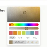
The pickr JavaScript library helps you create an elegant, customizable, touch-enabled color picker for your app.
Supports HEX, RGB, HSL, HSV, CMYK color formats and alpha channel.
Also provides a function that converts the default color values (HSVa) to HSLa, RGBa, HEX and CMYK values.
Supports both browser and node.js.
How to use it:
Install the pickr.
# NPM
$ npm install pickr-widget --save
Add the pickr’s JavaScript to the page.
<script src="dist/pickr.min.js"></script>
Add a theme CSS to the page.
<link href="themes/classic.min.css" rel="stylesheet">
<link href="themes/monolith.min.css" rel="stylesheet">
<link href="themes/nano.min.css" rel="stylesheet">
Create a container element to place the color picker.
<div class="example"></div>
Initialize the pickr to generate a default color picker.
const pickr = new Pickr({
      el: '.example',
      default: '#42445A' // default color
});
Customize the position of the color picker when triggered.
const pickr = new Pickr({
      el: '.example',
      default: '#42445A',
      position: 'middle', // or 'top', 'left'
});
Customize the color picker component.
const myPickr = new Pickr({
      el: '.example',
      components: {
        // color preview
        preview: true,
        // enables opacity slider
        opacity: true,
        // enables HUE slider
        hue: true,     // Hue slider
        // shows/hides controls
        output: {
          hex: true,
          rgba: true,
          hsla: true,
          hsva: true,
          cmyk: true,
          input: true
        }
      }
});
Available color converters.
hsva.toHSVA()
hsva.toHSLA()
hsva.toRGBA()
hsva.toHEX()
hsva.toCMYK()
hsva.clone()
Available options to customize the color picker.
const pickr = new Pickr({
  // custom classes
  appClass: null,
  // 'classic', 'monolith' or 'nano'
  theme: 'classic',
  // Selector or element which will be replaced with the actual color-picker.
  // Can be a HTMLElement.
  el: '.color-picker',
  // Where the pickr-app should be added as child.
  container: 'body',
  // Using the 'el' Element as button, won't replace it with the pickr-button.
  // If true, appendToBody will also be automatically true.
  useAsButton: false,
  // Padding in pixels
  padding: 8,
  // i18n
  i18n: {
    // Strings visible in the UI
    'ui:dialog': 'color picker dialog',
    'btn:toggle': 'toggle color picker dialog',
    'btn:swatch': 'color swatch',
    'btn:last-color': 'use previous color',
    'btn:save': 'Save',
    'btn:cancel': 'Cancel',
    'btn:clear': 'Clear',
    // Strings used for aria-labels
    'aria:btn:save': 'save and close',
    'aria:btn:cancel': 'cancel and close',
    'aria:btn:clear': 'clear and close',
    'aria:input': 'color input field',
    'aria:palette': 'color selection area',
    'aria:hue': 'hue selection slider',
    'aria:opacity': 'selection slider'
  },
  // Start state. If true 'disabled' will be added to the button's classlist.
  disabled: false,
  // If set to false it would directly apply the selected color on the button and preview.
  comparison: true,
  // Default color
  default: 'fff',
  // Valid options are `HEX`, `RGBA`, `HSVA`, `HSLA` and `CMYK`.
  defaultRepresentation: null,
  // Precision of output string (only effective if components.interaction.input is true)
  outputPrecision: 0,
  // move pickr in a non-alpha mode
  lockOpacity: false,
  // auto reposition the color picker to fit the screen
  autoReposition: true,
  // e.g. ['#F44336', '#E91E63', '#9C27B0', '#673AB7']
  swatches: null,
  // Enables inline mode
  inline: false,
  // 'v' => opacity- and hue-slider can both only moved vertically.
  // 'hv' => opacity-slider can be moved horizontally and hue-slider vertically.
  sliders: null,
  // Option to keep the color picker always visible. You can still hide / show it via
  // 'pickr.hide()' and 'pickr.show()'. The save button keeps his functionality, so if
  // you click it, it will fire the onSave event.
  showAlways: false,
  // Closes the picker on scroll
  closeOnScroll: false,
  // Close pickr with this specific key.
  // Default is 'Escape'. Can be the event key or code.
  closeWithKey: 'Escape',
  // Defines the position of the color-picker. Available options are
  // top, left and middle relativ to the picker button.
  // If clipping occurs, the color picker will automatically choose his position.
  position: 'bottom-middle',
  // Enables the ability to change numbers in an input field with the scroll-wheel.
  // To use it set the cursor on a position where a number is and scroll, use ctrl to make steps of five
  adjustableNumbers: true,
  // Show or hide specific components.
  // By default only the palette (and the save button) is visible.
  components: {
      palette: true, // // Defines if the palette itself should be visible.
      preview: true, // Left side color comparison
      opacity: true, // Opacity slider
      hue: true,     // Hue slider
      // Bottom interaction bar, theoretically you could use 'true' as propery.
      // But this would also hide the save-button.
      interaction: {
          hex: true,  // hex option  (hexadecimal representation of the rgba value)
          rgba: true, // rgba option (red green blue and alpha)
          hsla: true, // hsla option (hue saturation lightness and alpha)
          hsva: true, // hsva option (hue saturation value and alpha)
          cmyk: true, // cmyk option (cyan mangenta yellow key )
          input: true, // input / output element
          cancel: false, // Display Cancel Button, resets the color to the previous state
          clear: true, // Button which provides the ability to select no color,
          save: true   // Save button
      },
  },

});
API methods.
// sets a color
myPickr.setHSVA(h,s,v,a)
// parses a string
myPickr.setColor(string)
// get selected color
myPickr.getSelectedColor()
// shows the color picker
myPickr.show()
// hides the color picker
myPickr.hide()
// disables the color picker
myPickr.disable()
// enables the color picker
myPickr.enable()
// checks if is ipen
myPickr.isOpen()
// returns the root DOM element
myPickr.getRoot():HTMLElement
// returns the current HSVa color
myPickr.getColor()
// destroy the color picker
myPickr.destroy()
// destroy the color picker and remove it from DOM
myPickr.destroyAndRemove()
// Changes the current color-representation. Valid options are HEX, RGBA, HSVA, HSLA and CMYK,
myPicker.setColorRepresentation(type:String);
// Saves the color
myPicker.applyColor(silent:Boolean);
// Adds a color to the swatch palette
myPicker.addSwatch(color:String);
// Removes a color from the swatch palette
myPicker.removeSwatch(index:Number);
Event handlers.
myPicker.on('init', instance => {
    console.log('init', instance);
}).on('save', (color, instance) => {
    console.log('save', color, instance);
}).on('change', (color, instance) => {
    console.log('change', color, instance);
}).on('swatchselect', (color, instance) => {
    console.log('swatchselect', color, instance);
}).on('clear', (instance) => {
    console.log('clear', instance);
}).on('cancel', (instance) => {
    console.log('cancel', instance);
}).on('hide', (instance) => {
    console.log('hide', instance);
}).on('show', (instance) => {
    console.log('show', instance);
}).on('changestop', (instance) => {
    console.log('changestop', instance);
});
Changelog:
v1.9.1 (05/10/2024)
- Bugfixes
v1.9.0 (05/10/2024)
- Support percentages for alpha in hsl and hsv.
- Support new rgba syntax with relative values
v1.8.2 (06/27/2020)
- Fix broken comparison option due to switch to css variables
- Fix broken clear button
v1.8.1 (05/13/2020)
- Add missing types for the i18n properties
- Emit correct color when clicking on the previous color
- Fix possible stackoverflow in hide and show functions
- Use CSS Variables for all sorts of color propagation
v1.8.0 (09/07/2020)
changeandchangeStopnow have different arguments- Fix possible issue when pickr gets destroyed before initialization
v1.7.4 (09/07/2020)
- Fix: Prevent event-bubbling if representation-button gets clicked
v1.7.3 (09/06/2020)
- Update: Use latest nanopop version, update (dev-)dependencies and clear npm audits
v1.7.2 (07/14/2020)
- Fix: Misconfigured nanopop configuration leading to wrong positioning
- Fix: Initialization issue if pickr is not visible
v1.7.1 (06/17/2020)
- Fix initialization issue if container is not visible
v1.7.1 (06/17/2020)
- Fix: Chrome warnings about passive-eventlistener
- Update: Security related dependency updates
v1.7.0 (05/23/2020)
- Add: Pickr.DEFAULT_OPTIONS can be modified to change the default-options globally
- Remove: Validation of arguments passed to on has been removed
- Update: Pickr is now using NanoPop internally
- Update: The browser-target for the ES5 bundle has been updated, it’s still a WIP (see #210) but this should fix compatibility issues with older browsers
v1.6.0 (05/06/2020)
- Update: new i18n option to fully customize all strings.
- Fix `hslToHsv` with 0 saturation and lightness
- Remove focus on swatch when not active
- Add: Add missing aria-label
v1.5.1 (02/06/2020)
- Fix: Memory leak
- Fix: Issues with zoomed-in page
v1.5.0 (01/09/2020)
- Pickr will try to keep widget aligned to the reference
v1.4.8 (12/18/2019)
- Update type-declarations
v1.4.7 (11/09/2019)
- Fixed onChange event gives old color value when calling setColor()
- Add polyfills to es5 build
- Improve: Prevent propagating keyboard-events if arrow-keys are used
v1.4.6 (10/26/2019)
- Bugs fixed
v1.4.5 (10/16/2019)
- Bugs fixed
v1.4.4 (10/15/2019)
- Fix types
v1.4.3 (10/09/2019)
- Update return values of several methods
- Fix Button color not updating on iOS Safari
v1.4.2 (09/06/2019)
- Fix Wrong keyboard mappings on the color palette
- Fix default color can not have an rgba with an alpha of 0
v1.4.1 (09/03/2019)
- Add: New padding option to specify the space betweenel and pickr.
- Add: Very basic Accessibility support (currently only in English)
v1.4.0 (08/24/2019)
- Add: New getSelectedColor() function to get the currently selected color. Can be null if no color was selected.
- Add: container option to specify the parent of pcr-app.
- Change: Export resolveElement function which supports >>> as shadow-dom selector.
v1.3.0 (08/14/2019)
- Add: All themes now have vendor-prefixes.
- Add: Auto-detect swatch and select it.
- Fix: Broken .hide() and .show() functions if inline: true.
v1.2.7 (08/08/2019)
- Update
v1.2.6 (07/31/2019)
- Change: Center pickr on small devices.
v1.2.4 (07/26/2019)
- Add: New hide, show and changestop events.
- Fix: Visibility issues with safari.
- Fix: Infinity firing animation listener.
v1.2.3 (07/21/2019)
- Add: New clear and cancel events.
- Change: change gets fired on swatchselect.
- Fix: Pickr does not stick somewhere if repositioning fails.
- Fix: Update local representation (used by getColorRepresentation) on setColor.
v1.2.2 (07/18/2019)
- Update local representation on setColor
v1.2.1 (07/15/2019)
- Add: New autoReposition option
- Fix space-consume if invisible
v1.2.1 (07/08/2019)
- Add: New autoReposition option
- Improve: Hide opacity bar if lockOpacity is true
- Fix: Issue with floating-point RGBA in safari.
v1.2.0 (06/28/2019)
- Add: New lockOpacity option to move pickr in a non-alpha mode.
- Improve: Better color parsing, prevent entering alpha values on non-alpha types (e.g. rgb).
- Fix: Better swatch alignment if not that many where added.
v1.1.2 (06/25/2019)
- Change: Rename default.min.css to classic.min.css
- Fix: Take x- and y-scrolling into account, fixing strange behavior
v1.1.1 (06/24/2019)
- Add: New outputPrecision option to control the decimal places on the input field.
- Add: All toString methods (except toHEX) accept a number as parameter to specify the floating-point precision.
- Fix: Numbers with decimal places can now be adjusted with the mouse-wheel.
v1.1.0 (06/22/2019)
- Change: Move themes to separate folder
- Fix: Update output after recalculating the color. Fixes strange selection issues.
- Fix: Correct doubled alpha values in HEXA
v1.0.1 (06/20/2019)
- Change: All toString functions in HSVAColor now provide the full available, decimal accuracy
- Fix: Broken hex shorthand conversion
- Fix: Not updated output on cancelling
v1.0.0 (06/17/2019)
- Add: Cancel button to revert to previous color.
- Add: Silent option get’s now also recognized on clear (setColor(null)).
- Fix: Fix layout issues with safari.
v0.6.5 (06/10/2019)
- Add: Restrict range of numbers if user uses the mouse-wheel to change numbers.
- Add: Use the sliders option to define in which direction hue and opacity can be moved.
- Fix: Move pickr to the very top if positioning fails.
v0.6.4 (06/04/2019)
- Fix: Update crippled pickr.min.css
v0.6.3 (06/03/2019)
- Fix: Show opacity in hexa view also in hexadecimal.
- Fix: Prevent overflows in moveable ranges under 0/ above 1.
- Change: Lock cleared symbol if comparison is true (default).
05/31/2019
- v0.6.2: Bugs fixed
05/29/2019
- v0.6.1
05/28/2019
- v0.6.0
05/18/2019
- v0.5.1
05/08/2019
- v0.5.0
05/02/2019
- v0.4.11: Show grabbing-cursor only on grabbing; Use grab as default
04/19/2019
- v0.4.10: Small fix
04/13/2019
- v0.4.9: Small fix
04/11/2019
- v0.4.8: Small fix
04/09/2019
- v0.4.7: Small fix
04/08/2019
- v0.4.6: Small fix
04/02/2019
- v0.4.5: Small fix
03/17/2019
- v0.4.4: Small fix
03/08/2019
- v0.4.3: Small fix
03/03/2019
- v0.4.2: Small fix
02/28/2019
- v0.4.1: Small fix
02/24/2019
- v0.4.0: Small fix
02/21/2019
- v0.3.6: Small fix
02/14/2019
- v0.3.5: Small fix
01/24/2019
- v0.3.4: Small layout fix
01/21/2019
- v0.3.3
01/18/2019
- More space between swatches
01/17/2019
- Add basic color swatches
01/09/2019
- Fix unexpected calling of onUpdate in init
01/01/2019
- v0.3.2: Fix issues with too late applied styles
11/18/2018
- v0.3.1: Fix invisible checkboard pattern if ancestor background set; Adjust css so that non-existing elements doesn’t take space
11/04/2018
- v0.3.0: Change to touchstart and mousdown events to detect blur; Update dependencies
10/11/2018
- v0.2.5: Remove appendToBody option; Add parent option; Fix broken mobile input and negative number overflow
10/07/2018
- v0.2.4: Fix delayed color-recalculation; Fix ignored move action in moveable; Remove basically useless function binding
08/28/2018
- v0.2.3: Prevent recalculation on user input and some refactoring; Fix broken useAsButton option
08/23/2018
- v0.2.2: Refactor helper classes to factory functions; Fix hsva representation and missing snipped in moveable; Only round color values on output; Use factory function for hsvacolor class
08/08/2018
- v0.1.7: Fixed Opening page on <iframe> prevents color picker modal to show on mobile devices; minor improvements, smaller code; add enable and disable functions; Fix losting focus on first input bug; Append save-button option to components
07/08/2018
- v0.1.6
07/05/2018
- v0.1.5: Add support for rtl attribute; bugfix
06/28/2018
- v0.1.4: Add support for rtl attribute
06/26/2018
- Add possibility to apply custom button strings
06/21/2018
- v0.1.3
06/20/2018
- v0.1.2: Add appendToBody option; Mask invalid characters in data URI’s; Add parsing of hex representation with alpha channel
See Also:
 Modern Feature-Rich Color Picker in Vanilla JavaScript – jscolorpicker
 Modern Color Picker Component: Support for OKLCH, P3, and More – css-color-component
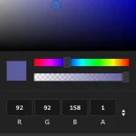 Mobile-friendly & Keyboard Accessible Color Picker – Alwan
 Accessible Color Picker – Coloris.js
 Customizable Color Picker For The Web – Grid Color Picker
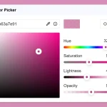 Lightweight & Fast Color Picker Web Component – color-dialog-box
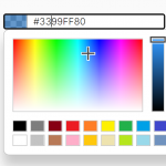 Customizable Mobile-friendly Color Picker – jscolor
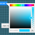 Vanilla JS Color Picker With Alpha Channel – vanilla-picker
How to enable default color swatches?