


duDialog is a pure JavaScript plugin for creating Material Design inspired alert, confirmation, selection dialog popups without any dependencies.
How to use it:
To get started, insert the duDialog’s JavaScript and CSS files into the page.
<link href="duDialog.css" rel="stylesheet">
<script src="duDialog.js"></script>
Create a basic alert dialog with an OK button.
new duDialog('Alert Message', 'This is an alert message.');Create a confirmation dialog with callbacks.
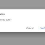
new duDialog('Confirm Dialog', 'Are You SUre', duDialog.OK_CANCEL, {
    okText: 'Confirm',
    callbacks: {
      okClick: function(){
        // do something
      },
      cancelClick: function(){
        // do something
      }
    }
});
new duDialog('Select An Item', ['CSS', 'SCRIPT', 'COM'], {
selection: true,
callbacks: {
itemSelect: function(e, item){
// this.value
}
}
});
// or
new duDialog('Select An Item',
[{ name: 'CSS', id: 1 }, { name: 'SCRIPT', id: 2 }, { name: 'COM', id: 3 }],
{
selection: true,
textField: 'name',
valueField: 'id',
callbacks: {
itemSelect: function(e, i){
// this.value
}
}
});All optional settings with default values.
// id attribute of the dialog container
id: null,
// determines if initialize only
init: false,
// determines if dark theme is on
dark: false,
// 1 - default action button (OK);
// 2 - OK and CANCEL buttons;
// 3 - YES, NO and CANCEL buttons
// 4 - no action button (used with single selection dialog)
buttons: 1,
// hides dialog on (any) button click if there's a defined callback handler
hideOnAction: false,
// determines if a Don't show again checkbox will be displayed
optOutCb: false,
// label for the opt-out checkbox
optOutText: 'Don\'t show again',
// text for the 'OK' button
okText: 'Ok',
// text for the 'Cancel' button
cancelText: 'Cancel',
// determines if dialog is for item selection
selection: false,
// determins if (single) select dialog will show the OK_CANCEL buttons for confirmation
confirmSelect: false,
// determines if multiple seletion
multiple: false,
// determines the minimum required selection (multi select only)
minSelect: 1,
// determines the maximum required selection (multi select only)
maxSelect: null,
// determines if multiple seletion (for selection dialog)
multiple: false,
// determines if search input is visible/enabled
allowSearch: false,
// default selected item valu
selectedValue: null,
// variable name for the select item value; use this for custom object structure
valueField: 'value',
// variable name for the select item display text; use this for custom object structure
textField: 'item',
// callback functions: okClick, cancelClick, itemSelect (for selection dialog), onSearch (for selection dialog), itemRender (for selection dialog)
callbacks: null
All possible callback functions.
callbacks: {
  /**
   * Triggers on OK button click; 'this' inside the callback refers to the dialog object
   * @param {Event} e - event object
   */
  okClick(e);
  /**
   * Triggers on CANCEL button click; 'this' inside the callback refers to the dialog object
   * @param {Event} e - event object
   */
  cancelClick(e);
  /**
   * Triggers on item selection change (selection dialog); 'this' inside the callback refers to the radio button.
   * For multiple selection dialog, this will be triggered on OK button click (okClick will not be executed); 'this' does not refer to the checkbox
   * @param {Event} e - event object;
   * @param {string|Object} i - selected item (string or object) bound to the radio button; array of selected items (string or object) for multiple selection
   */
  itemSelect(e, i);
  /**
   * Custom search function, triggers on search input keyup (selection dialog); 'this' inside the callback refers to the dialog object.
   * @param {string|Object} i - select item object or string;
   * @param {string} k - search query string
   * @returns boolean (for matching item/s)
   */
  onSearch(i, k);
  /**
   * Custom item render function; 'this' inside the callback refers to the dialog object.
   * Note: If used, you need to add your own styling
   * @param {string|Object} i - select item object or string
   * @returns string/html markup (to be used for rendering of the item label)
   */
  itemRender(i);
  /**
   * Triggers on OK button click if checked items is less than the minimum (minSelect config)
   * @param {number} min - minSelect value (configuration)
   */
  minRequired(min);
  /**
   * Triggers on item click if checked items is equal to the maximum (maxSelect config)
   * @param {number} max - maxSelect value (configuration)
   */
  maxReached(max);
}
Changelog:
v1.1.5 (04/16/2023)
- added Vue 3 support
v1.1.4 (04/25/2022)
- Added hideOnAction config – which auto hides the dialog whenever an action button is clicked if set to true
- Added optOutCb & optOutText options
- Added dialog loading state – call setLoading()
v1.1.3 (08/30/2021)
- Added YES_NO_CANCEL type
- Added functionality to group items – format here
- Added confirmSelect config to add confirmation buttons for single select dialog
- Fixes
v1.1.2 (07/18/2021)
- Moved type dialog parameter to options.buttons
- Renamed message dialog parameter to content
- Renamed button type NO_ACTION to NONE
- Renamed DUDialog class to _duDialog
- Minor code fixes/improvements
- Bugfix
v1.1.2 (09/18/2020)
- Updates & fixes
v1.1.1 (09/15/2020)
- Added Element.matches polyfill for IE11
- Added dark configuration which determines if dark mode is on
- Added minSelect config for multi select dialog – restricts the minimum selection required; with callback method minRequired
- Added maxSelect config for multi select dialog – restricts the maximum selection; with callback method maxReached
- Minor script and css fixes
- Removed :scope in querySelectors which causes an error in IE11
08/25/2020
- Added dark configuration which determines if dark mode is on
08/23/2020
- JS Updated
10/31/2019
- Bugfix
10/10/2019
- Bugfix
09/16/2019
- Bugfix
01/10/2019
- Minor enhancements
01/09/2019
- Minor enhancements
- Bugfixes
12/07/2018
- Small fixes
11/28/2018
- Minor updates
See Also:
 Pure JavaScript Toast & Dialog Popup Library – Alerty
 Beautiful Dialog Box Library Inspired By Material Design – SoloAlert
 Create Dynamic Draggable Alert/Confirm Popups – webcimes-modal
 Customizable Alert/Confirm Modal Library – modal-alert.js
 Minimal Alert & Confirmation Modals in JavaScript – PopupJs.js
 Create Custom Stylish Dialogs with SnapDialog JavaScript Library
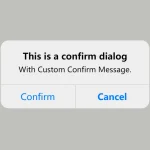 Create iOS-Style Popups & Notifications With Popup JS Library
 Elegant Notification Popup JavaScript Library – Notiflix
How can i call the dialog box when i click something?
Ok i already know, you can delete the comments
duDialog.js:2283 Uncaught TypeError: Cannot read properties of null (reading ‘appendChild’)
doesnt work GG